Welcome to HCI Research for All!
The idea behind the site has always been, and continues to be, the support of HCI researchers in building on, and validating, each other’s work. The aim is to decrease HCI theory fragmentation and so to increase HCI discipline progress, while preserving the on-going technical and human diversification of HCI. The contrast is with HCI community progress, which continues apace.
The site was initially used to develop these ideas on the basis of research, conducted at University College London from 1979 to 2001. The development resulted in the publication of a book, entitled ‘Approaches and Frameworks for HCI Research’, written by John Long and published by Cambridge University Press (CUP – www.cambridge.org/9781108719070). From the date of the book’s publication, that is, 12 February, 2021, it replaces the website, as a citable source for the particular expression of those ideas. The original website has been retained by way of archives of Approaches and Frameworks. The latter may be of interest to researchers in the origin and development of the ideas behind the book.
Feedback on all aspects of the book and the site is welcome and should be sent to myself at <j.long@ucl.ac.uk>. It will be added to the site as a post and the authors informed.
Welcome to ‘A Guide to Framing Design Practice for UX’
The site is used to post the source material for a new book entitled ‘A Guide to Framing Design Practice for UX’ (to be published by Springer Nature).
The new book is in contrast to the present book. The former is about Research, the latter about Practice. Also, respectively about HCI and UX. However, the two books are complementary. The second also cites the first. For this reason, they are referenced here together. Contributors’ biographies are also included.
The posting of the source material in the public domain means that the material can be referenced for comment. However, any such use of the source material must be clearly signalled, for example, by quotes or somesuch.
John Long (April, 2023)
Blyth, Gerred (2023)
Read More.....Usability, UX, Beyond and Back: A Practitioner’s Odyssey
Gerred Blyth, May 2023
For those that entered into the world of Human-Computer Interaction at the turn of the century,the rules of engagement were straightforward: Systems should be engineered to be cognitively
ergonomic. They should be usable. What is usability? That was simple too. It was defined by ISO
9241 as allowing users to achieve their goals with “effectiveness, efficiency and satisfaction.”
Each of those three terms had a variety of associated metrics.
Practitioners at this time duly measured those metrics which ensured their systems were
usable. All was well. The ISO standard was well defined, forged in the heat of thorough
committee review. It was clear to all its advocates that it was both necessary and sufficient to
describe a quality user experience.
While ISO 9241 was the “what” of user centred design, ISO13407 offered the “how”. Now in
addition to assessing a system’s usability, there were reliable and repeatable processes to
achieve expected outcomes. Finally, the “what and the how” could all be understood within
broader conceptions of the entire HCI discipline, such at that of Long and Dowell (1989,
reference 0a)
With the zeal of the recently converted, the practitioners in the Class of 2000 explained (to
anyone that they thought needed to hear) that the creation of quality systems really was a simple
affair. It was obvious. Follow the processes, place users at the heart of each step, measure for
effectiveness, efficiency and satisfaction, and a good result will follow. And woe betide anyone
that got in the way of this pure and foolproof logic… with distractions of new technologies, or
the realpolitik of limited budgets and time constraints, or – worst of all – patently unverifiable
claims of “but this design is better”.
—
Anyone that recognises the portrait above will then surely recognise at least parts of the
conceptual odyssey that I will now trace out. As a community, as an industry, and as individuals,
in the last twenty years we have journeyed from the primacy of “usability” to User Experience.
The journey has been well documented and has had many heroes. There have been triumphs
and successes. UX has earned its place at the table in powerful organisations. Many of those
same practitioners now believe in the precepts of UX as fervently as they did Usability.
But this journey has also given rise to many challenges and ordeals. A variety of distractions and
inspirations in those two decades have encouraged practitioners to travel yet further, past UX as
it is usually understood, and into new realms that have coloured differently again everything
they were so confident of once before.
Novel project work, different industry verticals, professional development, a spirited mentor or
an inspiring junior team member. Each of these moments has the potential to change how one
sees the world, and how one sees their work as a UX practitioner.
Here I will consider a number of these inspirations – muses, if you will – as a way to define and
challenge ‘what UX is’. As the journey unfolds, we will start to consider UX as a subset in the
wider notion of Quality.
The muses I present here are personal, any journeyman reader will have their own. Each one
has, since the turn of the century, presented the possibility that UX practice is neither necessary
nor sufficient for Quality to exist.
And yet, crucially, the further we travel from UX, from its modes and focus (and those of usability
before it) the more important a homecoming feels.
Muse 1: The Muse of Art and Delight
In 2014 at the UXPA International Conference, I presented my thoughts on my recent
experiences designing with and for artists and performers (Reference 1a). In this domain, the
usual precepts of UX thinking are hard to follow. I described two particular cases:
1. The user is staged as an artistic performer.
In this case, a layman user is engaged with a “walk up and use” interface that has an
artistic intention. Consider the great many interactive installations that are now found at
so many festivals, civic events and corporate head office entrance foyers. (See Reference
1b).
2. An artistic performer is cast as a user.
Examples such as the interactive gloves of musician Imogen Heap (Reference 1c) or the
completely bespoke musical instruments of Kraftwek or Harry Partch (Reference 1d).
Many of these interfaces are designed exclusively for the use of one single performer. The
design and the performance become almost indistinguishable.
In 2014, I continued to argue that the motivations of art and self expression were difficult, if not
impossible, to reconcile with the motivations of user experience, as it is usually understood.
In the first case, the end goal of the interaction is an artistic expression. The creation of
spectacle, or mystery, may be part of that. These multi-sensory immersive experiences are often
geared for gentle sensory outcomes, or surprising moments of delight. All of these outcomes are
not usually thought to be in the dominion of UX.
In the second case, the performer and their sense of performance identity and agency needs to
be in harmony with the creation of a completely novel tool. It is very difficult to imagine this
individualistic quality arising from the typical methods in the UX toolkit.
To be clear, in the last twenty years many UX theorists have included conceptions of delight, or
emotion, or affect, in their models of UX. In fact this was one of the key notions that
distinguished UX from traditional “system usability”. But it is hard to imagine that there is any
practical way to operationalise these ideas so that they will be of utility to artists and
performers working with the kinds of interactive systems described above. Yet, designed and
built they are, and undeniable in terms of quality, in the eyes of the right audience, in the right
context.
Muse 2: The Muse Of Pragmatism and Shipping
UX careers tend to follow one of a number of templates. It may be from “junior” to “senior” or
“individual contributor” to “manager”. Another common path for UX practitioners in the last
twenty years has been to move from UX Research to UX Design and then into Product
Management. This progression is mirrored in many other professions: from understanding, to
creating, to governing. From the many UX practitioners that have followed this path, there is a
common reflection: ‘I only know now how easy it is to criticise something, but how hard it is to
solve it’. (Reference 2a).
UX practitioners are well known to be harsh critics. Indeed, it is part of the core of their role in
many organisations, be it through expert reviews, or design critiques, or primary-research based
UX evaluations. An experienced UX practitioner will deconstruct an experience or an interface
and present winning solutions that will engender greater satisfaction and deeper, more
successful user interactions. That is what they are there to do.
As UXers obtain more experience and become more familiar with the implications of these
winning solutions, for example development costs, or opportunity costs , they will of course
start to see the bigger picture to what was previously “a no brainer for better user experience”.
This is a crucial part of the maturity of a practitioner, and the ability to converse in these terms
separates out the juniors from the seniors and leads in the world of UX.
One of the most impactful ways many UX practitioners will get this perspective is to act in the
role of a product manager. What might be obvious as the best design for user experience in one
aspect of the product suddenly becomes low priority when faced with the harsh reality of what
this work means that users will not get elsewhere. This balancing of UX impact versus effort is
the touchstone of a product manager’s role. Further to that, they must also address the
equally-important ambitions of a never-ending list of other non-UX focused initiatives.
Quality, for a product manager, has UX at its heart but it cannot be in thrall to the concept.
Pragmatic decisions take over, and the primary concern often becomes one of “shipping”. A
system focused on perfect user experience may be something to aspire to, but if it is unreleased
it will never beat the lesser system that nonetheless actually gets into users hands.
The challenge to UX here is to recognise that it is really only one part of the puzzle of the
creation of Quality.
Muses 3 and 4: The Muses of Persuasion and Dark Patterns
Another stepping stone on the path from Usability to UX, and beyond, was the attempt to
harness psychological and cognitive understanding to make products not just emotional, or
affective, but also in some way behaviour changing. The foremost proponent of this concept has
been Professor BJ Fogg at the Stanford Persuasive Technology Lab. (Reference 3a).
A variety of interactive design techniques have been researched and documented by Fogg. These
include compelling trigger / notification sound design, to full gamification of apps and other
day-to-day systems.
This concept has been another provocation for those in UX. Is their role to act entirely for the
benefit of their user stakeholders? Should tools empower users or change users? Fogg has taken
great pains to specify the parameters of ethical persuasion. But this stance was not embraced by
Nir Eyal, whose bestselling 2014 book “Hooked: How To Build Habit Forming Products” feels
scarcely palatable after the subsequent decade of mass social media manipulation that has been
so well documented.
Rowing back from unethical behaviour manipulation, and into more familiar “true UX” waters,
we might find ourselves with Dr Harry Brignull and his colleagues who have spent many years
documenting Deceptive Design (aka Dark Patterns, reference 4b). This inversion of the practices
of the behaviour manipulation experts identifies corporates and others who practise these tricks
and publicly names and shames them. The team also works in legal contexts to advise on and
help enforce laws that are intended to prevent manipulative interactive design.
Any UX practitioner being drawn into these themes in the last twenty years must surely also
conclude that a principal part of UX, of the quality of its offer, is its “pro bono publico” nature.
NB: A decade after publishing “Hooked”, and trading on its advice, it would seem that Eyal
reached the same conclusions, by authoring a new volume by the name of “Indistractibe: How To
Control Your Attention”. One might regard this new work as some kind of atonement. Or,
alternatively, an escalation in his own personal arms race with himself.
Muse 5: The Muse of Tech-First Innovation
Among UX practitioners it is an article of faith the user is the centre of the design process. Some
practitioners insist that they are foremost psychologists, and that they can design for any
technology because the human condition does not change. They warn against the very worst
crime of all: that solutions should ever be dictated by technology, rather than by a pure
understanding of user need.
All this is true, to a point. For the Class of 2000, it was easy to confidently smash the looms of the
technophiles and neophytes who bullishly insisted on new features based on barely usable early
technologies. Clunky touchscreen devices, awkward VR headsets, stuttering video meeting
technology, abysmal speech synthesis and recognition, irrelevant QR codes, and a hundred other
“all tech, no use case” ideas were battlegrounds for ‘tech first’ versus ‘user-first’ advocates.
But while these battles were underway, and the UX community were proud of their wins in the
name of their users, others were quietly creating early applications of these technologies,
building early adopter user bases, refining products and, ultimately, contributing to the
development of the actual technologies until every one finally gained adoption, and many
became themselves mainstays of “good user experience”
The challenge posed to UX here is: can it be allowed for designs to be built and promoted that
are clearly too early to be successful, as some kind of selfless act of allowing nascent
technologies to flourish?
Muse 6: The Muse of AI Design
2022 and 2023 have seen an breathtaking acceleration of the public understanding of, and
appetite for, Artificial Intelligence products.
The headline-grabbing AI darling Chat GPT proved to be the fastest growing consumer product
in history, reaching 100 million active monthly users in just two months (Reference 6a.) Dall-e
and Midjourney were following suit with barely believable monthly advances in artistic novel
image generation.
If anyone assumed that the revolution would imperil only the jobs of low skilled workforce they
were quickly disabused of this notion. Creative illustrators and copywriters suddenly found
themselves under existential threat.
Is UX practice next? For sure, in early 2023, with a little guidance the tools can write the copy
and create convincing visual mockups. But that is far from true UX thinking and practice. For AI
to generate successful products and experiences, it would need to be trained on the datasets of
similar successful experiences.
Quickly, the muse of AI Design looks more like a siren. By participating in the undeniably
diverting promise of AI, practitioners are training the very systems that will potentially soon
relieve them of their responsibilities. Like those illustrators and content creators before them,
we see UX designers today sleepwalking into the kind of practice that once had Oppenheimer
reaching for his copy of the Bhagavad-Gita.
In any case, this particular revolution began some time ago with the availability of big data in
online systems.
For many years already, our user experiences have included many dynamically composed lists:
think of a TV set with refreshing lists of popular channels, a website with
algorithmically-generated recommended books or products, a worksystem with dynamically
created ‘next best actions’ and so on. It has been the case for some time that a designer of any
system really cannot know what a particular user is seeing on their screen without having a
profile of that user.
However, this is changing with the advent of generative user experiences. To be clear, these are
not experiences that are created by designers with AI tools, researching with samples of six
participants, or usage data from six million.
These are experiences that are themselves created by generative AI systems (Reference 6b). The
servers will optimise not just individual dynamic components, but entire workflows to achieve
optimal results. The system will measure success of outcomes and modify experiences
accordingly, for every user. The complexity of a user profile, and the amount of flexibility within a
generative interface will be so profound (and, of course, in a machine learning black box) that it
will be impossible for a human practitioner to know or even predict what experience any one
user is having.
And so what role for UX in this new world? What does quality look like when you don’t get to see
it?
We know that AI systems can only generate alternatives if they are given parameters to measure
success against. What are the metrics of success that could be used? A range of output metrics
such as engagement and profit, no doubt. But also we are surely drawn back to three well
researched and well known measures of a system, familiar now for more than twenty years.
Namely: Effectiveness, Efficiency and Satisfaction.
Could it be so simple?
After the Muses, a Homecoming
At the start of this piece I explained that I would outline an odyssey that would be familiar to
many UX practitioners in the last twenty years. The muses I have identified are definitely
personal, but also shared by many individuals, and by the UX community itself.
And so what becomes of a practitioner undertaking this journey? What impact of the muses?
Each one alone is enough to inspire a completely different destination. Those paths are
engaging, intellectually satisfying, and likely well remunerated.
For many UX practitioners, the position is one that is adopted intimately, and will perhaps
forever colour their perceptions. Even as we dalliance with alternative paths and muses such as
the ones described here, UX is never far from mind, and it influences even the most unlikely of
projects and topics. Like Karl Popper’s Scientific Method, UX practice is ‘a way of operating’ that
will likely never depart, and will always be of use.
To stand at one remove from our own experiences, we might also think about the qualities of a
new practitioner that we would want to join our team if we were trying to create a quality user
experience for an as-yet-unknown context. Would it be advisable to choose the person dipping
their toes into art and performance? Or a product manager in the making? A behaviour change
advocate or protector? A tech enthusiast? An AI entrepreneur? No, we would be advised to
choose someone with very traditional UX skills. Someone that can understand real user needs
and engineer solutions to truly satisfy them.
But then: If a pure UX mindset is of such great value, to what end are these muses of any benefit
to anyone? If a homecoming is proper and desirable, what is the point of it all? Well, we might
think of these professional and intellectual muses as grist to the mill. While each one would be a
legitimate pursuit on its own terms, perhaps their true value lies in the journey itself, the lessons
therein, and their compound interaction with each other and with the original core set of HCI
and UX values. Learnings from one amplifies the skills learned in the other. They afford
unexpected evolution to us – as practitioners, yes – but also as agents in the world. As people.
And what was supposedly “work” all along was in fact growth. Here, in the final analysis, I am
reminded of Pirsig writing in 1974: “The real cycle you’re working on is a cycle called yourself”
References:
0a: https://hciengineering.net/long-and-dowell-1989/
1a:https://www.slideshare.net/UXPA/how-can-we-apply-the-motivations-of-art-selfexpression-and-playfulness-to-ux-and-vice-vers
a-gerred-blyth
1b: https://amt-lab.org/blog/2021/10/artistic-futures-digital-interactive-installations
1c: https://www.youtube.com/watch?v=ci-yB6EgVW4
1d: https://www.bbc.co.uk/music/articles/b49cbf91-9172-4881-9501-7fb5f87700a5
2a: https://rosenfeldmedia.com/books/product-management-for-ux-people/
3a: https://www.amazon.co.uk/Persuasive-Technology-Computers-Interactive-Technologies/dp/1558606432
4a:https://www.amazon.co.uk/Hooked-How-Build-Habit-Forming-Products/dp/B00HZOBOUO/ref=sr_1_2?crid=38N20V2EPQJ66&
keywords=nir+eyal
4b: https://www.deceptive.design/
6a: https://www.reuters.com/technology/chatgpt-sets-record-fastest-growing-user-base-analyst-note-2023-02-01/
6b: https://prototypr.io/post/generative-ai-design
Chakraborty, Seb (2023)
Read More.....Topic of UX
The topic of UX is complex and struggles with definition, scope, and perceived utility. At the same time, everyone wants it, feels it’s important and yet no-one completely owns it. Experience isunique; mine is mine and yours is yours and yet design would get quite complicated withoutsome commonality, a set of norms, rules of thumb or good old-fashioned principles.
UX Approaches
The UX approaches, of the late 90s, early 2000s, was largely based on a linear developmentcycle. where ideas are conceived, requirements are gathered, designs are built, tests areconducted and eventually the e.g., the thing is launched and needs to be operated and maintained.
Growth in Technology
Since the start of the 2000s, consider how the growth in technology has become exponential and reshaped every aspect of our lives. From mobility to metaverse, IOT to Augmented Reality, the world of experience has become rather too complicated and while UX has becomeessential, it inhabits as uncomfortable space, where it’s tricky to define and problematic to own.The UX designer’s role (assuming there is such a role in a company) their work is often confined todesigning a few widgets for the webpage.
Framework and Frames
Frameworks and frames, act as points of reference and an opportunity to simplify. They alsoperhaps help put in context the things that need to be thought about. Given that most things thatget built are produced by companies, one useful way to re-frame is the Product Centric framing, which positions three intersecting circles, describing the cross-cutting concerns of business, technology and UX.
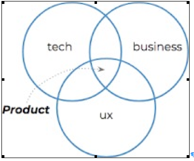
Illustration
Consider the choice of a microprocessor, sitting in the intersection. The technology consideration is relatively clear, encompassing requirements to do with chip fabrication,semi-conductor quality and number of transistors. The business consideration will be largely to do with the bill of materials. Choices may be impacted by inflationary pressures, impacts onsupply chain and any other political dimension, for instance, China’s blockade of ships to Taiwan. The UX, angle will be that the chip will need to both be compatible with the operating systems, theapplications and that they perform at the right speed to deliver the right experience.
At this level of framing, it’s straightforward to appreciate that functional and non-functionalrequirements that need to be satisfied in the building of a ‘thing’. The trillions of things in existence today, whether they be physical hardware devices, component parts of devices, websites, smartphone screens, in car displays, 3D headsets, the UX challenge becomes staggeringly complex.
Key Ideas
- UX is dead, long live UX
- How does a product centric frame for UX help?
- How do you do UX at speed in the era of exponential?
Cummaford, Steve (2021)
Read More.....Business-to-Consumer Best-Practice Update
Revenue for digital media and technology in general, and e-commerce in particular, has grown. Turnover for e-commerce has increased from about £20 billion in 1998 to about £2 trillion per annum globally. Hardly surprising then, that commercial best-practice has attracted resources, resulting in its development and advancement. Future research needs to take account both of how to apply current best-practice in the acquisition of HCI-EDPs and what format best suits their application to current best-practice design. To the latter ends, the changes to best-practice, since the completion of the research, are identified and implications for best-practice and for HCI-EDP application format noted. Future research would do well to take account of both sets of implications. Such changes in best practice follow:
1. From design for usability to design for user experience (UX).
2. From design methods to design methods, enhanced by technical advances in data capture, as exemplified by UX analytic tools, such as Adobe Analytics and Content Square.
3. From simple online transaction testing to online ‘design funnel’ testing.
4. From simple online transaction testing to online ‘AB’ testing.
5. From structured analysis and design methods to ‘lean UX’ design methods.
6. From the design problem to the minimum ‘viable product’ (MVP).
7. From process design methods to ‘atomic’ design methods.
8. From individual online user testing to online ‘scaled up’ user testing.
Note that in all cases, the full range needs to be included.
All these best-practice changes can be recruited to the design practice, used in the case study, to support the acquisition and validation of HCI-EDPs. Such application, however, would necessarily require the mapping of the novel change concepts, such as ‘lean’ and ‘minimum viable product’ to those of the conception, such as ‘design problem’ and ‘design solution’ and, indeed, ‘HCI-EDP’. The format of the latter for best practice application was an issue at the time of the research and remains an issue now.
In conclusion, as concerns e-commerce systems, it is clear, that they were a promising area of research, in terms of their potential for commercial development. The selection of physical goods e-commerce transaction systems has also proven to be an area of commercial interest and success. There is no shortage of such systems, with Amazon emerging as perhaps the best known, and possibly biggest. Information e-commerce systems, however, have almost disappeared in the form characterised in Cycle 2 development. The general class-level description of transaction systems for information may still be valid, for example, the sale of virtual goods in games or the metaverse, but SMS news alert services as such hardly exist. However, the particular example is less important than the development of the HCI-EDP conception and the class-based approach themselves.
Grant, Courtney (2023)
Read More.....Education
I completed my MSc in Human-Computer Interaction with Ergonomics. The course provided the foundation for a career in user-centred design.
Employment
After completing my MSc, I joined an engineering consultancy as a Human Factors consultant. I began working in multi-disciplinary design teams. I worked in defence, nuclear, and rail. I worked on both physical and software Ergonomics projects.
I also worked on safety assurance projects, which benefited me. I gained much from the rigorous approach that I needed to apply on these safety projects. This influenced the way I frame my Human Factors work.
Practice
I would describe my practice as varied. I have worked on projects that focus purely on physical Ergonomics. I have worked on projects that focus purely on software Ergonomics. I have worked on projects that integrate the two. For example, I have worked on projects where the organisation procured software systems from different suppliers, all of which we need to physically integrate onto the desks in a control room. I have also looked at the user experience of wider systems, paperwork, procedures, and so forth.
My practice is highly evidence-based. I base my recommendations on the best evidence, drawing on the literature from Ergonomics, Human Factors, HCI, and so forth. If I make a recommendation, I map it back to the relevant literature, or to the relevant standard clause. I read extensively. I trawl through the literature in this space. I collate what I find into an Excel-based commonplace book. I capture key insights from research, standards, guidance, and so forth. Before I kept a commonplace book, I used to lose track of key sources that I would come across. If I then encountered a similar problem where this source would also prove useful, I would have to search for it again from scratch. Keeping a commonplace book helps me to work more efficiently.
Analysis
When it comes to analysis, I like to be creative. For example, I create my own spreadsheets to find different patterns in the data I collect about systems. I also like to combine analytical methods to create something more robust. This helps me to understand a given situation from more angles. I have done this when I have looked at the risk of use error with user interfaces.
Evaluation
When it comes to evaluation, I like to stick to tried-and-tested methods. For example, when it comes to collecting quantifiable subjective user data, I prefer to stick to the likes of the System Usability Scale and the Single Ease Question. They are well-validated questionnaires, underpinned by research. If there is however a gap between what we need on a project and what is currently out there, then I would look to develop my own questionnaire.
Design Practice
In my experience, the degree to which you engage in these design practices depends on the project. It usually is a mixture, but the mixture of each form of design practice will vary by project. For example, on projects with greater amounts of uncertainty, I will need to use more trial and error to work through the assumptions.
Design Problem
As an example of a design problem that I have encountered, I have worked on projects where the project has procured software, but we cannot change certain elements of the software because it is core to the product. These elements may not be ideal or the “gold standard” from a Human Factors perspective. However, we must nonetheless find a way to make it work.
As another example of a design problem that I have encountered, I have worked on projects which involve bringing multiple software user interfaces into use, which a given operator needs to use. Therefore, to minimize the risk of negative transfer, these software user interfaces need to be compatible with each other when it comes to the user experience.
Systems Perspective
It is important to take a systems perspective. It is important to look at the whole environment where a given device needs to operate. For example, when it comes to control room design, you must think about how each control room element will integrate into the control room, from software to hardware to all other elements. Your thinking must extend beyond any one aspect.
Approach
I use the steps from BS EN ISO 9241-210 as a broad framework for my practice, most notably to understand the context of use, specify the user requirements, produce design solutions, and evaluate the design until we reach a fit-for-purpose solution. For each these steps, I use specific approaches that work for me.
When it comes to understanding the context of use, one approach I like to use is Cognitive Work Analysis, and in particular the contextual activity template. I use this to map out all the system’s functions and the different situations that the end-users will encounter. I also use Tabular Task Analysis. I map the user’s tasks out in the subject-verb-object format. I first started using this format after seeing the sentence structure outlined in the book “Guidelines for Developing Instructions” by Kay Inaba et. al (2004). I found this useful as an approach to task analysis. I created a template in Excel that divides up these elements of a user’s tasks in this way. This approach allows me to develop task analysis in a consistent, systematic manner. At this stage, I also like to record an inventory of all the system’s elements. For user interfaces, this would mean recording each user interface screen, and each user interface element. My approach is to collect vast amounts of data, and then narrow the focus down as needed.
User Requirements
When it comes to understanding the user requirements, I apply the relevant Human Factors parameters to the context of use. I compile spreadsheets that contain principles, patterns, guidelines and so forth. I record the source, a link to the source where applicable, and the key insights from the source. I also include keywords to search for. This allows me to filter and search for patterns across what I have collected. It is a commonplace book. I trawl through sources of evidence for anything that could be of help to me. I arm myself with hundreds of principles, patterns, and guidelines. It is then a case of applying the right parameters to the situation.
When it comes to producing design solutions, I like to work up a range of options for solutions, and this is where I will prototype different solutions. For example, I have used PowerPoint to quickly put together interactive user interface prototypes. I like how IDEO’s CEO Tim Brown talks about the need to “build to think.” I like IDEO’s “fail faster to succeed sooner” approach.
Evaluating Design Solutions
When it comes to evaluating design solutions, I assess each proposed design solution against the parameters that I have identified previously. For example, this could involve assessment against clauses from standards, such as consistency of the positioning of controls. This could also involve performance-related parameters, such as task completion rates. This could also involve collecting subjective feedback from users, such as via the Single Ease Question and the System Usability Scale, to capture quantifiable feedback. In addition to this, this could also involve collecting qualitative feedback from users.
Framework
I like to employ the framework outlined in BS EN ISO 9241-210. Specifying the context of use, understanding the user requirements, creating design solutions, and then evaluating these design solutions until you arrive at a suitable solution provides a robust framework for design practice.
Case Studies
I participated in the 2019 BTNG hackathon at the Microsoft Reactor office in London. Microsoft Reactor streamed the event live on their YouTube channel. The hackathon sought to reduce the impact of “brain-drain” in Nigeria, where highly skilled Nigerian professionals leave the country to work in other parts of the world. At this event, I worked in a team with two UX professionals, a Software Engineer, and a medical student. We developed a prototype software app that aimed to improve access to healthcare in parts of Nigeria by connecting them remotely to Nigerian Healthcare professionals working in the diaspora.
We researched the current healthcare situation in Nigeria. We identified huge challenges, both in urban and rural areas. Initially, we wanted to focus our solution on helping people in rural parts of Nigeria. However, issues with literacy, internet access and electricity meant that this would not currently be practicable. Therefore, we decided to focus on urban areas.
We prototyped our solution in Sketch, and the Software Engineer created the app itself in Android. The registration page allows users to add key information to their profile, such as details about their previous medical history. The app allows to confirm whether there is a medical emergency, and in this case, the app connects the user to the relevant emergency health services. For all other matters, the app offers three options to the user. The first option allows the user to look through a directory of common illnesses. The second option allows the user to find nearby health facilities. The third option allows the user to directly connect a healthcare professional (either by phone or via a video call).
This experience provided insights into the infrastructure challenges associated with delivering solutions into this problem space.
Example of Framing Design Practice
I worked on a major control room upgrade project. The project procured new control and communications systems for the operators to use. Different suppliers developed these different systems. This risked introducing inconsistency across these systems.
I took action to promote consistency across these systems. I created a style guide, which mapped out all the key features across all systems and specified the style and format for the suppliers to implement to promote consistency across the systems.
I took a pragmatic approach. I assessed the most developed system against the relevant Human Factors parameters. I then used the features from that system to define the style for the less developed systems to follow. Once the suppliers developed each of the systems, the style guide formed the basis for the integration assessment of all the systems.
My control panel design work is another example of how I frame my design practice. To specify the control panels on a particular project, we worked with end-user representatives to look at the tasks that they need to do with the control panels. We used that information to determine what control and indications they needed the control panel to include. I then developed an interactive PowerPoint prototype of the proposed solution to make sure it met the needs of the users. We then implemented the control panels, developed training guides, and trained users on how to operate them.
Ways Ahead for Framing Design Practice
I can see more conduct and reporting around equality, diversity, and inclusion. We need to use fit-for-purpose methods for this emerging area to enhance the way professionals deliver solutions. For example, in 1993, Jakob Nielsen said that the thinking aloud method is the most important usability method. This will be the case for users who are functionally able to articulate their thinking verbally. However, specific users may struggle with this method, such as people with dementia or aphasia. I expect to see professionals develop more inclusive approaches to design practice, such as further development of multi-modal communication approaches to user testing.
I also expect to see more conduct and reporting around sustainable design, with professional helping to develop better smart technology that will support optimal use of energy.
Additional Points
I also like to build in approaches from other fields. For example, I like Triz (Theory of Inventive Problem Solving), and specifically, the approach set out by Gordon Cameron in his book “Trizics.” It helps me to think about a problem from different angles. For example, there is a tool known as “Nine Windows.” This encourages you to look at a problem at the supersystem, system, and subsystem level. In addition to that, it encourages you to look at a problem in terms of its past, present, and future. This approach is incredibly useful for Human Factors work. It helps me to think more broadly.
References
Brown, T. (2009). Change by Design: How Design Thinking Transforms Organizations and Inspires Innovation. Harper Business.
Cameron, G. (2010). Trizics: Teach Yourself Triz, How to Invent, Innovate and Solve Impossible Technical Problems Systematically. CreateSpace Independent Publishing Platform.
IDEO (2013). Why You Should Talk Less and Do More. Available at: https://designthinking.ideo.com/blog/why-you-should-talk-less-and-do-more#:~:text=When%20you%27re%20trying%20new,re%20doing%20is%20an%20experiment.
Inaba, K., Parsons, S.O., and Smillie, R.J. (2004). Guidelines for Developing Instructions. CRC Press.
Nielsen, J. (1993). Usability Engineering. Academic Press Inc.
Middlemass, James (2023)
Read More.....Notes from the Coal Face
Experience Design (XD)
Some notes from the coalface: For the last few years I’ve been back in the ‘experience’ fold and am in a team currently known as ‘XD’ for Experience Design (‘currently’ because we spend more time in reorgs than in a stable structure! Rearranging reporting lines is guaranteed to solve all possible problems.). Anyway, Experience Design is supposed to indicate a combination of ‘Customer Experience’ and ‘Colleague Experience’ but in practice it’s much more of the latter and less of the former. In reality, most of the team are business process designers and much of the work is done using a tool called ‘ARIS’ which uses a fairly widely used notation called BPMN (business process modelling notation). Unfortunately it’s such a cumbersome tool that a lot of design decisions are made to suit whatever is expedient given the limitations of the tool and the notation! Interestingly, UX is treated as a separate ‘add on’ to CX. We’ve also got an interesting practice whereby the whole customer experience is reinvented for each product that launches, but as its so difficult to change anything it turns out to be pretty much the same each time, or to have minor variations for each product that just create confusion. Consequently, most of the team is kept so busy continually reinventing the wheel there is hardly any time left to improve anything.
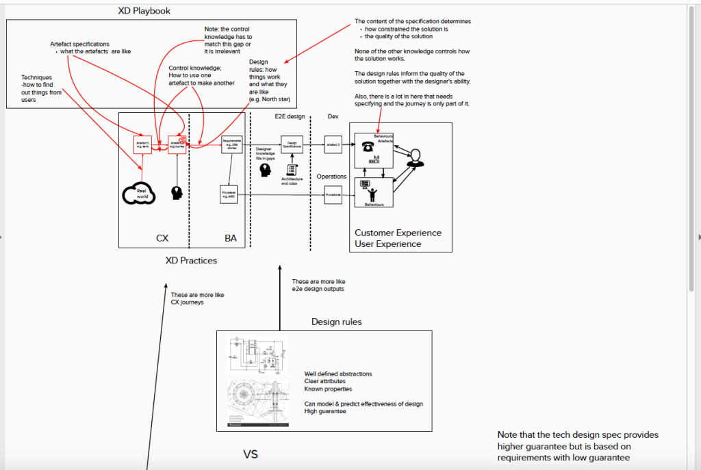
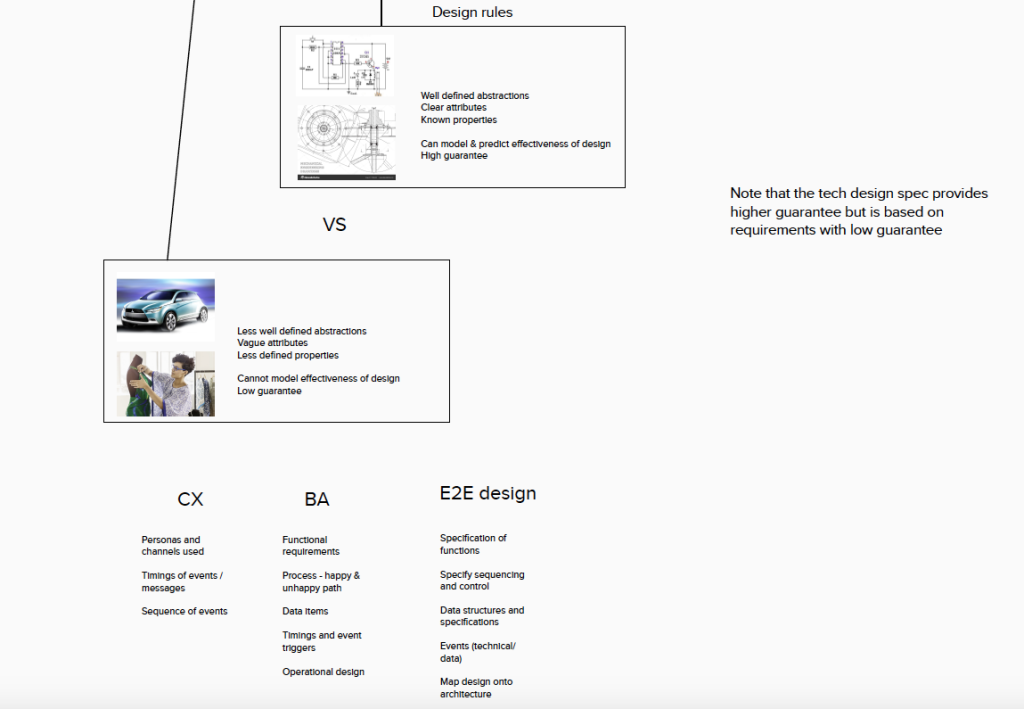
Happy Path Processes
I’m fortunate to be working on a more ‘green field’ project where we have a bit more latitude, but at this stage of the game that largely involves designing very simple ‘happy path’ processes then tracing individual data items through them to make sure users are going to be presented with the right bits to do their job – not as straightforward as you might imagine, because adding an attribute into a system interface is a bit of an undertaking. Even identifying which attribute is required can involve significant work – we recently required one called ‘port speed’ and were excited to discover the product (data) model contained several similarly named attributes with no indication of which was which.
Benefits
That said, the benefit of being on this project is that we’re less constrained in how we’re working and free to model things in whatever way fits what the system designers want to know. The wider team, especially managers, have the notion that they should be establishing ‘best practice’, which generally involves attempting to use whatever document has been well received on a single project (usually only because someone put a lot of work into it) as a template and then wondering why the next project struggles to use it on a slightly different problem. I’ve reminded them of the maxim that ‘if all you have is a hammer, everything looks like a nail’, but it doesn’t seem to sink in. It also doesn’t appear that there has ever been any work done to find out what the recipients of our designs need – they usually just wait for us to produce the first draft and then ask us to add whatever they think is missing and claim that it has always done that way, was due months ago and has been holding them up!
PS
By the way – if you thought there was some disappointing literature associated with UX, have a look at CX! It’s something else.
Sinclair, James (2023)
Read More.....PROJECT – ACCESSORIES COMPETITORS’ REVIEW
Method
We evaluated the accessories-buying process for three different companies: Samsung, Apple, and Google. To perform a competitive analysis, we judged each site against the same set of heuristics, defined below. Components and pages were judged on a three point scale: 1=poor, 2=OK, 3=good.
Competitors
We looked specifically at three flagship phones: the Samsung S10, the Apple iPhone X, and the Google Pixel 3. All are high-end, expensive, models and are likely to appeal to a similar demographic. The websites for each product have many similarities, but have their own style.
Journeys
For each retailer, there are two main purchase routes for accessories.
Marketing
Accessories are marketed on PCD pages and on theiown PDPs. The user is likely to enter this journey when she is looking directly for accessories and browsing relevant pages.
Upsell
Certain accessories are also suggested when the user makes a related purchase. We compared the buying journey for the Samsung S10, the Apple iPhone X, and the Google Pixel, and evaluated how accessories were upsold for each.
Heuristics
Efficiency – Users should be able to move through the process in the manner most convenient to them. If possible, there should be shortcuts for some frequent actions.
Consistency – The site should have the same characteristics and behave in the same way across different pages.
Effort – The user should not have to remember details from previous pages. The user should not feel trapped. The user should not wonder what they are meant to do.
Flexibility – Users may behave differently than expected. The site should allow users to modify their actions and navigate in their own way.
Generalisation – Users prefer sites to work the same way as all the other sites they already know.
Clarity – The user should always know where they are and what they are looking at. Familiar words, phrases and concepts should be used. Buzzwords and technical language should be avoided.
Feedback The system should let users know when an action has been performed.
When evaluating each page, we highlighted particular issues and scored them 1–3, where 1=poor, 2=OK, 3=good. The ‘heat maps’ represent overall scores for the entire journey. However, while a user journey might score low on clarity, for example, there might also be elements within that journey that score a 3, if the copy has been particularly clear for that specific
component. These findings have been drawn out on the detailed pages that follow.
Accessories
Executive Summary
In a nutshell, Samsung scores relatively poorly on the marketing journey. Whilst the Accessories PCD is extremely clear, and scores highest out of the competitors, the Product Finder is awkward to use. This is because of issues with the filter, sort and default listing. It therefore scores low on effort, generalisation and clarity.
On the other hand, Samsung scores highest on the Upsell journey. Samsung scores 2: OK, on everything but flexibility.
In general there are missed opportunities to upsell more products, but the overall journey is straightforward. Improvements can still be made at a more granular level.
Marketing Journey
Summary
Samsung scores relatively poorly on the marketing journey. Whilst the Accessories PCD is extremely clear, and scores highest out of the competitors, the Product Finder is awkward to use. This is because of issues with the filter, sort and default listing. Additionally there are major problems with the S10 journey as it is impossible to find PDPs for these products, as “Learn More” links back to the Accessories tab. It therefore scores low on effort, generalisation and clarity.
Apple is surprisingly inconsistent. They lose marks for clarity because they do not highlight the compatibility of their products.
Google scores highly, but it should be noted that the site is a much smaller shop. Fewer products, fewer journeys, and fewer options, generally means a simpler, easier-to-use site.
Samsung S10 Apple Iphone X Google Pixel
Table 7.1 Marketing Journey Scores
Consistency 1 1 3
Effort 1 2 3
Flexibility 1 2 3
Clarity 1 1 2
Feedback 3 2 3
Efficiency 1 1 3
Generalisation 1 2 3
1…..Poor 2. OK 3. Good
Samsung
Mobile Landing Page
Finding
The mobile landing page serves as an excellent introduction to the Galaxy series. However, the way the actual products are linked to is unusual when compared to Apple and Google, as we’ll see on the next pages. Regarding the accessories journey, it is quite easy to find the flagship phones, but quite awkward to find the accessories.
Effort 2 Clarity 2
Finding
The product line is contained with a strip that behaves like a navigation bar, but doesn’t look like one. The images are large, but the text is unusually small. Users would also expect something like this to be located at the top of the page, not third down.
Clarity 1 Generalisation 1
Recommendation
Consider moving to the top of the page, shrinking images, and enlarging text.
Finding
The images are not clickable. The links also open in new tabs, which is unexpected.
Efficiency 1 Generalisation 1
Recommendation
The images should be clickable. The links should open in the same tab.
APPLE
iPhone Landing Page
Finding
The nav bar is present throughout the site, allowing quick navigation.
Effort 3 Consistency 3
Finding
Accessories are given own category in navigation bar. This is expected, but the use of icon plus text improves visual clarity and makes the page very scannable.
Generalisation 2 Effort 3 Clarity 2
Finding
There is also an Accessories section further down the page.
Effort 2 Flexibility 2
Phones Landing Page
Finding
A nav bar is available on both this page and the Accessories PCD.
Consistency 2 Generalisation 2
Finding
Navigation bar offers clear categories illustrated with image and text.
Generalisation 2 Effort 3 Clarity 2
SAMSUNG
Accessories PCD
Finding
The mobile accessories page is clear and easy to use. The most popular categories are easily accessible and there are multiple links through to relevant pages.
Effort 3 Clarity 2
Finding
The first heading reads like a sub-heading. Title is currently conversational, and the subheading is descriptive. Clarity would be improved if these were swapped around.
Clarity 2
Recommendation
“Mobile Accessories” should be swapped with “Get More from Your Device”.
APPLE iPHONE
Accessories PCD
Finding
Quite difficult to get to “all”.
Effort 1 Generalisation 1
Finding
Colours not clickable.
Feedback 1
Finding
“Shop by category” probably the most useful thing on this page, but buried at the bottom of it.
Efficiency 1
Finding
Apple provide a PCD specifically for iPhone accessories. For Samsung this is only available for the mobile category. Like Samsung, the Apple PCD provides a link to the Accessories finder in the Key Visual.
The page then features a number of convenience categories: Featured, Air Pods, What’s New and Shop by Category.
Flexibility 3 Clarity 3
GOOGLE PIXEL
Accessories PCD
Finding
Follows a similar pattern to other retailers with featured products taking up most space, but there are also clear links through to “All Accessories”.
Generalisation 3 Clarity 3
Finding
Generally clear copy, which is easy to read and informative.
Clarity 3 Effort 2
SAMSUNG
Checkout
Finding
Unexpected behaviour. The “Back to Shop” does not take the user back to results, but to a different section of samsung.com
Generalisation 1
Recommendation
Back button should go back.
Finding
Too many elements. The page design is distracting.
Clarity 1
Recommendation
Checkout could be simplified, allowing the user to focus on completing the purchase.
Finding
“Customer also bought” shows unlikely or redundant items.
Clarity 1
Recommendation
Change to “You might also like” or similar phrasing.
APPLE iPHONE
Checkout
Finding
A featured product is recommended, which allows Apple to upsell something not directly connected.
Clarity 1
Finding
Few additional products are made available at this point.
Flexibility 1
GOOGLE PIXEL
Checkout
Finding
Simple checkout design allows user to focus on completing their purchase. Again, this comes at the expense of flexibility, but it is still easy to find your way back.
Efficiency 3 Effort 3 Flexibility 1
Upsell Journey
The upsell journey evaluates how accessories are sold to the user once they choose to buy a flagship phone.
The scoring is the opposite of the marketing journey. The Samsung S10 scores highest, Apple iPhone second, and Google Pixel third.
Samsung scores 2: good, on everything but flexibility. In general, there are missed opportunities to upsell more products, and there are times when the user’s control is limited. There are various issues on each individual page, but the overall journey is straightforward.
Apple achieves similar scores to Samsung and has many of the same issues. Some parts of their site behave inconsistently or have unexpected behaviour so they lose points for consistency and generalisation.
Google scores lowest because they have a highly inflexible model. Once the user decides to purchase a Pixel phone, they are funnelled through a series of pages and given little opportunity to purchase accessories or go back. The buy process is very straightforward, clearly signposted, and easy to use, but actively prevents the user from modifying options or leaving the train- tracked buy journey.
Table 7.2 Upsell Journey Scores
Samsung S10 Apple Iphone X Google Pixel
Consistency 2 1 2
Effort 2 2 2
Flexibility 1 3 1
Clarity 2 2 2
Feedback 2 1 1
Efficiency 2 2 2
Generalisation 2 1 2
1…..Poor 2. OK 3. Good
Samsung S10
Finding
Accessories section is not clearly marked, nor described.
Clarity 1 Generalisation 2
Recommendation
Use a clear in-line header.
Finding
Images, copy, and structure combine to create something flashy, but they should instead combine to create something clear. User should be able to answer “Where am I now? What am I being shown?”
Clarity 1
Recommendation
Emphasise Accessories.
APPLE
SLP
Finding
Accessories section at very bottom of PDP, and not accessible from a nav bar.
Generalisation 1 Effort 1 Consistency 1
Finding
Accessories clearly marked with simple copy and linked through to accessories PCD.
Clarity 1
Google Pixel
SLP
Finding
Impossible to get to all accessories. There is no link to accessories on the page. Must go through “Shop My
Case” and then reset filters.
Efficiency 1 Flexibility 1
Samsung S10
Accessories Tab
Finding
Relationship between information and images too loose. The large amount of white space makes some items invisible on smaller screens.
Effort 1
Recommendation
Condense white space.
Finding
Descriptive info is good. Page structure is clear. However, the fade-in animations, combined with the very large amount of white space, make the page quite hard to scan.
Clarity 2 Efficiency 1
Recommendation
Condense white space, reduce animations.
Finding
No option to Learn More, only Buy Now. This is particularly frustrating if user has reached this page from the PF and is now stuck in a loop.
Effort 1 Generalisation 1 Consistency 1
Recommendation
Create links to PDP.
APPLE iPHONE
Buy Page
Finding
“What’s in the Box” has to be expanded, but contains clear, useful information.
Clarity 2 Effort 2
Finding
No mention of accessories at this point in the buy journey.
Generalisation 1
GOOGLE PIXEL
Buy Page
Finding
Once the buy button is clicked, the purchase journey is kept on strict tracks. It is a simple experience, but there is limited opportunity to add accessories, or to go back for more information.
Clarity 2 Flexibility 1
SAMSUNG 10
Checkout
Finding
User not given a final summary of what’s included.
Clarity 1
Recommendation
Show users what’s already included so that they can
make educated choices about what to add.
APPLE iPHONE
Checkout
Finding
Checkout for iPhone upsell journey is identical to the checkout for marketing journey. Recommendations are not tailored to choice.
Finding
A featured product is recommended, which allows Apple to upsell something not directly connected.
Clarity 1
Finding
Few additional products are made available at this point.
Flexibility 1
GOOGLE PIXEL
Checkout
Finding
The Accessories buttons now says “Buy”, where previously it said “Add to Basket”. On some pages of the .com, there is no CTA at all, and the user must click the card. This is inconsistent.
Flexibility 1 Consistency 1
Finding
There is no link to additional accessories.
Flexibility 1
PROJECT – DA BRILLIANT BASICS
Introduction
In 2019 Sinclair was asked to improve the user experience for domestic appliances. This entailed reconciling two sitemaps, one from the product team and one from SEO specialists. Creating new pages to house search engine content and refining existing page types to improve engagement and the user journey. Finally taking a product finder from one national site and refactoring it to another.
The work delivered the following assets, a new sitemap, an AEM prototype and a Virtual Assistant, to be tested with users in laboratory-based sessions.
Methodology
15 participants were recruited for a lab-based usability study. Sessions were organised into three sets, so providing time for findings from one set to be fed into the design and tested in the next set.
Sample and Equipment
Sample
Fifteen participants were recruited from the target audience, for face-to-face Lab-based sessions .
All participants had purchased a domestic appliance within the last three years. They were drawn from ABC1 and were split between male and female, urban and rural, ages 20–65, and approximately half owned a Xxxxxx product.
Lab Equipment
Desktop Windows Mid range tower + screen Desktop Mac 21.5-inch iMac
Tablet Android
Tablet iOS
Phone Android
Phone iOS
Sound Recorder: Tascam DR-40 – 4-Track handheld digital audio recorder
Software
OBS device recording software
Sessions
Each session had a facilitator and a note taker.
The facilitator introduced the study and asked the participant for their consent to record the session. The participant was then handed a form and asked to read and sign if they agreed to how the recordings and data would be used.
The sessions ran for 1 hour and were split into three parts; an open-ended interview, prototype testing and a tree test.
The interview was open-ended and took approximately 15 minutes and explored the customer journey for purchasing a domestic appliance. The interview was recorded on an audio device.
Prototype testing ran 25–30 minutes. The scenario discovered during the interview was used to test the prototypes. The participant was allowed to proceed without interruption, and then asked to retrace their steps, and questioned about their behaviour and choices.
Where time permitted, participants were given additional scenarios to test different aspects of the prototype. Areas and content that had not been covered through the participant’s free exploration were prompted or walked through.
All video and recordings were stopped for the Tree test. The test was run on a desktop computer and self- administered and the data capture was automated. Each participant was given an overview of the test and guidance on how to use it. The order of the tasks was randomised.
The tree test was given to further participants as a web link, from both within Cheil and externally in order to drive up the response numbers.
Analysis
The qualitative data were printed and were reviewed to identify repeated ideas, issues, or findings. These were then tagged with codes or themes.
The tagged data were then grouped into categories, which form the backbone of this report.
AEM Prototype
The primary functions of the AEM prototype were to accommodate the new sitemap, improve users’ engagement with content and facilitate the user’s journey through the category hierarchy.
To achieve this pages were created directly in AEM. The benefits of this approach were threefold. Firstly, as all pages have to be constructed out of the components available, it ensured that this condition was met. Secondly, it allowed construction of a hi-fidelity prototype that would function, for the most part, identically to published pages. Finally, it allowed exploration of what type and combination of components would deliver the best experience.
Summary Findings
Product Category Detail (PCD)
A number of participants would not scroll down the page. The first barrier was the size of the key visual. Taking up the entire view port, it gave a false impression that no further content was available and/or prevented participants from initially seeing more content.
Images were hugely important to grab participants’ attention and identify the content. The lack of suitable images in V1 created a barrier to engagement.
All search category items were linked to the relevant new SLPs. However, participants expected a different behaviour depending on content type. Category ranges, Family Hub, American Style, should go to the SLP, whereas SEO descriptions such as colour and size should go to a pre-filtered product finder page (PFP).
Search Landing Page (SLP)
Most participants did not interact with feature benefits when they were presented in a carousel. The carousel was generally missed. This was especially the case on the Xxxxxxx mobile, where the navigational arrows were off the front screen. Where the participants saw the carousel animate, their attention was drawn to it.
The ‘Buy now’ call to action (CTA) was off-putting to a number of participants, as they were in a research mode and not ready to purchase.
Headings and images were scanned, but sub-headings and descriptions were missed or ignored.
Unsurprisingly, participants engaged only with copy that addressed topics that they were interested in.
Participants were put off or puzzled by technical jargon and brand terms. Replacing .com’s content with tangible product copy from AO.com worked better.
Product Detail Page (PDP)
At this stage of the user journey, features and benefits were not very useful. Participants relayed that they had already seen this type of content.
Participants responded well to ‘How it stacks up’. They were able to identify that the middle card was the one described on the page. Furthermore, participants attempted to compare items. The usefulness of this was questionable due to the wording and presentation.
Most participants tended to focus on the product specification. Here, time and attention were given as they tried to find answers to the questions they had about size, energy efficiency, fridge to freezer ratio and so on.
Reviews were of interest, but taken with a pinch of salt as they were on the manufacturer’s website.
Navigation
Creating a series of pages the user could identify and navigate was a challenge. When testing a user’s flow through the three main pages, the results were mixed.
Changes made during testing improved the forward flow, allowing participants to navigate to deeper content.
When participants were asked to navigate back or between sections, the pages generally failed to support this task. Typically, participants did not look within and/ or identify the navigational components, instead preferring to use the browser’s back buttons or the site menu. These results are acceptable, but disappointing as the minimum requirement is to ensure that users are aware of the options available to them
Product Category Detail (PCD) V1
Issue: participants did not scroll. The key visual image was too large, which enticed users to click through to ‘See all fridges’ rather than to explore the page.
Recommendation: reduce the height of the key visual in order to pull additional page content into the view port.
Issue: the anchor menu, under the key visual was mostly ignored. Additionally, participants that were questioned did not clearly understand its purpose, thinking that it would link to new pages.
Recommendation: move above the key visual and consider a more descriptive label, ‘see what’s in the page’.
Issue: ‘Choose by feature’ left participants slightly confused as size, colour, and ice maker do not form a coherent group.
Recommendation: split these into categories, size, colour and features.
Issue: some participants did not engage with the page content due to the style and quality of images.
Recommendation: participants typically expressed a preference for photos rather than icons, and liked images of products in context.
Issue: the order of content and topics chosen did not map onto the way participants were attempting to search for content.
Recommendation: reorder the page and use terms and descriptions that address participants’ concerns.
Issue: some participants tried repeatedly to click on the image to progress their journey, not realising that this could only be done through the CTA.
Recommendation: put in a request to HQ to have the whole element be made clickable.
– Image too big
– Anchors missed
– Participants did not fully understand this content
– Participants wanted to click on the box
PCD V2
What’s Changed?
Header made smaller and placed on dark background to save space and help dto emphasise it.
More images showing products in context
Anchor links move above key visual for greater consistency
Content re -organised around participants criteria
Progress meter reduced in size, small font and thinner line to help de- emphasise it.
PCD V2 https://qaweb.xxxxxxx.com/uk/component- testing/Onboarding/onboarding-overview12/
A link to the Virtual Assistant is introduced to the page
Images replace icons to create more engagement and variety
PCD V2
Finding: a smaller hero image helped participants see more of page.
Issue: participants’ first interaction tended to also mark the end of the page exploration. Only one participant scanned the entire page before choosing what to click on.
Recommendation: getting users to explore the entire page is a nice to have, but not necessary for its function. That they find relevant content is.
Issue: separating style, budget, type and colour into individual ‘Choose by’ options made the information clear, but some participants expected behaviour similar to a configurator as these options appeared to be sequential.
Recommendation: change the label ‘Choose by’ to ‘Explore’ or ‘Find Out More’.
Issue: the link to the Virtual Assistant was introduced but also missed and ignored by participants. Those who saw it were unwilling to interact with it as they thought it looked like an advert.
Recommendation: try a different visual treatment that does not look like a promotion.
PCD V2 https://qaweb.xxxxxxx.com/uk/component- testing/Onboarding/onboarding-overview12/
Anchor menu missed
Anchor links move above key visual for greater consistency
Virtual Assistant ignored
PCD V3
What’s Changed?
Anchors replaced with breadcrumb.
Progress meter reduced in size, small font and thinner line to help de- emphasise it.
Label change to set participants expectation.
Tabs used to make page shorter and help focus participants on content available.
Integrated given its own content.
Virtual assistant given a different visual treatment. Copy swapped to set participants expectations.
Virtual Assistant grouped with see all fridges.
PCD V3 https://qaweb.xxxxxxx.com/uk/component- testing/Onboarding/onboarding-overview1211/
PCD V3
Finding: combing size, type, colour and feature into a single tabbed component worked as a navigational device.
Finding: combining features shortened the page in order to encourage exploration, but this had no effect on the participants that were shown it.
Finding: the ‘Choose by’ heading replaced with ‘Discover’ to set expectation. This worked to some extent.
Issue: some participants interacted with this, but expected to link through to a filtered PDP from attributes colour, size, and features.
Finding: the Type of Fridge linked behaved as participants expected.
Recommendation: change the order of the tabs, with type first and ensure colour, size and features all link to a pre-filtered PFP.
Issue: the redesigned link to Virtual Assistant (VA) did not attract more attention as participants did not scroll past the first item with which they interacted.
Recommendation: consider moving it above the primary categories.
Finding: changing the VA copy to read ‘Answer three questions’ set participants’ expectation of what they would get from it.
PCD V3 https://qaweb.xxxxxxx.com/uk/component- testing/Onboarding/onboarding-overview1211/
Breadcrumb ignored.
Progress meter reduced in size, small font and thinner line to help de- emphasise it.
Participants expected to link to PFP.
Participants did not scroll beyond this point
Search Landing Page (SLP) V1
Image too big.
Anchors missed.
Carousel missed.
Copy was not useful.
Finding: page engagement was hindered by lack of relevant copy and imagery.
Issue: as with the PCD, participants did not scroll. The key visual image was too large, discouraging participants from exploring the page.
Recommendation: reduce the height of the key visual in order to pull additional page content into the view port.
Issue: again, the anchor menu under the key visual was mostly ignored.
Recommendation: move above the key visual and consider a more descriptive label, ‘see what’s in the page’.
Issue: the phrase ‘Large Capacity’ was not understood.
Recommendation: provide dimensions and litres. Some participants commented that a capacity helped for comparison as it provided a single metric.
Issue: participants missed the carousel. This was especially problematic on mobile and meant participants were not engaging with features and benefits.
Recommendation: remove the carousel and tile the features and benefits in the page.
SLP V1 https://qaweb.xxxxxxx.com/uk/component- testing/UX-DA/da-seo-category-af21111111/
Issue: the copy in general was seen as marketing jargon.
Recommendation: provide tangible content that addresses what customers need to know.
Issue: participants did not want to click on the ‘Buy Now’ CTA as they felt that they were not ready to buy.
Recommendation: ‘Buy Now’ is misleading and too pushy for content at this stage of the customer journey. Try ‘learn more’.
Capacity not understood
‘Buy now’ off putting.
Lack of images hinders engagement.
SLP V2
What’s Changed?
Header made smaller and placed on dark background to save space and help de- emphasise it.
Features and benefits broken out into tiles.
Anchor links move above key visual for greater consistency.
Copy from AO.com used.
Icons taken from .com.
‘Learn more’ replaces ‘buy now’.
A link to the Virtual Assistant is introduced to the page.
SLP V2
Finding: providing more relevant copy and imagery helped participants engage with the page.
Finding: breaking the feature benefits out of the carousel got more engagement from participants. Some participants would scan the image, read the headline and only read the description if relevant.
Issue: subheadings were missed.
Recommendation: consider altering the size of the heading and sub-heading to reduce the difference.
Issue: the Anchor menu above key visual was missed by participants.
Recommendation: remove the anchor menu as it provides no benefits.
Issue: participants still not engaging with ‘Related Products’.
Recommendation: some participants commented that Key Features, Related Products and Featured products all looked very similar. Try making these items more visually distinct.
Issue: as with the PCD, the link to the Virtual Assistant was introduced but also missed and ignored by participants. Those who saw it were unwilling to interact with it as they thought it looked like an advert.
Recommendation: try a different visual treatment that does not look like a promotion.
Anchor menu missed
Virtual Assistant ignored
Subheadings missed
Related products missed and or ignored
SLP V3
What’s Changed?
Anchors replaced with breadcrumb.
Capacity explained.
SLP V3 https://qaweb.xxxxxxx.com/uk/component- testing/UX-DA/da-seo-category-af211/
Virtual assistant given a different visual treatment. Copy swapped to set participants expectations.
Tab feature from PCD introduced to aid navigation.
Featured products dropped to three items.
Virtual Assistant grouped with see all fridges.
SLP V3
Issue: the breadcrumb was not used to aid navigation.
Recommendation: leave the breadcrumb as it is a familiar model.
Finding: the copy from AO.com was well received by participants.
Finding: participants were able to progress their journey to PDP, PFP and the Virtual Assistant.
Issue: there was limited interaction with ‘Discover our entire range’ but participants preferred to return to PCD.
Recommendation: try a different heading and change the order of items.
Finding: some participants were interested in reading about features, but for the most part were primarily interested in reaching a PDP.
SLP V3 https://qaweb.xxxxxxxx.com/uk/component- testing/UX-DA/da-seo-category-af211/
Limited engagement.
Breadcrumb ignored.
Product Detail Page (PDP) V1
Finding: reviews were important to some users, but not all. There was some scepticism as they are on the manufacturer’s site.
Finding: the most important content was product images and the product specs.
Finding: ‘How it stacks up’ well liked. The ability to compare models was considered a ‘must have’ by most users.
Issue: User Manuals take up significant screen space and are not needed at this point.
Issue: ‘See all fridges’ and ‘Virtual Assistant’ at bottom of page were not seen on mobile as the component scrolls rather than stacks.
Recommendation: swap this out for a different component that stacks.
Reviews important.
Carousel missed.
Copy was not useful.
Specs important, but in this format the content is hard to comprehend.
Content not relevant.
Content liked , participants used it to compare.
Virtual Assistant missed on mobile.
PDP V2
What’s Changed?
Price bar removed.
Copy from .com.
Features and benefits broken out into tiles.
Specs table replaces previous specs layout.
Reviews moved below specs.
Virtual Assistant given a different treatment to avoid scroll on mobile
PDP V2
Issue: the product overview content takes up too much room on this page when shown as strips, and is probably not relevant.
Issue: the overview content forced participants to scroll down to find the product specs.
Finding: participants thought that the overview was repetitive and not necessary at this stage of the journey. However, it is worth keeping in mind that they had navigated to this page seeing similar content on the SLPs.
Recommendation: consider changing the order of content in this page to place specs above.
Issue: participants were frustrated with the product overview points. They were seen as jargon and not relevant.
Recommendation: ensure all content and descriptions are written in plain English.
Issue: the Virtual Assistant link was missed by everybody.
Recommendation: change the way the Virtual Assistant is presented. Ensure that it does not look like a promotion.
Features and benefits take up too much space.
Participants did not like marketing tone of copy.
Virtual Assistant missed by all participants.
PDP V3
What’s Changed?
Breadcrumb inserted above configurator for consistency.
PDP V3 https://qaweb.xxxxxxx.com/uk/component- testing/UX-DA/da-pdp-01/
Virtual assistant given a different visual treatment. Copy swapped to set participants expectations.
Tab feature from PCD introduced to aid navigation.
Virtual Assistant grouped with ‘see all fridges’.
PDP V3
Finding: participants skipped over the product overview to the specs.
Recommendation: specs and Key Features should be moved beneath the configurator.
Finding: some participants interacted with the Virtual Assistant and Discover tabs components to navigate to new content.
Key features and product spec were of interest to participants.
PDP V3 https://qaweb.xxxxxxx.com/uk/component- testing/UX-DA/da-pdp-01/
Some interaction with Virtual Assistant.
Virtual Assistant
The virtual assistant prototype was developed from a live example on xxxxxxx.com/us.
The new national model was evaluated via expert review and ad-hoc user testing. From the issues uncovered, the decision was made to develop a bespoke version for the UK, keeping the good and addressing the issues.
Summary Findings
Across mobile, tablet and desktop, users’ interactions were consistent.
The order and nature of the questions were in line with participants’ needs.
Across all versions, participants understood how many results were available based on their selections. Some participants struggled, however, to undo their choices.
With the first iteration of the assistant, participants tended to ignore the choices and focus purely on the results.
The progress meter was the primary mechanism for moving between choices, rather than the next and previous buttons.
With the second iteration, the results were still the main focus on the desktop. On mobile and tablet, most participants focused on the questions and used the Next and Previous buttons to move between choices.
The third iteration removed the results and provided a clear call to action at the end of the questions. Participants were able to easily complete the questions and bring up results.
Participants could also easily return to the questions.
Difficulty remained in the clarity of feedback showing selected choices, and the affordance given to deselect.
Through discussion with participants across all versions, the solution is to grey out options that are not available, and provide clearer ON states, with an explicit clear icon.
Virtual Assistant V1
Copy
Finding: the order and nature of the questions were in
line with participants’ needs.
Finding: across all versions, participants understood and liked the results feedback.
Issue: the title ‘Virtual Assistant’ was misleading. Participants expected a chat interaction.
Recommendation: explore alternate titles, consider ‘Help Me Choose’, which is widely used.
Issue: some participants thought that budget sounded cheap.
Issue: Standard, Medium and Other American were not understood.
Recommendation: change to small, medium and large.
Finding: feature information in the results cards was easily discovered and used.
Issue: participants wanted to see price information in the results cards.
Issue: participants wanted to see dimensions and energy ratings on the product cards.
Recommendation: provide this content.
Results feedback seen and understood.
Participants missed assistant and focused on results.
Sizes not understood.
Participants clicked to bring up additional information.
Virtual Assistant V1
Interaction
Issue: participants did not immediately understand how to deselect their choices. Some figured it out, others really struggled.
Issue: participants focused purely on the results and ignored the choices.
Recommendation: make results smaller.
Finding: participants understood and could use the ‘Show More’ button in the results.
Issue: the progress meter was the primary mechanism for moving between choices as participants were missing the ‘Next ‘and ‘Previous’ buttons.
Recommendation: de-emphasise progress meter. Make the visual presence of the progress buttons stronger.
Sorting
Issue: some participants misunderstood sort, thinking it was tied to the budget step.
Issue: some participants missed the button.
Issue: some participants wanted more sort options.
Recommendation: change the label and/or consider whether it is necessary to sort as the results will be limited.
Deselect not clear.
Progress buttons missed.
Progress buttons missed.
Progress meter was used to navigate.
Participants missed assistant and focused on results.
Virtual Assistant V2
What’s Changed?
Results made smaller and de- emphasised.
Low, Mid and High have been replaced with numeric values.
‘Previous’ and ‘Next’ put on dark background to create more contrast with page.
Standard, medium and American are replaced with small, medium and large.
Dashed line replaces colour variation to create a stronger effect.
Header made smaller and placed on dark background to save space and help de-emphasise it.
Progress meter reduced in size, small font and thinner line to help de-emphasise it.
Result numbers removed to simplify design.
Results made smaller and de- emphasised.
Virtual Assistant V2
Interaction
Issue: on desktop, some participants were still drawn to the results.
Recommendation: remove results and re-enforce the sequential nature of the choices.
Finding: the progress meter was seen and participants’ primary means of navigation were the ‘Previous’ and ‘Next’ buttons.
Finding: changing the budget options to numerical made the choice clear to participants.
Issue: small, medium and large worked slightly better than the previous descriptions but some participants wanted additional information, i.e. numerical values.
Recommendation: provide width metrics.
Issue: participants were confused when 0 results were returned.
Recommendation: numerical feedback for individual filters had been removed to clean up the design. Through discussion with participants across all versions, the solution is to grey out options that are not available and provide clearer ON states, with an explicit clear icon.
Progress meter still seen and understood.
Results still clear.
Budget options clear.
Previous and next now used to navigate.
Participants missed assistant and focused on results.
Virtual Assistant V3
What’s Changed?
Back and sort put in a nav bar to make them easier to locate.
Results hidden until user hits results.
Splash screen added to set the participants expectation.
Virtual Assistant V3
Finding: The participants understood the model and were able to choose a fridge that met their criteria quickly and effectively.
Finding: Participants easily found the back button on the results page and returned to the assistant.
Issue: Feedback around selected choice and how to deselect continued to be problematic.
Issue: Participants were still confused when 0 results were returned, even though numbers had been re- instated.
Recommendation: Through discussion with participants across all versions, the solution is to grey out options that are not available and provide clearer ON states, with an explicit clear icon.
Participants easily found the back option.
Splashed screen helped.
Zero results feedback not clear.
Virtual Assistant V4
‘Help Me Choose’ replaces ‘Virtual Assistant’.
Filters style has been made more obvious.
Stronger selected state and explicit deselect symbol.
Inactive state and numerical feedback for 0 results
Tree Test
The tree test allows assessment of how well the content is organised and described.
The test provides a simple menu, which allows participants to browse the content without other cues and feedback. This provides a useful way of testing a sitemap. The information is shown in a manner that most users will engage with, by having them unpack terms to find what they are looking for. As such, it provides a good counterpart to card sorting, which requires participants to pack content into groups in a way that makes sense to them.
DA Tested Sitemap
This sitemap shows the content structure resulting from the sitemaps proposed by the DA team and Starcom.
Digital Appliances
Refridgerators Laundry Cooking Appliances Microwaves Dishwashers Vacuum Cleaners
Robot Vacuums Stick Vacuums
Builtin
Waterwall Traditional Rotary|8 Slim|0
Freestanding
Waterwall Traditional Rotary|8
Builtin Freestanding
Combi
Hood
Tilted/angled
T Shape Curved|1 Pyramid Shape Hidden/telescopic
Hob
Induction|2 Electric Gas
Compact Oven
Chef Collection Grande Arche Prezio
Metro
Single Oven
Grande Arche
Dual Cook Flex Dual Cook|3
Tumble Dryer Washer Dryer
Ecobubble + Quickdrive Ecobubble + Addwash Ecobubble|6
Washing Machines
Ecobubble + Quickdrive Ecobubble + Addwash
Small Fridgefreezers
Big Fridgefreezers
Fridgefreezers With Ice Dispensers Freestanding Fridgefreezers
Builtin Fridgefreezers|4
One Door|7
Fridgefreezers
American Style Double Door Fridgefreezers Multidoor French Style Fridgefreezers Family Hub Fridgefreezers
Grill|5 Solo
Steam Cooking Vapour Cooking Chef Collection
Dual Cook Flex Dual Cook|3
Prezio Dual Cook|3
Metro
Dual Cook|3 Dual Fan|9
Ecobubble
Tree Test Sample
In order to drive up numbers, we recruited additional participants to those that came for the lab-based sessions. The sample included xxxxx employees not involved in the project and friends and family. We stopped recruiting at 35 responses since the shape of the data was very consistent.
Experience Age 16 – 24 [3]
Role
other [2] null [2]
customer [18]
Gender
female [14]
null [2]
none [11]
a bit [11]
a lot [9]
null [2]
55 – 64 [5]
null [2]
25 – 34 [8]
45 – 54 [11]
35 – 44 [5] 65+ [1]
xxxxx employee [11]
xxxxxxx employee [2]
male [19]
Summary Findings
Out of the 10 paths investigated, 7 performed well. Participants on these paths had high success rates, high efficiency, took fewer steps and took less time. The success rate for these 7 paths ranged from 95– 100%.
This indicates that for these paths the content is well- organised and no additional work needs to be done.
However, 3 paths were problematic: Dual Cook oven, Fan oven and ‘Ecobubble’. Of these, ‘Fan Oven’ had considerably poorer metrics than any other path. The success rate was 38% and the efficiency metric 12% (100% = perfect).
The main issue behind the problematic tasks was the use of brand terms as category headers, rather than a label that described the content of the group.
SUCCESS
STEPS
| 0.95 |
| 1.00 |
| 0.97 |
| 0.58 |
| 0.97 |
| 0.97 |
| 0.76 |
| 1.00 |
| 1.00 |
| 0.38 |
| 3.40 |
| 3.20 |
| 3.59 |
| 5.55 |
| 2.68 |
| 3.79 |
| 4.83 |
| 2.50 |
| 3.25 |
TIME
42.06
EFFICIENCY
11.77
| 0.89 |
| 0.97 |
| 0.93 |
| 0.47 |
| 0.83 |
| 0.83 |
| 0.64 |
| 0.92 |
| 0.95 |
| 0.12 |
60.11
75.50 59.18
32.72
32.68
45.40
31.17
28.23
19.66
Fan oven
Rotorary Dishwash One door Fridge Ecobubble Microwave Fridgefreezer
Dual Cook Induction Hob Cooker Dishwasher
Fan oven
Rotorary Dishwash One door Fridge Ecobubble Microwave Fridgefreezer
Dual Cook Induction Hob Cooker Dishwasher
Fan oven
Rotorary Dishwash One door Fridge Ecobubble Microwave Fridgefreezer
Dual Cook Induction Hob Cooker Dishwasher
Fan oven
Rotorary Dishwash One door Fridge Ecobubble Microwave Fridgefreezer
Dual Cook Induction Hob Cooker Dishwasher
Exited Site (28)
Cooker: Path Analysis
SUCCESS TIME STEPS
1.00 32.72 3.20 0.97
EFFICIENCY
Curved (28)
What does a good path look like?
A good path shows a high degree of coherence in the way participants navigate it.
Here, 29 out of 30 participants started the journey by looking at Cooking Appliances.
28 out of 29 then proceed to make the subsequent correct choices and find the content.
This provides the pattern shown to the right, with one clear branch and one minor branching point.
origin (30)
Hood (28)
Cooking Appliances (29)
Vacuum Cleaners (1)
Robot Vacuums (1)
Vacuum Cleaners (1)
Hob (1)
Cooking Appliances (1)
Path Analysis http://www.paperst.co.uk/tree/projects/dada/ explorer.htm?path=Cooker
Hood (1)
Curved (1)
Exited Site (1)
The Good Paths
Dishwasher
Cooker
Induction Hob
Fridgefreezer
Induction (1)
Digital Appliances (1)
Hob (1)
Cooking Appliances (1)
Diswashers (1)
Compact oven (1)
Cooking Appliances (1)
Digital Appliances (1)
Single oven (1)
origin (32)
Cooking Appliances (30)
Digital Appliances (1)
Cooking Appliances (1)
Hob (1)
Exited Site (27)
Hob (28)
Induction (27)
Induction (1)
Hob (1)
Cooking Appliances (1)
Electric (1)
Digital Appliances (1)
Vacuum Cleaners (1)
Robot Vacuums (1)
Vacuum Cleaners (1)
origin (30)
Cooking Appliances (29)
Hob (1)
Hood (28)
Cooking Appliances (1)
Curved (28)
Hood (1)
Exited Site (28)
Diswashers (1)
Digital Appliances (1)
Exited Site (23)
Slim (23)
Cooking Appliances (1)
origin (30)
Diswashers (1)
Built-in (23)
Freestanding (4)
Waterwall (3)
Traditional Rotary (3)
Laundry (1)
Digital Appliances (1)
Diswashers (28)
Digital Appliances (1)
Diswashers (1)
Built-in (1)
Exited Site (2)
INTEGRATED/BUILT- IN FRID- (2)
FAMILY HUB FRIDGE FREEZER- (1)
REFRIGERATORS (3)
American style double doo- (1)
Multidoor French Style fr- (1)
Refridgerators (28)
Builtin fridgefreezers (8)
Family hub fridgefreezers (1)
origin (31)
Fridgefreezers (9)
INTEGRATED/BUILT- IN FRID- (1)
Family hub fridgefreezers (1)
Builtin fridgefreezers (17)
Exited Site (17)
American style double doo- (1)
Microwave
One Door Fridge
Rotary Dishwasher
American style double doo- (1)
Family hub fridgefreezers (3)
Refridgerators (30)
Fridgefreezers (1)
One door (1)
Multidoor French Style fr- (2)
origin (30)
Exited Site (26)
One door (26)
Diswashers (1)
Digital Appliances (1)
Family hub fridgefreezers (1)
Freestanding (1)
Traditional Rotary (23)
Refridgerators (1)
Exited Site (2)
origin (28)
Waterwall (1)
Freestanding (24)
Freestanding (1)
Exited Site (23)
Diswashers (27)
Built-in (3)
Traditional Rotary (2)
Diswashers (1)
Microwaves (2)
Freestanding (5)
Grill (3)
Freestanding (1)
Microwaves (1)
Digital Appliances (1)
Microwaves (1)
Cooking Appliances (1)
Digital Appliances (1)
origin (33)
Built-in (5)
Microwaves (31)
Digital Appliances (1)
Cooking Appliances (1)
Digital Appliances (1)
Grill (19)
Combi (6)
Exited Site (19)
Exited Site (1)
Freestanding (25)
Grill (5)
Digital Appliances (1)
Microwaves (1)
Dual Fan: Path Analysis
Metro (1)
SUCCESS 0.38
TIME STEPS 75.50 11.77
EFFICIENCY 0.12
Compact oven (1)
Prezio (1)
Prezio (3)
Grande Arche (2)
Chef Collection (2)
Metro (1)
What does a bad path look like?
The visualisation shows a chaotic experience. Participants made random choices and took a large number of steps when trying to find this content.
Cooking Appliances (1)
Hob (1)
Pyramid Shape (1)
Path Analysis http://www.paperst.co.uk/tree/projects/dada/ explorer.htm?path=Fan%20oven
Dual Cook (3)
Ecobubble QuickDrive (1) Ecobubble AddWash (1)
Ecobubble (1)
Ecobubble AddWash (1)
Cooking Appliances (2)
Exited Site (1)
T Shape (1)
Exited Site (1)
Single oven (1)
Single oven (1)
Ecobubble QuickDrive (1)
Metro (1)
Combi (1)
Hood (2)
Chef Collection (2)
Prezio (1)
Metro (1)
Prezio (2)
Compact oven (9)
Metro (3)
Solo (1)
Washing Machines (1)
Freestanding (1)
Cooking Appliances (24)
Exited Site (1)
Single oven (13)
Steam Cooking (2)
Dual Cook (1)
Dual Cook Flex (1)
Prezio (1)
Exited Site (1)
Chef Collection (1)
Grande Arche (1)
Dual Cook Flex (1)
Dual Cook (1)
Single oven (1)
Prezio (1)
Chef Collection (4)
Chef Collection (1)
Vapour Cooking (1)
Chef Collection (1)
Single oven (1)
Laundry (1)
Chef Collection (1)
Grande Arche (1)
Exited Site (1)
Microwaves (1)
origin (26)
Grande Arche (4)
Chef Collection (1)
Prezio (1)
Chef Collection (1)
Cooking Appliances (1)
Single oven (1)
Dual Cook (1)
Exited Site (1)
Dual Fan (1)
Exited Site (1)
Single oven (1) Exited Site (1)
Dual Cook (1)
Vapour Cooking (3)
Metro (1)
Dual Cook (1)
Dual Cook Flex (1)
Dual Cook Flex (3)
Exited Site (1)
Metro (1)
Grande Arche (2)
Cooking Appliances (1)
Metro (1)
Chef Collection (1)
Dual Cook Flex (1)
Exited Site (1)
Dual Fan (1)
Dual Cook (1)
Exited Site (1)
Exited Site (1)
Exited Site (1)
Cooking Appliances (1)
Single oven (1)
Dual Cook (1)
Curved (1)
Dual Cook Flex (1)
Single oven (1)
Chef Collection (1)
Digital Appliances (1)
Curved (1)
Gas (1)
Hidden/Telescopic (1)
Tilted/Angled (1)
Dual Fan: Path Analysis
SUCCESS 0.38
Task
TIME STEPS
75.50 11.77 0.12
You heard of a feature called Ecobubble. Where do you find a washer dryer that has this feature?
Analysis
The first step is correctly identified. ‘Cooking appliances’ was chosen by 24 out of 26 participants.
The second step is difficult. The content could reasonably be in either ‘Compact Oven’ or ‘Single Oven’, but in fact can only be found in the ‘Single Oven’ category. Here, the participants are split fairly evenly, indicating that they have to guess.
The third step is the primary cause of the problem. Here, the participants are confronted with multiple brand names, the content only exists in a single category, and they are again forced to guess.
Single oven (1)
Dual Cook (1)
Exited Site (1)
Exited Site (1)
Steam Cooking (2)
Single oven (1)
Dual Cook (1)
Dual Cook Flex (1)
Prezio (1)
Path Analysis http://www.paperst.co.uk/tree/projects/dada/ explorer.htm?path=Fan%20oven
EFFICIENCY
All Path Data
Step One: Cooking Appliances
Step Two: Single vs Compact Oven
Exited Site (1)
Chef Collection (1)
Chef Collection (1)
Chef Collection (1)
Dual Cook Flex (1)
Exited Site (1)
Dual Cook Flex (1)
Dual Cook (1)
Prezio (1)
Grande Arche (1)
Exited Site (1)
Metro (1)
Prezio (1)
Exited Site (1)
Metro (1)
Chef Collection (1)
Metro (1)
Grande Arche (1)
Prezio (2)
Compact oven (9)
Metro (3)
Prezio (1)
Single oven (1)
Prezio (1)
Chef Collection (1)
Prezio (1)
Grande Arche (1)
Cooking Appliances (1)
Compact oven (1)
Electric (1)
Solo (1)
Digital Appliances (1)
Grande Arche (2)
origin (26)
Exited Site (1)
Chef Collection (4)
Exited Site (1)
Dual Fan (1)
Metro (1)
Single oven (1)
Dual Fan (1)
Dual Fan (1)
Single oven (13)
Cooking Appliances (1)
Single oven (1)
Chef Collection (1)
Dual Cook (1)
Cooking Appliances (1)
Single oven (1)
Dual Cook Flex (1)
Dual Fan (1)
Exited Site (1)
Cooking Appliances (1)
Hob (1)
Electric (1)
Single oven (1)
Dual Cook Flex (1)
Exited Site (1)
Dual Fan (1)
Dual Cook (1)
Single oven (1)
Metro (1)
Grande Arche (1)
Single oven (1)
Digital Appliances (1)
Induction (1)
Exited Site (1)
Cooking Appliances (1)
Metro (1)
Exited Site (1)
Exited Site (1)
Metro (1)
Prezio (1)
Hob (1)
Exited Site (1)
Exited Site (1)
Gas (1)
Exited Site (1)
Cooking Appliances (1)
Hob (1)
Induction (1)
Digital Appliances (1)
Single oven (1)
Dual Cook (1)
Single oven (1)
Steam Cooking (1)
Chef Collection (1)
Exited Site (1)
Ecobubble AddWash (1)
Metro (1)
Freestanding (1)
Curved (1)
Chef Collection (1)
Induction (1)
Cooking Appliances (1)
Hood (1)
Prezio (1)
Microwaves (1)
Vapour Cooking (1)
Metro (1)
Grande Arche (1)
Single oven (2)
Dual Fan (1)
Cooking Appliances (1)
Compact oven (1)
Hood (2)
Gas (1)
Dual Cook (1)
Single oven (1)
Cooking Appliances (1)
Compact oven (1)
Cooking Appliances (1)
Compact oven (1)
Grande Arche (1)
Vapour Cooking (1)
Steam Cooking (1)
Dual Cook Flex (1)
Chef Collection (1)
Dual Cook Flex (1)
Single oven (1)
Dual Cook (1)
Chef Collection (1)
Dual Cook Flex (1)
Grande Arche (1)
Metro (1)
Vapour Cooking (1)
Exited Site (1)
Chef Collection (1)
Grande Arche (1)
Cooking Appliances (1)
Ecobubble AddWash (1)
Ecobubble QuickDrive (1)
Cooking Appliances (1)
Dual Fan (1)
Metro (1)
Grande Arche (1)
Dual Cook Flex (1)
Metro (1)
Dual Fan (1)
Exited Site (1)
Chef Collection (1)
Compact oven (1)
Electric (1)
Step Three: Brand Terms
Steam Cooking (2)
Grande Arche (2)
Single oven (13)
Prezio (1)
Metro (1)
Chef Collection (1)
Ecobubble (1)
Grande Arche (1)
Dual Cook Flex (1)
Single oven (1)
Dual Cook (1)
Chef Collection (1)
Prezio (1)
Metro (1)
Grande Arche (1)
Exited Site (1)
Grande Arche (1)
Exited Site (1)
Prezio (1)
Chef Collection (2)
Prezio (1)
Grande Arche (1)
Single oven (1)
Dual Cook (1)
Dual Cook Flex (1)
Cooking Appliances (24)
Single oven (13)
Gas (1)
Single oven (1)
Compact oven (1)
Exited Site (1)
Compact oven (1)
Prezio (1)
Cooking Appliances (1)
Cooking Appliances (1)
Exited Site (1)
Digital Appliances (1)
Compact oven (1)
Dual Cook (1)
Combi (1)
Ecobubble QuickDrive (1)
Exited Site (1)
Cooking Appliances (1)
Chef Collection (1)
Grande Arche (1)
Compact oven (1)
Prezio (1)
Cooking Appliances (1)
Prezio (1)
Microwaves (1)
Laundry (1)
T Shape (1)
Dual Cook (3)
Dual Cook (1)
Single oven (1)
Prezio (3)
Exited Site (1)
Cooking Appliances (2)
Dual Fan (1)
Metro (1)
Metro (1)
Cooking Appliances (1)
Hob (1)
Chef Collection (1)
Hood (2)
Ecobubble AddWash (1)
Chef Collection (2)
Cooking Appliances (24)
Cooking Appliances (1)
Curved (1)
Dual Cook (1)
Tilted/Angled (1)
Electric (1)
Dual Fan (1)
Hidden/Telescopic (1)
Single oven (1)
Dual Cook Flex (3)
Pyramid Shape (1)
Gas (1)
Cooking Appliances (1)
Single oven (1)
Washing Machines (1)
Cooking Appliances (24)
Compact oven (9)
Metro (1)
Cooking Appliances (1)
Dual Cook Flex (1)
Grande Arche (4)
Metro (1)
Vapour Cooking (3)
Metro (1)
Metro (1)
Single oven (1)
Chef Collection (1)
Laundry (1)
origin (26)
Grande Arche (2)
Exited Site (1)
Single oven (1)
Cooking Appliances (1)
Compact oven (1)
Chef Collection (1)
Dual Cook (1)
Vapour Cooking (3) Cooking Appliances (1) Exited Site (1)
Compact oven (1)
Cooking Appliances (1)
Vapour Cooking (1)
Metro (1)
Dual Cook (1)
Chef Collection (1)
Digital Appliances (1)
Cooking Appliances (1)
Dual Cook (1)
Compact oven (1)
Chef Collection (1)
Single oven (1)
Dual Cook Flex (1)
Single oven (1)
Dual Cook (1)
Compact oven (1)
Grande Arche (1)
Chef Collection (1)
Chef Collection (4)
Single oven (1)
Metro (1)
Dual Cook Flex (1)
Ecobubble: Path Analysis
SUCCESS 0.76
Task
TIME STEPS
31.17 4.83 0.64
You heard of a feature called Ecobubble. Where do you find a washer dryer that has this feature?
Analysis
The first step is mostly correctly identified. ‘Laundry’ was chosen by 23 out of 29 participants.
The second step, again, was mostly correctly identified. ‘Washer Dryer’ was chosen by 18 out of 23 participants. 5 chose ‘Washing Machines’. This suggests that they misread or forgot the detail of the task, which specifically references washer dryer.
The third step for those that correctly chose ‘Washer Dryer’ shows 15 of the 18 correctly completed the task. The remaining 3 clicked on other types of ‘Ecobubble’, which is perfectly reasonable.
A similar pattern emerges for those that mistakenly looked at ‘Washing Machines’: all forms of ‘Ecobubble’ were clicked.
The drop in performance in this compared to other successfully completed tasks is due to the specific nature of the task rather than the categorisation. It may be that having so many variations of a brand term, such as ‘Ecobubble’, provides opportunities for confusion.
Ecobubble (1)
Ecobubble AddWash (1)
Ecobubble (15)
EFFICIENCY
All Path Data
Step One: Laundry
Washing Machines (5)
Step Two: Washer Dryer
Washer Dryer (18)
Ecobubble QuickDrive (2)
Waterwall (1)
Traditional Rotary (1)
Digital Appliances (1)
Ecobubble AddWash (1)
Washer Dryer (18)
Digital Appliances (1)
Ecobubble (15)
Washer Dryer (1)
Laundry (23)
origin (29)
Digital Appliances (1)
Diswashers (1)
Washer Dryer (1)
Exited Site (2)
Traditional Rotary (1)
Ecobubble (1)
Ecobubble QuickDrive (2)
Exited Site (1)
Freestanding (1)
Cooking Appliances (1)
Diswashers (5)
Traditional Rotary (1)
origin (29)
Laundry (23)
Laundry (1)
Ecobubble AddWash (1)
Exited Site (1)
Washer Dryer (18)
Laundry (1)
Diswashers (1)
Exited Site (1)
Ecobubble (1)
Exited Site (1)
Washer Dryer (1)
Built-in (1)
Ecobubble (4)
Ecobubble AddWash (1)
Laundry (1)
Waterwall (1)
Diswashers (1)
Exited Site (1)
Exited Site (1)
Ecobubble QuickDrive (1)
Ecobubble AddWash (1)
Ecobubble (1)
Ecobubble
Ecobubble (1)
AddWash (1)
Ecobubble QuickDrive (1)
Washer Dryer (1)
Laundry (1)
Slim (1)
Traditional Rotary (1)
Digital Appliances (1)
Traditional Rotary (1)
Laundry (1)
Waterwall (1)
Ecobubble QuickDrive (1)
Ecobubble QuickDrive (1)
Cooking Appliances (1)
Slim (1)
Washing Machines (1)
Built-in (1)
Step Three: Washing Machines
Ecobubble AddWash (1)
Ecobubble QuickDrive (1)
Exited Site (2)
Ecobubble (4)
Washing Machines (5)
Ecobubble (1)
Built-in (1)
Diswashers (1)
Ecobubble AddWash (1)
Diswashers (1)
Ecobubble QuickDrive (1)
Laundry (1)
Exited Site (15)
Washing Machines (5)
Ecobubble (1)
Waterwall (3)
Freestanding (5)
Exited Site (1)
Exited
Site (1)
Waterwall
(1)
Washer Dryer (1)
Diswashers (1)
Exited Site (2)
Ecobubble QuickDrive (1)
Laundry (1)
Exited Site (1)
Washer Dryer (1)
Ecobubble (1)
Ecobubble AddWash (1)
Exited Site (1)
Diswashers (5)
Dual Cook: Path Analysis
SUCCESS 0.58
Task
TIME STEPS
60.11 5.55 0.47
You would like to cook two things at different temperatures in the same oven. Can you find an oven with this feature?
Analysis
The first step is correctly identified. ’Cooking appliances’ was chosen by 33 out of 33 participants.
The second step is difficult. The content could reasonably be in either ‘Compact Oven’ or ‘Single Oven’, but in fact can only be found in the ‘Single Oven’ category. Here the participants are split fairly evenly, indicating that they have to guess.
As with ‘Dual Fan’, the third step is the primary cause of the problem (brand names), but with ‘Dual Cook’ the odds are better as it appears in multiple categories. More likely than not, the guess pays off.
The fix is to make sure categories are descriptive, and not brand terms.
Exited Site (1)
Prezio (1)
Metro (1)
Prezio (1)
Grande Arche (1)
Chef Collection (1)
EFFICIENCY
All Path Data
Step One: Cooking Appliances
Hob (1)
Cooking Appliances (33)
Step Two: Single Oven
Prezio (2)
Metro (8)
Steam Cooking (2)
Grande Arche (1)
Exited Site (1)
Single oven (1)
Cooking Appliances (1)
Single oven (19)
Digital Appliances (1)
Chef Collection (1)
Exited Site (4)
Metro (8)
Chef Collection (6)
Step Three: Metro
Single oven (19)
Exited Site (1)
Microwaves (1)
Compact oven (1)
Exited Site (1)
Chef Collection (2)
Grande Arche (1)
Prezio (1)
Dual Cook (1)
Cooking Appliances (1)
Chef Collection (2)
Dual Cook (1)
Cooking Appliances (1)
Metro (1)
Exited Site (1)
Digital Appliances (1)
Exited Site (1)
Dual Cook Flex (1)
Exited Site (1)
Cooking Appliances (1)
Single oven (1)
Cooking Appliances (1)
Exited Site (1)
Chef Collection (1)
Dual Cook (1)
Cooking Appliances (1)
Prezio (1)
Metro (3)
Grande Arche (2)
Compact oven (1)
Dual Cook Flex (1)
Prezio (1)
Dual Cook (1)
Single oven (1)
Dual Cook (1)
Grande Arche (2)
Chef Collection (1)
Single oven (3)
Gas (1)
Cooking Appliances (1)
Hood (1)
Exited Site (2)
Dual Cook (1)
Exited Site (1)
Chef Collection (1)
Vapour Cooking (1)
Grande Arche (1)
Steam Cooking (2)
Dual Cook (4)
Dual Cook Flex (2)
Dual Cook (2)
Dual Cook (2)
Exited Site (4)
Prezio (2)
Metro (1)
Exited Site (1)
Cooking Appliances (1)
Exited Site (2)
Cooking Appliances (3)
Induction (1)
Cooking Appliances (1)
Exited Site (1)
Chef Collection (6)
Exited Site (1)
Single oven (19)
Dual Cook (3)
Exited Site (3)
Cooking Appliances (33)
Prezio (2)
Dual Fan (5)
origin (33)
Hob (1)
Exited Site (2)
Dual Cook (1)
Metro (8)
Compact oven (13)
Compact oven (13)
Metro (1)
Metro (1)
Prezio (1)
Chef Collection (4)
Exited Site (1)
Dual Fan (5)
Exited Site (1)
Chef Collection (1)
origin (33)
Cooking Appliances (33)
Single oven (19)
Single oven (1)
Electric (1)
Chef Collection (1)
Exited Site (1)
Dual Cook (1)
T Shape (1)
Hidden/Telescopic (1)
Steam Cooking (1)
Exited Site (1)
Dual Cook (3)
Compact oven (1)
DA Iterated Sitemap
The cooking collections have been given their own category ‘Collections’ as they need introducing. This will allow the user to explore, understand and make an informed choice without disrupting or blocking their journey.
Refridgerators
Laundry
Digital Appliances
Cooking Appliances
Microwaves
Dishwashers
Vacuum Cleaners
Sitemap
https://docs.google.com/spreadsheets/d/ 1mjL4ke3t3a_FiinV3D3O1ERkIznHfbCRhfBrfi-MndM/edit?usp=sharing
Robot Vacuums Stick Vacuums
Builtin
Waterwall Traditional Rotary|8 Slim|0
Freestanding
Waterwall Traditional Rotary|8
Builtin Freestanding
Combi Grill|5 Solo
Hood
Tilted/angled
T Shape Curved|1 Pyramid Shape Hidden/telescopic
Hob
Induction|2 Electric Gas
Collections
Grande Arche Prezio
Prezio
Metro
Compact Oven
Single Oven
Dual Cook Steam Cooking Vapour Cooking
Tumble Dryer Washer Dryer
Ecobubble + Quickdrive Ecobubble + Addwash Ecobubble|6
Washing Machines
Ecobubble + Quickdrive Ecobubble + Addwash Ecobubble
Small Fridgefreezers
Big Fridgefreezers
Fridgefreezers With Ice Dispensers Freestanding Fridgefreezers
Builtin Fridgefreezers|4
One Door|7
Fridgefreezers
American Style Double Door Fridgefreezers Multidoor French Style Fridgefreezers Family Hub Fridgefreezers
Next Steps
A heuristic review and internal user testing were conducted.
Timmer, Peter (2010)
Read More.....A Sketch of the ‘Conversion Funnel’. Can Cognitive Engineering Assist in its Design?
Peter Timmer
Bisant Ltd, 49 Clonmell Road, London, N17 6JY, England
1. Abstract
The ‘white heat’ of commercial web design is increasingly around a business’ ‘conversion funnel’. Conversion funnels are the means by which the business services its customers, and such funnels are critical to the performance of the digital channel. In this paper, a sketch of commercial conversion funnel design practice is offered. A complex relationship is described, where web analytics increasingly helps the business measure performance. Dowell’s and Long’s conception (1998) [1], of the cognitive engineering design problem, is then used to suggest how the conversion funnel design process can be better structured, in a manner suitable for ‘design for performance’, and to address a business context of engineering that is at present ignored in commercial web site design.
2. Introduction
Business services are delivered by ‘channels’, and channels are maintained by businesses for the purpose of contact and communication with consumers. Door‐to‐door sales representatives, direct mail catalogues, a branch network of shops, call centres, and digital (web sites) are all channels for managed contact with consumers. Channels all come with associated financial expenses to the business, at minimum, for maintenance of the channel.
Sales and Marketing functions within businesses drive product sales to consumers across all relevant channels, via techniques such as advertising campaigns. While it has always proved hard to measure the impact of a budgeted television commercial on sales within a particular channel, in the case of digital marketing this has proved to be easy. While a television advert rarely mentions a particular store, to the detriment of the product or brand being advertised, in the case of the digital channel, a banner advert can drive the prospective customer directly to a retail ecommerce site, and onwards into a purchasing journey.
One consequence of the directness of this relationship, between digital adverting and digital purchasing, is that all budgets can be measured within the business, and the expense of a banner advertising campaign, combined with the expenses of designing, building and maintaining a retail web site for the digital channel, can be weighed against the direct contribution to sales that the digital channel makes. Business expenses can be measured end‐to‐end, and incremental sales from the digital channel, and therefore profits, are known. The digital channel has a bright future because of this accountability between the marketing expense of the channel, and the channel’s marginal contribution to product sales.
Given that the design of ‘effective’ digital web sites has a bright future; this paper looks at how design for the digital channel might be structured within this context. In the first part of this paper, commercial practice is examined, in terms of the analysis tools available to the information architect who will design the core goal‐oriented journeys (education, consideration & fulfilment) and interactive experiences, such as navigation, that the web site needs to support. The concept of the ‘Conversion Funnel’ will be outlined in sketch form due to the size of the actual area of interest. In the second part of the paper, an attempt will be made to understand the sketched space in terms of a design problem of ‘cognitive engineering’ where ‘performance’ is the beginning and end of a design cycle; and the hypothesis testing of website analytics should be replaced with efforts to optimise web site performance through a more rigorous approach to the prescription of informed design specifications. The information architect will thereby become a cognitive engineer.
3. A Sketch of the conversion funnel
The concept of the conversion funnel has arisen from web site analytics, and speaks of a user’s journey across web pages that lead to a business service goal being achieved, such as a sale, appointment being booked, or completion of an application form. In these instances, such as clicking on a ‘Checkout’ button (in a retail context); the user is normally guided through a step‐wise process, to buy the product. This normally involves steps such as ‘Personal details’ (needed for shipping and logistics), Financial details (needed for billing and finance), Accept Terms and Conditions (needed by legal), ‘Opt‐in’ to future product marketing updates and offers, and so forth. Each of these sub‐sets of customer data is mandated by the business, for service delivery in the digital channel.
A statistical phenomena of such step‐wise journeys, is that you can’t have more users at step 3 than were at step 1. Through the conversion funnel you can only lose users, and subsequent service opportunities. Web site analytics enable each page on the user’s journey to receive a unique ‘tag’ that enables user clicks to be tracked. All buttons and controls on all pages can be tagged, so where there is more than one way to the next step, individual buttons on the page can be assessed for success, at guiding the user’s journey. Web analytics’ claim is that this tagging and analysis process informs web site ‘optimisation’, by generating statistical aggregations of user behaviour on a set of tagged pages.
If we take an example, Figure 1 shows illustrative conversion funnel data for a ‘quote and buy’ service, offered by a business in the digital channel. A five page journey is of interest, and while all pages are tagged, a conversion funnel has been set‐up for a user journey from offering a quotation, to purchase confirmation – the last four pages of the e journey.
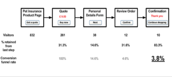
Figure 1 tells the following story.
On a business web site, a Pet Insurance product is described, and offered for purchase in the digital channel. Product information is displayed to the user on a single page, the ‘Pet Insurance Product Page’, shown in Figure 1 top left. Analytics data reveals that on a single day, this product page had 832 unique visitors. The page holds an important primary Call to Action, ’Get a quote’.
When the user clicks the ‘Get a quote’ button, on the product page, they are taken to a ‘Quote’ page. Accurate quotations require a number of pieces of information to be elicited from the prospective customer, so on the Quote page radio buttons and drop‐down choice controls enable the pet (to be insured) to be described. A dynamic quote is thereby generated within the page, based on the user’s actions. Here, a quote of £9.00 results, and once a well‐formed quotation is generated and displayed, a ‘Buy now’ button is offered to the user. Analytics show 261 users, of the 832 users who visited the product page, progressed to see the Quote page. That is 31.3% retention of interest in the product. This group, of 261 users who click on the ‘Get a Quote’ button, may be considered by the business to be a target group of ‘warm prospects’, users judged as having a genuine interested in the product, and are ready to act within the digital channel. Of the 571 visitors to the product page that didn’t seek a quote, some may have been conducting research, and then progressed an order via a Call Centre channel, or approached a shop branch or broker channel. The digital channel may still be serving important user needs even when action within the channel is not evident.
If the prospective customer then clicks the ‘Buy now’ button on the Quote page, having considered the quote, they are taken to a ‘Personal details’ form, where contact and financial details are captured. A ‘Next’ button then progresses the user onto a ‘Review Order’ page, and a ‘Confirm’ button will generate an Order Confirmation page. In theory, everybody who sees the Order Confirmation page is a customer of the business, as they have bought the product via the digital channel. The Order Confirmation page is therefore the end of a transaction process, and cannot be found and visited via the navigation, or passed as a URL within an email.
Analytics data show, across these pages, a gradual drop‐off in visitor numbers as prospective customers ‘bounce’ out of this journey to purchase the product, maybe via bookmarks or by closing the window. It can be seen that only 10 users saw the Confirmation page on the day in question, 10 prospective customers became actual customers of the business. Tabulated below the analytics data for page visits are percentage statistics that reflect the volume of visitors retained by the digital channel, from preceding steps. Only 14.6% percent of people who sought a quote, elected to then ‘Buy now’, and of this elite group, two thirds were then lost during form filling.
Finally, a conversion funnel has been set up from the Quote page through to the Confirmation page. If the 261 visitors to the ‘Quote’ page are considered a target group for purchasing (the warm prospects), and only 10 of that group of prospective customers actually became customers (the ones that saw the Confirmation page), the businesses digital channel has a 3.8% conversion rate for this product.
4. Information architecture and the conversion funnel sketch
Now, information architects design the pages that are reflected in such statistical analyses of the web site, and web site analytics reflect a limited ‘glimpse’ of a web site design’s ‘performance’. Where a business has sales targets for the digital channel, it is possible that the current volume level of 10 product sales per day is insufficient to justify the expense of the channel, and uplift is needed to 20 sales per day, for the achievement of business benefit in offering the channel to prospective customers. In this case, of the 261 visitors to the Quote page, changes need to be made to the digital channel (web site) and/or sales process, so that a 7.6% conversion rate is attained (20 confirmation pages are seen from the 261 who saw the Quote page). This may be possible without changing the website significantly. A ‘5% off’ offer could be given to the user. Alternatively, theories may be created about how the Quote page could be improved, to get more people through to click ‘Buy now’ and start filling the Personal Details Form. Instructional text may be insufficient to reassure the user how easy the process will be, or ‘Buy now’ buttons may be out of sight and require scrolling. The business, in conjunction with the information architect, may thereby seek to redesign parts of the site to achieve improved conversion rates and sales volume uplift. Alternatively, the business, in conjunction with digital marketers, may place an increasing number of banner adverts on partner sites, to drive twice the volume of users to the product page, and thereby mine the existing statistical patterns through the conversion funnel to reach the same end result, 20 target sales for the channel. This paper is concerned with the former.
Drawing on conversion funnel data, the web site is thereby changed, maybe with clearer instructional text and two ‘Buy now’ buttons, one at the top and one at the bottom of the page. The changed site is then measured, in a similar manner to the first design, and over time a comparative conversion funnel is generated. While a method of applied science would appear to be being employed, the difference between two (measured) digital experiences may be a great number of site alterations, each alteration reflecting a hypothesis, with many parties within the business generating hypotheses and requesting changes. If uplift is attained, it may be hard to know which alteration was most effective; but then all the business wants is uplift, not the practice of a purely scientific approach.
To compliment multiple design changes to pages, it is possible to conduct ‘split’ testing, or AB testing, on page elements such as button designs, labelling, font size, imagery and so forth. In this case, two buttons may be designed, one saying ‘Buy now’, and another saying ‘Join us’, and placed in the page in equal measure until a statistical difference in usage is detected. Then, one design may prevail as being more effective, and so testing single hypotheses can also be undertaken. An image of a sick animal may be more effective at driving people to ‘buy’ pet insurance than an image of a happy customer. The page ‘design specifications’ that support the conversion funnel can in this way be tweaked and thereby optimised to meet business goals. The cost of changing the digital channel’s user experience needs to be weighed against incremental gains, through better conversion rates.
Earlier, when the conversion funnel was sketched, the claim that web analytics can ‘optimise’ a web site was touched upon. Web site analytics does appear to support web site optimisation, but optimisation is about more than measuring aggregated and individual click paths. Optimisation has a second component that has been mentioned here, design specifications. Behind the aggregated statistics are designed pages that form the user’s experience. To optimise the pages, in line with business targets, design specifications are required, and specifically ‘designs for performance’. Designed changes need to attain targets, and address unnecessary user problems getting through the funnel. The user can at any point leave the funnel simply by clicking away on a bookmark. If the prospective customer is to be converted into a business customer in the digital channel, but are confused by what is being viewed during the purchasing journey, such confusions need to be removed from the design. A specification for a design solution is needed, to compliment the design problems uncovered by the web site analytics. Together, analytics and design specifications support web site optimisation.
5. Cognitive engineering and design problems
The above picture of commercial design practice takes in many individuals, disciplines and concerns; and so the design process needs guidance, in how to structure the way in which the root design problem of digital channel ‘performance’ is conceived, and thereby approached in the design process. In this regard, the paper asserts that the sketch provided, of the conversion funnel, can be best understood in terms of a design problem of cognitive engineering. A conception of cognitive engineering as ‘design for performance’ (Dowell & Long, 1998 [1]) will be used to re‐express the problem of conversion funnel design, in a manner suitable to the engineering context of ‘optimisation’ that exists around it, in all but name.
The digital channel to prospective customers is one channel of many, but all channels can be conceived of in terms of Ergonomics, in that all channels will involve to a greater or lesser extent, humans interacting with devices to perform effective work (Dowell & Long, 1989 [2]; Long, 1987 [3]). Where businesses offer common services across multiple channels, the humans in question (prospective customers) interact with functionally equivalent devices to perform the same ‘work’, such as product purchase. Web sites offer ‘electronic form’ devices to the user. Direct mail channels offer paper‐based form devices, pre‐paid envelope devices, and sometimes even pens. Via different channels a common range of products can be purchased. To the prospective customer, the work is the same – generating an order; but with different devices, levels of performance may widely differ. Dowell and Long conceive of performance as having two inseparable components, ‘Task Quality’ and ‘User Costs’. Quality here refers to how well formed the order is, by interacting with the devices that the business offers (via the channel). The static and standardised images of a paper‐based catalogue may generate more returned products to a business than a web site that offers zooming, panning, and a library of product photographs from different angles. When the order is fulfilled, users of the digital channel may be more likely to be delighted with their purchase, than a user who was unable to determine aspects of the product until closer inspection was possible. The quality of the user’s work varies across channels. Associated with work of a given quality are costs to the user. These may be most simply conceived of as time and effort, or may be more refined and make reference to costs of mental and physical human behaviours (e.g. training), plus device costs such as load on a server of posting back information to that server, after every click. In our retail example, the time cost of waiting for the postal delivery of a paper‐based order form (back to the business in the direct mail channel) may be removed by using the digital channel’s electronic form. Going to a branch to buy the product may involve the prospective customer incurring greater costs (time, effort, financial), but generate the highest quality of work. There again, a lack of stock at a local branch may lead to the work being left undone when this channel is chosen, with other consequent costs to the user, of performing work of zero quality, such as frustration. When looking at digital channel performance, it is therefore helpful to look at performance in these terms, quality of work done at some cost.
In this retail example, the similar work undertaken across different channels may be abstractly conceived of as one whereby ‘ownership’ of an object or objects, is transferred from the seller to the buyer, along with the physical location or evidence of ownership. A lamp appears in your living room, or a policy number is sent to you via post. In each case, the prospective customer interacts with devices, provided by the seller, to ensure this work is performed effectively. Dowell & Long call the human interacting with the channel’s devices the ‘worksystem’. The worksystem incurs costs as its contribution to the expression of work performance.
Worksystem design for the digital channel needs to be similarly conceived. The product browsing experience needs to be simple and informative, the route to the checkout needs to be self evident, and product selection supported by devices such as ‘baskets’, with clear means of action (‘Add to Basket’ buttons) and action reversal (‘Remove’ buttons). A shopping checkout experience that looses 96% of customers that approach it, with something in their basket, thereby becomes a very interesting and commercially valuable design concern. Channel performance needs to be improved, but can that improvement be brought about by increasing the likelihood of higher quality work being done, at a lower cost of time and effort to the worksystem? It is suggested here that this is a helpful way to think about structuring the root design problem of the digital channel, performance. Generating uplift in the digital channel through redesign of web pages is a problem of cognitive engineering.
Dowell and Long’s conception mirrors the behaviours of worksystem, with an abstract place, entitled the ‘domain’ which is comprised of domain ‘objects’. In retail domains, the objects may be modelled in a variety of ways; what is important to the conception is that each behaviour of the worksystem is understood in terms of progressing some desired transformation of a domain object on its way to a final state whereby the work is accomplished. In a retail domain, ownership of a domain object is transferred. One simple model of such a domain may be in terms of transforming ‘order’ objects from a state of ‘empty and unfulfillable’ (no object in a shopping basket) through to ‘valid and unfulfillable’ (something in the shopping basket that can be purchased), and then on through the conversion funnel to a domain object (target) state of ‘valid and fulfillable’ (all personal, financial, and logistical details known to pay for and deliver the object to the new owner in return for the cash value). Until ‘Terms and Conditions’ are accepted for example, a valid order is unfulfillable, as the prospective customer has not yet accepted the ‘conditions of business’, for scenarios such as theft in transit. Such business logic pervades the digital channel, and yet is not a necessary part of the ‘work’ carried out by worksystems in the branch (shop) channel, where responsibility for safe transport is undertaken by the consumer once they have left the shop, with a well manufactured bag supplied by the business. The conception of a cognitive engineering design problem therefore ties worksystem behaviour into a view of how that behaviour is transforming the domain object into its target state – accomplishing effective work. Task quality is used to measure the work done in the domain, and so the measurement of worksystem performance has a second element, inseparable from worksystem costs. Costs cannot be truly understood unless we know what work they were incurred ‘doing’.
Engineering ‘design problems’ then arise when desired levels of worksystem performance are poorly aligned (do not match) with levels of cost and quality desired by the business (digital channel provider). At such a point, after desired performance is known and expressed, and actual performance known and expressed, and poor alignment is thereby expressible, cognitive engineering design processes can be undertaken, as they can be grounded in worksystem performance measurement.
The cognitive engineering design processes that are broadly employed when solving performance‐ oriented design problems are ‘diagnosis’ and ‘prescription’. The business, at minimum, will have expectations that a digital channel will generate, across all its ‘valid and fulfillable’ orders, a level of profit. If this level of profit is being attained, but the business has unusually high levels of returned goods, and subsequent re‐funds, a place to start diagnosis might be on the ‘browse’ and ‘add to basket’ experience. Are product sizes well displayed? Do prospective customers know what they are adding to the basket? Alternatively, profit may be visible in the value of total order objects that progress from ‘empty and unfulfillable’ to ‘valid and unfulfillable’, but enormous numbers of prospective orders may be abandoned in the Conversion Funnel, maybe at the Terms and Conditions step. Diagnosis in this case may start by looking at the Worksystem at this point in the retail experience.
The cognitive engineering process of diagnosis will draw on as much Business Intelligence data as is available, about worksystem behaviour, to establish a plausible theory about why the performance data indicates a design problem exists. Prescription, then involves specifying a design solution, one that will alter the performance data, bring about ‘uplift’, and align the businesses desired level of performance with actual levels. Cognitive engineering, by separating worksystem from domain, modelling worksystem behaviours as separate from domain object transformations, and measuring worksystem costs alongside work quality, offers digital channel designers a valuable means of structuring how the root design problem of performance is conceived (Dowell & Long, 1998) [1].
6. Performance measurement
Dowell & Long’s conception of the cognitive engineering design problem is not alone, in trying to outline basic fundamental components that make up an engineering discipline of ‘cognitive design’. It has however been chosen, because of its emphasis, less on ‘cognitive behaviour’ leading the design process, as much as deficiency in ‘performance’, and then re‐specifying the worksystem, and most importantly the human ‘cognitive’ component (that leads to the creation of business ‘customers’), as a means to address a design solution to the problem. The user’s cognition drives their action, which thereby progresses them through the conversion funnel. A button may be rendered larger, and brighter, to capture a customer’s mental process of ‘attention’ (Long & Baddeley, 1984 [4]), a clear table may support ‘reasoning’ about a choice (Buckley & Long, 1990 [5]), and thereby encourage the desired user ‘click’ (behaviour), that will improve performance data towards the businesses desired performance levels, and turn problem into solution (alignment).
By attributing a measurement of cost and quality to an expression of performance, and the concepts of ‘desired’ and ‘actual’ levels of performance to assist in the framing of a ‘design problem’, cognitive engineers have a number of places to start the diagnosis process.
Firstly, the business needs to be able to express desired performance. This will likely be in aggregate terms, and largely reference task quality, especially the number of occasions the worksystem generated ‘valid and fulfillable’ orders, and the total value of those orders, against some measurement of cost (expense), in supporting the digital channel to the consumer. Performance is also likely to make reference to the missed opportunity in terms of low task quality and high user costs. Orders abandoned in the conversion funnel (‘work’ left undone in the domain), time to progress through the conversion funnel at each step, complaints and customer satisfaction ratings (worksystem costs). It is in measuring actual performance via such criteria that web site analytics, and wider Business Intelligence, provides the cognitive engineer with a valuable toolset for performance measurement and thereby design problem diagnosis.
While the engineering approach relies on the business to express ‘desired performance’, once this is expressed, means are required for measuring the actual performance, and so by: tagging pages across the site; modelling user journeys and paths across the site; measuring the time spent on each page; and comparing this to the value of the basket at each step; measurements of actual performance (of individual prospective customers) can be aggregated into summary statistics. These summary statistics are models of performance that support diagnosis, diagnosis of points in the journey where performance starts to deteriorate, against the performance which is desired. Diagnosis may start from pages where performance deteriorated beyond repair, instances where prospective customers were lost from the funnel (and wider site) completely – they ‘bounced’ away, or pages where time spent before advancement appeared unusually long, as hesitancy and uncertainty sets in. Web site analytics can provide granular and aggregated data to support the cognitive engineer in diagnosis, and reasoning about why the performance data are as measured, and indicative of the origins of a plausible design problem; the design problem under consideration.
In contrast to scientific hypotheses, that are part of a scientific method to generate scientific knowledge that supports better ‘explanation and prediction’; cognitive engineering needs to develop a set of diagnoses that when addressed during the cognitive engineering process of ‘prescription’ (specification), will improve and align the Worksystem’s performance data so that it better matches the businesses desired level of performance. If uplift is not possible, the digital channel may disappear as a candidate user experience choice for prospective customers, when interacting with the business.
Diagnosis therefore needs to go beyond an approach of applied science, and instead to look at the user’s journey to a point where performance deteriorates, as well as the page where deterioration is most marked. Theories need to be generated by the cognitive engineer that draw upon all the disciplines that support cognitive design (attention, reasoning, vision), to explain the performance (design) problem. The abandonment of a basket at the page before confirmation may have little to do with a problem with the order summary page itself. Quite the opposite is possible when the user’s journey is examined. The order summary page may reveal the true transportation expense of the ‘valid and fulfillable’ order, expenses that if known earlier would have resulted in fewer prospective customers abandoning their order at such a late stage. Diagnoses need to consider the customer’s journey, and the mental events that the pages support, such as ‘true order cost realisation’. Prescriptions will then follow, in the form of design specifications that address the diagnosis and thereby solve the design problem.
7. The Conversion Funnel design revisited
Business Intelligence for the digital channel is taking many forms, and introducing many new issues around not only consumer privacy, but also around the limits of what can be inferred about consumers from their digital footprints (Baker, 2008 [6]). As many interests compete for influence over the user experience through the conversion funnel, a framework is required to structure the design process so that interests are weighted appropriately. The business owns the channel to its prospective customers, and once it has decided on the key objectives for that channel, it will inevitably set performance targets for the channel. Technologies are evolving to subsequently service the businesses interest in digital channel performance measurement, and it is important to understand the strengths and limitations of the ‘glimpse’ of customer cognition that statistical models provide, something Guy Debord would call ‘the spectacle’, and how we design based on these impoverished representations of the consumer’s reality (Debord, 1967 [7]). In this paper, Dowell & Long’s (1998) conception of the cognitive engineering design problem has been used to bring some order to these competing interests; and better understand what contribution different parties are making to the primary business objective of digital channel performance. Click paths and conversion rates represent aggregations of humans interacting with computers to perform work, and their greatest contribution to the primary business objective is to measure performance, and provide the cognitive engineer with diagnostic inputs, and evidence a re‐designed conversion funnel really is the design solution the business is looking for. To compliment measures of quality and cost, the cognitive engineer needs to tie a digital experience in the digital channel (prospective customers interacting with digital devices), to a domain where work is done, and business targets are attained. This design process will then draw upon models of cognition. Cognitive ‘engineering’ of a design solution is thereby grounded in performance, at the start (diagnosis) and end (prescription) of each design cycle. It is because this is increasingly how the digital channel is being designed, that Dowell & Long’s conception has been chosen. Cognitive engineering in practice, is about designing devices that support cognition, which supports action, which transforms domain objects to accomplish work, of a quality and at a cost. The interests of the cognitive engineer and the business are thereby aligned, by a common interest in channel performance.
8. References
[1] Dowell, J., Long, J. B., 1998. Conception of the cognitive engineering design problem. Ergonomics 41 (2), 126‐139. [2] Dowell, J., Long, J. B., 1989. Towards a conception of an engineering discipline of human factors. Ergonomics, 32 (11), 1513‐1535. [3] Long, J.B., 1987. Cognitive Ergonomics and Human Computer Interaction. In: Warr, P., (Ed.) Psychology at Work. Penguin, Harmondsworth. [4] Long, J. B., Baddeley, A., (Eds.). 1984. Attention and Performance IX (International Symposium on Attention and Performance). Lawrence Erlbaum. [5] Buckley, P., Long, J. B., 1990. Using videotext for shopping – a qualitative analysis. Behaviour & Information Technology, 9 ( 9), 47‐61. [6] Baker, S., 2008. The Numerati. Jonathan Cape, London. [7] Debord, G., 2004. Society of the Spectacle. Rebel Press. [7] Debord, G., 2004. Society of the Spectacle. Rebel Press.