MUSE(SE)
MUSE for Software Engineers
Introduction to the PaperMUSE is a Method for Usability Engineering. It seeks to integrate usability into the development of interactive systems. It provides an environment in which human factors contributions can realise their full potential. (Lim and Long, 1994 – Cambridge University Press: Cambridge). MUSE comprises three phases: 1. Elicitation and Analysis; 2. Synthesis; and 3. Design Specification. MUSE is intended for application by human factors engineers. MUSE (SE), the version presented here, is intended for application by software engineers. It contains guidance, for example, concerning why and how to perform task analysis, as well as how to apply heuristics, with both of which human factors engineers would be assumed already familiar. The version of MUSE(SE) presented here was used to evaluate the method against target users. Hence, the specific, testing format.
The extension of MUSE to MUSE(SE) is an example of researchers building on eachother’s work. MUSE(SE) extends the target user group from human factors engineers to software engineers. The extension involves considerable additional content for MUSE both at the medium and low levels of detail.
Note that although MUSE began life as a specific method, as it is developed further, as in the case of MUSE(SE), it becomes a de facto ‘framework’. The ‘framework’ comprises the common elements of the MUSE extensions – so, a Method for Usability Engineering indeed. It is thus consistent with the general goal of this website, which is to help HCI researchers to build on eachother’s work.
James Middlemass and John Long, Ergonomics and HCI Unit, University College London
Introduction to James Middlemass
James Middlemass was an MSc student at UCL in the class of 1992/3 and a Research Fellow on European Systems and Software Initiative project 10290, ‘Benefits of Integrating Usability and Software Engineering Methods’. His subsequent work on integrating design knowledge into the MUSE/SE Method led to the version presented here.
His subsequent career includes the following:
2000-2005 – Senior Business Manager at T-Mobile UK
2005-2010 – Senior Solutions Delivery Manager at T-Mobile
2010-Present – Principal Solutions Delivery Manager at Everything Everywhere Ltd.
Thank you for taking part in the trial application of MUSE(SE).
As the trial is part of a research project, it is important that you follow the procedures as closely as possible.
Please feel free to write on the procedures. Write a note next to any procedures that you find problematic; any comments you want to make whilst following the method, whether positive or negative, will be particularly valuable.
When the application is complete, your comments will be a valuable aspect of the evaluation, and will be used as an input towards future improvements to the method.
If you require help or advice on the method at any point during the test application, please feel free to contact me:
Phone: 0171 504 5316
Fax: 0171 580 1100
Email: j.middlemass@ucl.ac.uk
Contents
Introduction to MUSE(SE) 6
Notations used in MUSE(SE) 9
MUSE(SE) Procedures 12
Introduction 12
Phase 1 14
Extant Systems Analysis Stage 15
Examine Documents 16
Examine systems 17
Familiarise investigator with the system 18
Interview user representatives 20
Record findings 22
Construct ‘typical’ tasks 23
Study the systems 24
Decompose tasks 26
Identify usability requirements 26
OMT Cross-Checking Point 26
GTM stage 28
Generifying tasks 28
GTM Heuristics 30
Generification 32
Preparing GTM(y) 32
Preparing GTM(x) 33
Verify models 33
Phase 2 35
SUN stage 36
Document user problems 36
OMT Cross-Checking Point 39
DoDD(y) stage 41
Production of the DoDD(y) 42
Production of the user object model 43
OMT Cross-Checking Point 47
CTM(y) stage 49
Decompose task 49
Task Synthesis 50
CTM(y) supporting table 50
Allocation of function 51
Verify model 51
CTM Heuristics 52
OMT Cross-Checking Point 53
System and User Task Model 55
Decomposition of the CTM(y) 55
Assessing the design 56
Refering back to SUN and DoDD(y) 57
Completing the STM table 57
Document functionality 58
Handshake with SE 58
Phase 3 60
ITM(y) stage 61
Reviewing the STM(y) 61
H-C leaves 61
Referring to the DoDD(y) 62
H leaves 62
ITM diagram and table 63
Iterating the design 63
Locating screen boundaries 64
OMT Cross-Checking Point 66
ITM heuristics 67
Display Design stage 70
Defining screen layouts 71
Specifying IM(y)s 72
Dictionary of Screen Objects 72
Window management and errors 73
The DITaSAD 74
Display Design Stage Heuristics 75
Design Evaluation stage 79
Analytic evaluation 79
Empirical evaluation 80
Deciding where to redesign 84
Finalise documentation 84
Iteration Heuristics 86
Example 89
Extant Systems Analysis Stage 90
Statement of requirements 90
Examining the systems 91
Observational studies 92
Interviewing user representatives 96
‘Mind maps’ from interviews 97
TD(ext) products 98
TD supporting table 100
Tasks for test subjects 101
Usability Testing 102
Extract from the Ravden and Johnson Checklist 103
Choosing related systems 104
TD(ext) example: Finder 105
Identifying usability requirements 106
GTM stage 106
GTM(ext) for Finder 106
GTM(ext) for ResEdit 106
GTM(ext) for Microsoft Internet Explorer 107
GTM(ext) for NetScape Navigator 107
GTM(y) 108
GTM(x) 109
SUN stage 110
Statement of User Needs 110
DoDD(y) stage 113
DoDD(y) 113
User object model 114
Action – Object Matrix 114
CTM(y) stage 115
Composite Task Model 116
CTM Table 117
SUTaM stage 118
Extract from the STM 118
STM table 119
ITM(y) stage 120
Extract from the ITM 120
Decomposing the STM 121
ITM Table 122
Determining screen boundaries 123
Display Design stage 125
Pictorial screen layouts 125
Dictionary of Screen Objects 126
Dialog and Error Message Table 127
Extract from the DITaSAD 127
Design Evaluation stage 128
Analytic evaluation 128
Empirical evaluation 128
Paper prototyping 129
Impact analysis 132
Rank ordering problems 133
Using iteration heuristics 133
Reviewing PLUME categories 134
The Ravden & Johnson Evaluation Checklist 135
Blank Tables 154
Task Description Table 155
Generalised Task Model Supporting Table 156
Statement of User Needs 157
DoDD(y) Supporting Table 163
Composite Task Model Supporting Table 164
System and User Task Model Supporting Table 165
Interaction Task Model Supporting Table 166
Dialog and Error Message Table 167
Dictionary of Screen Objects Table 168
Introduction to MUSE(SE)
MUSE is a structured method for usability engineering. The method was developed to address the problem of Human Factors inputs to software design being ‘too-little-too-late’, where the input is mainly advice instead of specifications, and arrives too late in the process to be implemented. MUSE(SE) is an enhanced version of MUSE, intended for use by software engineers. Not only does it contain most of the knowledge needed to design effective user interfaces, it also contains procedures for checking the evolving design against the software engineering specifications. Although a certain amount of time must be devoted to MUSE(SE) during the early stages of a project, the benefits should justify the investment; the system should require fewer design iterations due to the user requirements being more clearly understood and the user interface having a better relationship to the requirements.
Many current Human Factors (HF) contributions to design are limited to a stage of design where the product developed by Software Engineers is available for usability assessment. Unhappily, this stage of design is one at which changes to the product may be prohibitively expensive. MUSE addresses this problem by specifying the user interface design process and the points at which HF and SE designs should be checked against each other.
The design of the user interface is approached ‘top-down’ based on information derived ‘bottom-up’. Design progresses in defined stages from specification of general features of the tasks to be performed (derived from analysis of the User Requirements and any existing systems) to specification of the specific details of the user interface to be implemented. The user of the method is provided with the techniques to apply at each stage, and any checklists or guidelines required by the method. Points at which certain features of the MUSE and SE design products should be cross-checked to ensure that the functionality specified in the software engineering design is compatible with that required by the user interface design is specified. Thus, the likelihood that the user interface under development will be implementable and provide the appropriate functionality to support the user’s task is maximised.
The diagram on the following page shows a schematic view of the MUSE method. A brief description of the method follows, outlining the three main phases of the method and the main products produced.

The first phase of the method is called the Information Elicitation and Analysis Phase. It involves collecting and analysing information intended to inform later design activities, and consists of two stages, the Extant Systems Analysis stage and the Generalised Task Model stage. During the Extant Systems Analysis stage background design information is collected that relates both to the system currently in use and to other systems that are related in some way, for example by having a similar task domain. The information concerns the users of the systems, the devices used and the tasks performed. The objective is to identify those features of the systems that are problematic for users, or that may provide good ideas suitable for re-use in the target system. During the Generalised Task Model stage, a device independent task model of the existing systems (GTM(x)) is generated using the task descriptions from the previous stage, and this is used in conjunction with the Statement of Requirements to produce a Generalised Task Model for the system to be designed (GTM(y)).
The second phase of MUSE , the design synthesis phase, begins by establishing the human factors requirements of the design, in terms of performance criteria, likely user problems or required task support, and these are recorded in the Statement of User Needs (SUN(y)). The semantics of the application domain as it relates to the worksystem are also analysed in this stage, and are recorded as a semantic network called the Domain of Design Discourse, or DoDD(y). The Composite Task Model (CTM) stage expresses the conceptual design of the target system, and is produced using the GTM(x) and the GTM(y). The process is informed by the SUN(y) and the DoDD(y) produced in the previous stage. The resulting design is checked against that of the software engineering stream, to ensure that the correct functionality will be provided. The conceptual design addresses error-free task performance only, in order to avoid obscuring the overall structure of the task.
During the System and User Task Model stage, the Composite Task Model is decomposed to separate the subtasks that are to be performed using the system under development from those that are performed using other devices. The subtasks performed using the ‘target’ system are represented in the System Task Model, while the remaining (‘off-line’) tasks are represented in the User Task Model. Within the STM, allocation of function between user and computer is performed, and represented by designating actions as belonging to either ‘H’ (the user) or ‘C’ (the computer).
The final phase of MUSE is termed the Design Specification phase, and develops the conceptual design further to arrive at a device-specific implementable specification which includes error-recovery procedures. In the Interaction Task Model stage, the leaves of the STM representing user (‘H’) actions are decomposed further to produce a device-level specification of the interaction. This specification is mainly informed by the selected User Interface Environment, but the SUN(y) and DoDD(y) may also be used to further inform design decisions. The ITM(y) is annotated to indicate the locations of intended major screen transitions, which in practice are generally the boundaries of individual sub-tasks. During the Interface Model stage, the leaves of the STM(y) representing computer (‘C’) actions are decomposed to produce a set of Interface Models. These are detailed descriptions of the behaviours exhibited by screen objects, and the conditions that trigger them. In the Display Design stage, a set of Pictorial Screen Layouts (PSL(y)) are defined to correspond with the screen boundaries identified in the ITM(y). The interface objects that make up the screens are described in the Dictionary of Screen Objects (DSO(y)). A further product called the Display and Inter-Task Screen Actuation Diagram is produced, and details the conditions under which screen transitions may occur together with the conditions that would trigger the presentation of an error message. The error messages and dialogues are listed in the Dialogue and Error Message Table (DET).
Notations used in MUSE(SE)
The main notation used by MUSE(SE) is Jackson Structure Diagram Notation (SDN). Some other notations are used during domain modelling, but these will be described in the course of the procedures.
SDN is a hierarchical notation used in MUSE(SE) for representing the structure of tasks and the behaviour of user interfaces. A supporting table is usually generated for each SDN diagram to provide additional detail; the recommended format of the table for each product will be given at the appropriate point in the procedures.
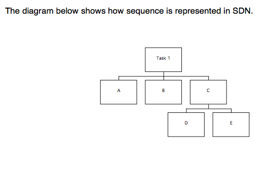
Task 1 consists of a sequence of A, B, and C. C consists of a sequence D, E. Task 1 is therefore a sequence A, B, D, E.

Task 2 also consists of a sequence A, B, C. However, C consists of a selection over D and E (indicated by the ‘o’; D and E describe the actions, but could be used to describe conditions with the ). Task 2 therefore consists of either A, B, D, or A, B, E.
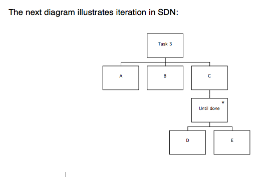
Once again, the task consists of a sequence A, B, C. C consists of an iteration of D and E (indicated by the ‘*’), which is repeated until the user is ready to stop. Task 3 consists of a sequence such as A, B, D, E, D, E, D, E.
Finally, combinations of constructs can be used to represent more complicated behaviours. The most useful of these is lax ordering, where parts of a task can be completed in any order.
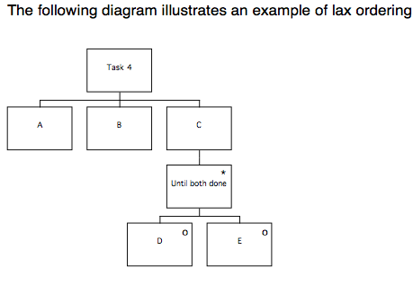
Task 4 consists of a sequence A, B, C, as before. This time, C consists of an iteration over a selection between D and E. Depending on the conditions applicable to the iteration and selection, this construct can represent an instance where neither D or E are performed, either of D or E is performed one or more times, or a sequence D, E or E, D is performed one or more times. In the case of Task 4, the sequence of events could be any of A B E D, A B E E D, or A B D E, because the condition on the iteration is ‘until both done’.
Note: MUSE(SE) uses SDN in a fairly informal manner to describe behaviours of the user. As a result, diagrams can sometimes contain ambiguities, and this is one reason why it is important that supporting tables are used to provide additional information about the diagrams.
MUSE(SE) Procedures
Introduction
The next section of this document describes the procedures for MUSE(SE). Before you start, you should understand how to draw the SDN diagrams used in MUSE(SE), and you should have a basic understanding of the purpose of each of the MUSE products. Refer to the example after the procedures if you need to see what a product should look like.
Each section of the document contains a summary of the procedures for a phase or stage of MUSE(SE), followed by the detailed procedures. Some stages are provided with a set of heuristics, or ‘rules of thumb’ after the procedures; these have been selected because they offer guidance that may be relevant at that point in the method. Several of the heuristics are included more than once; this is because they are relevant at more than one point in the method.
Within the detailed procedures, procedures in bold are described in more detail afterwards; where this involves several steps to be followed, they are listed either as bullet points or as sub-procedures, e.g. 1a, 1b, etc. Procedures in plain text are not described further, but may be followed by commentary.
Every so often there is an ‘OMT cross-checking point’. If you are working in a team, then you should arrange to meet with the person responsible for the OMT products at these points to compare designs. If you are working on your own, then you should update your OMT products at these points, using the cross-checking procedures to indicate the MUSE(SE) products that should be used to inform the development of the OMT products[1]. If it turns out that it isn’t possible to make the OMT products agree with the MUSE(SE) products, the cross-checking procedures can be used to determine which MUSE(SE) products will need to be amended.
Where you see a note like this, in square brackets:
[Refer to xxx]…it means you have to refer to another document, which will be included at the back of the procedures. Note that proformas for all of the tables required by the method are also included at the back of the procedures so that they can be photocopied and used for making handwritten notes during the design process. Do not be tempted to omit completion of the tables supporting each product. The tables are at least as important to the design process as the diagrams, because they contain the design rationale.
Every so often there is a table like the one below for you to rate the procedures you have just followed. If a particular procedure causes difficulty, please make a note of it so that you remember to record it in the comments section of the table. (Documents referred to in the square bracketed comments should be treated as part of the procedures).
The table asks you to rate each section of the method according to how ‘coherent’ and ‘complete’ you found the procedures, and to rate the extent to which the procedures ‘concerned what was desired’. You are also asked to record how long each stage took (in person hours, or days). Coherent refers to how understandable the procedures were; if they made little sense, then you would disagree with the statement that they were coherent, whereas if they were perfectly clear then you would agree. The completeness of the procedures refers to whether or not they seemed to miss anything out; you would disagree with the statement that they were complete if you had to work out what to do yourself because the procedures were insufficiently detailed, or if you had to refer to guidelines that weren’t mentioned in the method. The extent to which the procedures ‘concern what is desired’ refers to how relevant you felt they were to the MUSE design process; if the procedures were clear and detailed, but still didn’t enable you to produce the appropriate design product, then you would disagree that they concerned what was desired. The space at the bottom of the table is provided for your comments on your answers, or on other aspects of the stage.
| Example Rating table
Please rate the above procedures according to the extent they fit the descriptions in the left hand column
|
||||||||
| Agree strongly | Agree | Neutral | Disagree | Disagree Strongly | ||||
| Coherent (i.e. understandable) |
* | * | ||||||
| Complete
(i.e. there was nothing missing) |
* | * | ||||||
| Concerned what was desired
(i.e. did the procedures allow you to do what you were supposed to?) |
* | * | ||||||
|
Time taken:
|
Diagrams | Tables | Revision | Other (specify) | ||||
|
Further
|
* Please describe what the problem was |
|||||||
Phase 1
Information Elicitation and Analysis

MUSE(SE) Phase 1 Procedures: Extant Systems Analysis Stage
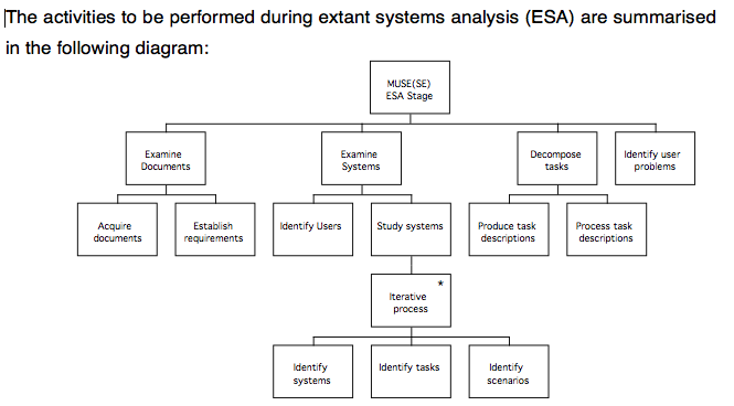
These steps involve applying some techniques to elicit the information, which are summarised below.
The detailed procedures on the following pages will describe how to carry out each of these steps:
- Examine Documents: Obtain the statement of requirements
Establish the requirements - Examine the systems: Identify Users
Identify Systems
Identify Tasks
Identify circumstances of use
2.1 Familiarise investigator with the system to find out how it works by: Observational studies
Task execution
2.2 Interview user representatives to obtain problems and task objects using:
Card sorting
Structured interviews
2.3 Record findings of 2.1 as preliminary TD products, and separate those of 2.2 into problems and domain information
2.4 Construct ‘typical’ tasks for use during testing.
2.5 Study the systems using:
Informal / Observational studies / Usability tests
Concurrent verbal protocol
Task execution
PLUME, Guidelines and heuristics
Checklist
- Decompose tasks to: produce TD(ext)
process TD(ext) into GTM(ext - Identify usability requirements
Detailed procedures
The following paragraphs provide detailed procedures describing the information to be gathered during each of the steps in the analysis stage, and also describe how to record the information in the appropriate MUSE(SE) product for later reference.
It is recommended that you read the procedures through before performing them, so that you can plan each stage. It is assumed that a project plan has been produced; this should be consulted to obtain details of how quality control is to be addressed, and the number and scope of any planned design iterations. The effort allocated to each stage of the method should be noted so that it can be reflected in the detailed plans for each stage of the method. Access to users should be arranged as early as possible in the project, and a file should be opened to store the products of each stage of the method.
The procedures for steps 1 to 5 will now be discussed in detail.
- Examine Documents: Obtain the statement of requirements
Establish the requirements
The statement of requirements should be obtained, and reviewed in order to gain an understanding of what the target system will be required to do, in terms of the functionality that the system will have, and the types of tasks it will support. The requirements document will need to be consulted during the course of design, so it should be filed with the MUSE(SE) design documents for reference.
- Examine the systems: Identify Users
Identify Systems
Identify Tasks
Identify circumstances of use
Identifying the users
The following information concerning the users of the system should be obtained, by asking the ‘client’, by consulting user representatives, or by conducting a straw poll of users. If there are a number of different groups who will use the system, then the information should be collected for each group. If the user group is expected to contain a lot of variation within any or all of the categories, then you should make a note of this and attempt to estimate the most likely range of variation.
Number of users
Type of users
Experience level
Computer skills
Other systems used (now)
Education level
Tasks Performed using system
Age
Sex
Any other information that may be relevant should also be noted
Identifying the tasks
The following aspects of the task the system is intended to support should be noted:
Who does the task
Task goals
Frequency
Duration
How often errors occur, and how critical this is
What subtasks there are
Identifying the circumstances in which the system is used
An understanding should be gained of the circumstances surrounding use of the system; whether it is used once a week or every five minutes; whether using the system is considered enjoyable or a chore, and whether the users can choose whether or not to use the system. Any other observations of this kind should also be noted.
Use Pattern
Frequency of use
Motivation for use: what the system means to the users
Whether use is mandatory or discretionary
These preliminary notes should be treated as forming part of the statement of user needs, which will be constructed later in the method following detailed analysis.
2.1 Familiarise investigator with the system by:
Observational studies
Task execution
Select systems to examine based on the task that the target system is required to support. The current system is always selected, and similar systems can be selected as well if they appear likely to prove informative. (You might want to pick the related systems after examining the current system. Only the relevant parts of related systems are analysed, and only to the level of detail that is likely to be informative).
To determine which related systems should be examined, the Statement of Requirements should be examined. By considering the key characteristics of the system (i.e. what general type of system it is), together with any relevant constraints, it should be possible to produce a list of systems which have something in common with it from the user’s point of view. Systems that involve doing a similar sort of task, or which impose similar constraints on the user are the most likely to provide good design ideas.
Once you have a list of candidate systems, select which ones to examine bearing in mind the time available and the ease with which access can be arranged. It is suggested that at least three systems are chosen: the current system, the ‘next best’ system, or the closest available alternative, and a system where users do a similar task, but which either works well from the users point of view or presents similar problems (this might provide insight into the cause of the problems).
Following selection of systems, informally observe users performing the tasks to obtain information as follows:
The main tasks the users have to achieve
Whether these tasks have any subtasks
The main behaviours of the user and the computer when performing the tasks
How the behaviours are decomposed in relation to the tasks and over time
The work domain objects, their attributes, values, and properties (methods)
The investigator performs the task, to assess likely levels of:
User costs: How difficult the system is to learn, i.e. training requirements,
How much physical effort is needed to use the system, i.e. fatigue and physical effort involved
How much mental effort is needed to use the system, i.e. costs of mental fatigue, correcting errors, and time taken to perform task
Device costs Structural i.e. wear and tear on device, such as repetitive key operations
Resource costs i.e. processor use
(This evaluation of costs should be used to flag areas for later investigation, following greater familiarisation with the device. Resource costs incurred by the device are of relevance only in circumstances where they are likely to constrain the solution, for example where a very slow processor is being used or memory is severely limited).
Whilst performing the task and experimenting with the device, you should seek to understand the functionality and structure of the device. This is not necessarily equivalent to gaining knowledge of the structure of the task or the subtasks, because the device may not support the user’s task very well at all, and will frequently have surplus or inappropriate functionality. Whilst examining the user interface, try to identify the main objects that are presented to the user and what their properties appear to be. You will need these before you interview the users, so now would be a good time to read procedures for the following step (2.2).
Don’t attempt to construct TD products based solely on experimentation with the device, as this can lead to replicating the problems of the existing system in the new design. Information about the structure of the task obtained by this means must be regarded as unreliable until validated by observation of real users, but is nonetheless a very useful preliminary activity .
To continue the process of familiarising the investigator with the system before user testing commences, a small number of users should be interviewed:
2.2 Interview user representatives to obtain problems and task objects using: Card sorting
Structured interviews
The investigator interviews a small number of representative users (about 2 or 3 should be sufficient, or enough to get a cross section of the users if the user group is very varied). The objective of the interview is to obtain more information on the main tasks that are carried out using the system, and what the semantics of these tasks are (i.e. what the task involves, at a fairly high level – without going into the details of using the device, because this will be studied by direct observation). The investigator should also find out whether the users think that there are any problems with the task as it is currently performed. The investigator should then discuss the task with the users to discover the main objects that are transformed during the task, and any other entities involved; as well as finding out the attributes that get transformed, the properties of the objects and the rules concerning them should be elicited.
Cards are prepared for each of the objects identified during the initial familiarisation of the investigator with the system. Each card will contain the name of the object together with the attributes, values and properties (i.e. methods) previously identified; spare blank cards should be provided for new objects or relationships uncovered during the interview. The objects should have abstract attributes as well as physical (i.e. ‘safe’, ‘unsafe’, ‘urgent’, ‘done’ or ‘ready’). These cards are used during the interview to help elicit further information about the objects by correcting the descriptions, sorting the cards into groups, and naming or relating the groups with the extra cards provided; this is described in more detail on the next page. A whiteboard and some Post-It notes should be obtained before the interview starts.
The users are interviewed (with the system present) to obtain information on:
- The goals of the task in terms of the objects and attributes transformed
- The main IWS behaviours performed (i.e. task and semantic level behaviours)
- The user’s mental processes and representations
- Particular problems experienced
- The work domain objects, and their attributes, etc.
Arrange access to a number of users (ensure enough are interviewed to represent a good cross-section of the user group for the target system) so that you can interview them with the system present. Video or audio recording the interviews may help with later analysis, and it would be useful to have a whiteboard available.
- Begin by introducing yourself and telling them the purpose of the discussion. Let them know that they’re the expert on their job, and you’re designing a system to help them do it better, so you need their input. It’s important that they don’t feel you’re there to evaluate them and they realise it’s the system that’s under scrutiny. Say you’re interested in what their job involves (i.e. the main tasks), the entities that get modified by the task or that have a bearing on the tasks, the way they actually do their job, and where and how the current system supports the job; the idea is for them to help you to determine whether the new system would benefit from any modifications, or whether it should be like the old one. Explain that you’re going to draw a diagram to show the structure of their task, a list of good and bad features of the system, and a ‘mind-map’ diagram to illustrate the rules that they need to know to do the task and how they think about the properties of the ‘objects’ involved.
- Get them to describe briefly and in general terms the tasks that they do, which of them they use the system to support, and what the general goals of the tasks are. Make a list of the tasks, and note any potential objects they mention whilst they are speaking. Check if the tasks must be performed in any set order, and make a note of this. List the goals of the tasks.
- Sketch an initial task description diagram. The top node should describe the overall diagram, i.e. ‘Widget stock controller’s tasks’. The top row of the task model should consist of the main tasks that they mentioned, i.e. ‘Check stock levels’, ‘Establish widget requirements’, ‘Generate orders’, ‘Process a delivery’, ‘Notify accounts department’, ‘Update stock levels’. Make sure that the diagram reflects any constraints on the ordering of the tasks. Lead them through the diagram, explaining the notation, and ask them if it’s correct. If it isn’t, change it so it is. Now mark the tasks that they use the system to support, and ask them to show you how they would perform each task.
- Start a new diagram for each task, labelling it to agree with the corresponding node on the main diagram. Ask them to demonstrate the task bit by bit, so that you can start to decompose the task description, carrying the decomposition down to a level where the diagram would be sufficient to enable someone else to perform the task. As they go, ask them to point out where they find the task problematic; note the problems so that you can record them in the tables later on. Make a note of any new objects or attributes that are revealed whilst they demonstrate the task. Show them the task description, and ask them whether it describes the way they would normally do the task, and if it’s incomplete or incorrect in any way. Continue until the whole task is documented as a task description diagram.
- Write the name of each object and entity on the cards onto a Post-It, and stick the Post-Its to the white board. With the user’s help, arrange them on the whiteboard so that the relationships between them can be indicated by connecting lines, and annotate the diagram to indicate what the relationships are, as in an entity-relationship diagram. Continue until the user is happy that the diagram is complete and reflects their view of the task. (Remember that you’re trying to elicit the user’s view of the task domain at this point; you’re not trying to construct the software engineering object model (or even necessarily a ‘correct’ entity-relationship diagram), so it doesn’t matter if there are some objects that you won’t be implementing, some that will need to be decomposed further when the system design progresses, of if the relationships in the model are more like the methods of some of the objects. The attributes of the objects will probably inform the SE model, even if the objects themselves are differently organised, as will the ‘methods’).
- Copy the completed model onto paper so that you can refer to it later when the MUSE(SE) DoDD(y) is produced. Any additional attributes or methods discovered should be added to the appropriate card, and any new objects discovered should be recorded.
The interviewer should aim to find out whether the categories of information above are completely represented, perhaps by getting the users to think of exceptions that aren’t covered.
2.3 Record findings of 2.1 as preliminary TD(ext) products, and separate those of 2.2 into behaviours and domain information
The goals of the task are used with the information about behaviours gathered from the interview to form the top level of a preliminary TD(ext). The IWS behaviours and decomposition information from the observation and interview is added to complete the initial structured diagrams.
Use the task descriptions from the interviews to derive a single model for each system studied that describes the behaviour of the users observed, showing where choices exist or alternative orders can be used for performing the task. It may be possible to base this on the most complete model from the interviews conducted about each system; alternatively, you will need to build the model up based on several interviews.
A table like the one shown below should be prepared for each diagram, and any notes about the diagram entered into the cells. The tables can be referred to later in the design process, to avoid losing ideas or observations.
| Name | Description | Observation | Design Implication |
Speculation |
| Which cell is referred to | Further description as necessary | Any notes | Any implications, based on ESA work | Any design speculations occurring at this stage |
The information from the interview concerning the user mental behaviours is used to elaborate the appropriate points in the diagram. The information on mental representations from the interview should be filed for later inclusion into the DoDD(y). The information concerning costs from the task performance by the investigator can be used to prime collection of information during usability tests by suggesting particular things to look out for, as should the user problems discussed during the interview. Where differences existed in the order of task performance between individuals, this indicates that the task is lax ordered and the fact should be noted in the table and recorded in the SUN when it is produced later in the method. Using the TD(ext), it should be possible to follow the sequence of the contributing TDs; where it is not possible to do so, this must be noted in the table and recorded in the SUN when it is produced later in the method so that the Composite Task Model can be checked to ensure that the problem has not been ported along with the high level structure of a TD(ext).
2.4 Construct ‘typical’ tasks to be used during testing.
Information from the preliminary TD(ext) and the other procedures above is used to construct realistic examples of tasks for the users to perform whilst the investigator records them. The tasks can be used to obtain more information about potential user problems noted earlier, by designing them in such a way that the user is likely to encounter the problem as they do the task. The descriptions of the tasks should not dictate the manner of task execution, only the task to be achieved by the users and sufficient contextual information to give the task meaning. (For example: ‘You need to email a Word document to x, who works at y; you know they use a PC, but you’ve no idea what word processor they have’). Before using the tasks for testing, they should be checked with a user representative to ensure that they are realistic. As well as constructing sufficient tasks for current testing needs, some should be prepared ready for testing the design at the end of the method (if possible, use different tasks for testing now and at the end of the method; this will provide greater confidence that the design supports the full range of tasks, not just the instances that were studied in detail).
2.5 Study the systems using:
Informal / Observational studies / Usability tests
Concurrent verbal protocol
Task execution
PLUME, Guidelines and heuristics
More than one user should be studied for each system that is to be examined, whether related or current. You should make sure you have your preliminary task description for the relevant system available, and that a notepad is handy to write down any additional observations.
Recruit some typical users to use the system whilst you observe them. If possible, the session should be recorded on video (or at least audio tape, if a video camera is not available). Make sure the user understands that it is the system that is being evaluated and not them.
Provide each user with one of the descriptions of typical tasks that were generated in the previous step. Ask them to perform the task described as they usually would, but tell them that it’s not a test and you’ll help them if they get into difficulties; whilst they are doing the task, ask them provide a running commentary describing what they are thinking about and any assumptions they are making about the task or the system. You may find you need to remind the user to keep their commentary going from time to time, particularly if they start getting into difficulty. If they get into severe difficulties, it may be necessary to give them a hint, or even to stop the trial and discuss the problem.
Observe the users performing the task to uncover any mistakes or incompleteness in the TD(ext); where found, these should be noted. Video (or at least audio) recordings of the subjects should be made wherever possible, to support later analysis of interesting events or things that happened too quickly to be noted in real-time. New domain objects or attributes that are observed are also noted for the DoDD(y). User problems or errors noted during the test are noted, so that they can be investigated further in later trials, and recorded in the Statement of User Needs when it is constructed.
The verbal protocol is used to annotate the TD(ext) product with the mental processes of the user, as are the user problems, errors, and performance shortfalls. The notes made during observation of users should be written up in the tables for the TD(ext) product so that they will not be forgotten later in the design.
The notes gathered in this stage also form an input to the Statement of User Needs. As much as possible, group the problems according to which of the following categories they appear to concern most directly:
Productivity
Learnability
User satisfaction
Memorability
Errors
These categories are known as the PLUME categories, and will be revisited later in the method when the Statement of User Needs is produced.
Users’ mental representations (i.e. the notions they have about objects, their properties and the rules for manipulating them) should be noted for use during construction of the Domain of Design Discourse product (DoDD(y)).
[Obtain a copy of the Ravden and Johnson checklist, which is reproduced at the back of these procedures]Finally, the investigator uses the system once again, this time employing the Ravden and Johnson checklist. In addition, a styleguide and any relevant guidelines or heuristics may be used to assess the device, paying particular attention to areas where errors were noted under PLUME categories, with the goal of diagnosing the source of the problem. The information resulting from this is used to annotate the TD(ext), and filed ready for inclusion in SUN(y). If the user’s workstation is to be redesigned, it should be assessed against an appropriate set of guidelines such as those found in the US MIL-STD or the EC Directive; relevant findings from this assessment may be used to annotate the TD, and should be filed for inclusion in the SUN along with an assessment of any relevant user physical limitations, also derived from guidelines or standards.
Repeat procedures 2.1, 2.3, and 2.5 for any related systems identified.
- Decompose tasks to: produce TD(ext)
process TD(ext)
The information from the second set of observational studies (step 2.5) is used to complete the TD(ext), which should be constructed following the above procedures for the preliminary TD(ext) given in steps 2.2 and 2.3.
The TD(ext) table should now be completed further with the evaluation information on behaviours from the observational studies, and the information on mental processes gained in the interviews and from the card sorting and protocol activities. The tables are also annotated with information on the quality of task performance (i.e. how well the users were able to achieve the task) from the usability testing and domain objects from observation, interviews, and card sorting. The TD(ext) is then summarised and abstracted to a device independent level to form the GTM(ext); GTM(ext) production will be discussed as part of the GTM stage.
- Identify usability requirements
At this point, identification of the usability requirements can be performed, and acceptable levels for productivity, learnability, user satisfaction, memorability and errors should be decided. A means of determining the acceptability of these properties should be decided, and the they should be prioritised and recorded. The styleguide that the target design will be expected to follow should be selected at this stage, and this should be noted as one of the usability requirements.
OMT Cross-Checking Point:
Refer to the Use Cases and scenarios generated as part of the OMT process, and carry out the following checks, considering the models as a whole in both cases.
- Make sure that user and device actions (and device semantics) documented in the TD products are described correctly in the use cases and scenarios (to the extent that these are likely to remain unchanged in the new system; it’s more important that the models do not contradict each other rather than that they are identical).
- Make sure that domain objects and their attributes documented in the task descriptions are correctly described in the use cases and scenarios (to the extent that they are likely to remain unchanged in the new system), particularly where user inputs are concerned.
| ESA Rating table
Please rate the above procedures according to the extent they fit the descriptions in the left hand column
|
||||||||
| Agree strongly | Agree | Neutral | Disagree | Disagree Strongly | ||||
| Coherent (i.e. understandable) |
* | * | ||||||
| Complete
(i.e. there was nothing missing) |
* | * | ||||||
| Concerned what was desired
(i.e. did the procedures allow you to do what you were supposed to?) |
* | * | ||||||
|
Time taken:
|
Diagrams | Tables | Revision | Other (specify) | ||||
|
Further
|
* Please describe what the problem was |
|||||||
MUSE(SE) Phase 1 Procedures: GTM stage
Following Extant Systems analysis, the next stage of the method involves abstracting from the task models generated from each system studied (the TD(ext)s) to produce a device independent view of each system called a Generalised Task Model, or GTM(ext). These models are then combined to result in one that describes all the features of interest of the current systems, called the GTM(x). A similar model (GTM(y)) will be produced of the target system, based on the statement of requirements for the purposes of comparison. The following diagram summarises the stage.
Generifying tasks to produce GTM(ext)s
Generification involves raising the level of description of the tasks so that they are device independent and can be compared with each other more easily. A GTM(ext) represents the manner in which tasks are currently performed, so one GTM(ext) is required for each type of task studied (i.e. if related tasks were examined, each requires a GTM(ext)). Frequently, much of the work of producing a GTM(ext) involves summarising the lowest levels of description and making sure that terms are used consistently both within and between diagrams. Where this is made difficult by a large or complicated task description, the following procedures can be used:
- List out the objects and actions
- Eliminate redundant items (so each item is listed once)
- Group the terms that appear similar
- Name each group (the group names can be validated by showing them to users, or the users could help with the grouping process if this is convenient)
- Reconstruct the model, using the generic terms
- Validate the model by asking users if it is a description of the original task
Some rules of thumb to be borne in mind when preparing GTM(x) and GTM(y) are presented on the next two pages, followed by the procedures for production of the GTM(x) and GTM(y).
GTM Heuristics
Consistency:
The GTMs need to be internally consistent:
- Use terminology consistently; make sure that descriptions of objects or actions don’t change within, or between, the GTMs.
- Comparable operations should be activated in the same way, and should work in the same way everywhere.
…but also need to be consistent with the user’s knowledge of the task, so that users will be able to see what they can do and what state the machine is in at any point…
- Object names mentioned in the GTM should be concrete and recognisable
- Use the same word to describe actions (functions) that seem similar to the user
- When using metaphors, ensure properties of objects are appropriate
The target system should also be consistent with other applications…
- Follow conventions for the environment, so users can reuse knowledge from elsewhere
- Use terminology that is consistent with the styleguide; be careful about using words which are the names or system objects (or menus), unless you are really referring to them.
Simplicity:
Remember that the aim is to design an interface that will be simple, easy to learn, and easy to use; users shouldn’t be surprised by the behaviour of the system.
Promote simplicity by using the following rules of thumb:
- Remember that maximising functionality works against maintaining simplicity.
- Reduce the number and complexity of necessary actions to a minimum;
- Reduce presentation of information to the minimum needed to communicate adequately.
- Disclose information to the user progressively to they only see it at the appropriate time.
- Use natural mappings and semantics in the design.
- Use verbs in the GTM to describe actions (e.g. ‘sort items’ instead of ‘sorter’; avoid describing components of the system when it would be more appropriate to describe the task.
The heuristics shown on the previous two pages should be borne in mind whilst preparing the GTMs.
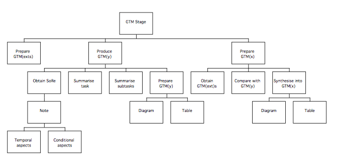
- Generify (scope system at task level)
This involves the following steps, which are described in more detail afterwards.
Prepare GTM(y)
obtain SoR; note temporal and conditional aspects
summarise task in device independent terms
summarise subtasks in device independent terms
prepare documents
Prepare GTM(x)
obtain GTM(ext)s
compare to GTM(y)
identify elements of (ext) relevant to (y)
identify compatible GTM(ext) components
synthesise parts into GTM(x)
Preparing GTM(y)
GTM(y) is based on the Statement of Requirements (SoR). The SoR should be reviewed and the main tasks identified. Any requirements concerning the ordering of the tasks or conditions under which they should be performed should be noted, and a diagram similar to those generated for the GTM(ext)s should be produced, summarising the requirements in device independent terms.
If the GTM(y) is unexpectedly simple, this should not necessarily be regarded as indicating a error of production, but may indicate that subsequent enhancement of aspects of the requirements specification may be required.
A supporting table should be prepared for the GTM(y), which should follow the structure shown below.
| Name | Description | Observation | Design Implication |
Speculation |
| Which cell is referred to | Further description as necessary | Any notes | Any implications , based on ESA work | Any design speculations occurring at this stage |
Preparing GTM(x)
GTM(x) is a device independent model of the aspects of the existing systems that might be suitable for incorporation in the target system. The model is based on the GTM(ext) products that were prepared for each system studied during the extant systems analysis. The information in the supporting tables for the Task Descriptions (TD(ext)) may be useful when deciding which parts of the GTM(ext)s to include, particularly any comments in the implications or observations columns. The comments from the TD tables can be copied into the supporting tables for the GTM(x), but care should be taken to updated the names of the nodes where necessary. If appropriate, the GTM table can be cross-referenced to the original task description to provide additional information. Information about the problems experienced by users gathered during the interviews should be reviewed in case it contains relevant information not in the TD tables.
A supporting table should be prepared for the GTM(x), which should follow the same structure as the GTM(y) table.
Once the GTM(x) has been produced, it can be compared to the GTM(y). If the two models look very different, it may indicate that the new system will seem unfamiliar to the users, who will either require additional training or extra support from the design of the interface, perhaps either through descriptions printed beside buttons, on-line help, or maybe a wizard or agent. If the GTM(x) is not very extensive, it probably indicates that the systems studied during analysis did not provide many promising ideas, and it may be an idea to revisit the analysis stage unless GTM(y) is particularly complete and the system is well understood.
- Verify models
Partial verification of the models has already been performed, when the users were interviewed and shown the partly completed task descriptions. The completed TD(ext)s and GTMs may be checked with user representatives to provide additional confidence concerning their completeness and accuracy before further work is based upon them.
| GTM Rating table
Please rate the above procedures according to the extent they fit the descriptions in the left hand column
|
||||||||
| Agree strongly | Agree | Neutral | Disagree | Disagree Strongly | ||||
| Coherent (i.e. understandable) |
* | * | ||||||
| Complete
(i.e. there was nothing missing) |
* | * | ||||||
| Concerned what was desired
(i.e. did the procedures allow you to do what you were supposed to?) |
* | * | ||||||
|
Time taken:
|
Diagrams | Tables | Revision | Other (specify) | ||||
|
Further
|
* Please describe what the problem was |
|||||||
Phase 2
Design Synthesis

MUSE(SE) Phase 2 Procedures: SUN stage
The purpose of the SUN is to summarise the ESA findings so that they can easily be referred to during the remainder of the design process; in effect, the SUN presents a human factors perspective on the Statement of Requirements. The process of producing the SUN mostly involves summarising the findings from previous stages, and is quite straightforward as the following diagram shows.
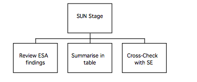
- Document user problems
The information gathered during ESA analysis, particularly that marked for inclusion in the Statement of User Needs, is now collated to form SUN(y). It is important that the SUN lists both good and bad aspects of the systems studied, so that the good features are preserved in the target system and the bad aspects of the existing system do not reappear. Insights gained into problems or benefits caused by the relationships between aspects of the worksystem, such as mismatches between the users mental model of the task and the way it is represented by the system, or the association between actions and the objects that perform or suffer them, should have been uncovered both during assessment with the styleguide, guidelines and related heuristics and during the observational studies; these are recorded in the various sections of the SUN. The information collected concerning the characteristics of the target user groups is also incorporated into SUN(y), as are the ‘usability requirements’ (PLUME categories and the styleguide chosen) that define the acceptable properties for the target system.
The SUN is divided into six sections, which are listed on the next page; each section contains guidance about which of the activities carries out during examination of the existing systems is most likely to provide the relevant information.
Each section of the finished SUN should contain a pair of tables. The tables describe the good and bad features of the existing system and how these are to be reflected by the target system. The tables are shown after the sections on the next page.
The SUN is divided into the sections shown in the following table:
| Statement of User Needs Sections |
| User and Device Actions (from checklist sections 1-8, observational studies, interviews, and the task models) |
| User mental processes and mental model (from interviews, card sorting, verbal protocol, and task models) |
| Task (Domain) Objects – Goals (from interviews and card sorting) – Domain objects (from observation, interviews and card sorting) – Task quality (from usability tests) (Performance from PLUME – record target level from Usability requirements) |
| User and device costs (from observations, task execution, usability tests, informal tests, as well as sections 1, 3, 5 , 6 and 10 of the checklist) – Learnability (also record target level from Usability requirements) – User satisfaction (also record target level from Usability requirements) – Memorability, Learnability (also record target level from Usability requirements) – Errors (and time on task);(also record target level from Usability requirements) |
| Physical aspects; device construction, appearance and layout. (from physical guidelines, and sections 1, 5, and 10 of checklist) |
| Miscellaneous (from sections 3-10 of the checklist). |
Each section of the SUN should follow the format shown below:
| Problem | Caused by | Consequences | Addressed by |
| What problem the users suffer
(complete now) |
Feature of the existing system that causes the problem
(complete now) |
Impact on the target system; what will have to be done to avoid recurrence (complete either now or later) |
How the target system has addressed the problem (complete later) |
| Feature | Caused by | Consequences | Addressed by |
| Desirable aspect of existing system that the target system should keep
(complete now) |
Feature of the existing system that causes the feature
(complete now) |
Potential impact on the target system; what will have to be done to preserve feature (complete either now or later) |
How the target system has addressed the problem (complete later) |
OMT Cross-Checking Point:
Refer to the object model, event flow (or object message) diagram and event (or message) trace generated as part of the OMT process, and carry out the following checks. (It may be more convenient to perform this check at the same time as the DoDD(y) check in the next stage).
Review the SUN to ensure that users did not report difficulties communicating with the system (i.e. with the language or the semantics of the old user interface). Consider whether these are likely to recur in the new system, by looking at the event flow and event trace and assess whether good points of the old system have been reused as appropriate.
Check that any objects from the domain and their attributes mentioned in the SUN are treated appropriately in the Object model.
Ensure that associations between actions and objects noted in the SUN are treated appropriately in the Object model, by considering whether each object has appropriate attributes and methods. (Check that there is a ‘User Interface’ class, as well as the interface-related classes in the DoDD(y); it won’t be very detailed yet, but it will be required later on).
| SUN Rating table
Please rate the above procedures according to the extent they fit the descriptions in the left hand column
|
||||||||
| Agree strongly | Agree | Neutral | Disagree | Disagree Strongly | ||||
| Coherent (i.e. understandable) |
* | * | ||||||
| Complete
(i.e. there was nothing missing) |
* | * | ||||||
| Concerned what was desired
(i.e. did the procedures allow you to do what you were supposed to?) |
* | * | ||||||
|
Time taken:
|
Diagrams | Tables | Revision | Other (specify) | ||||
|
Further
|
* Please describe what the problem was |
|||||||
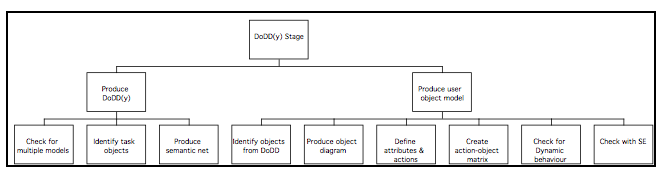
MUSE(SE) Phase 2 Procedures: DoDD(y) stage
The user’s view of the task domain is modelled to provide insight into their mental model of the task and allow the user interface to be specified in such a way that it will be easily understood by the user and be easy to learn and use. Two models of the task domain are produced, a semantic net called the DoDD(y), and the user object model. The user object model resembles a software engineering model more closely than the DoDD(y), and in fact uses software engineering notations. The main difference between the two models is that the user object model describes the objects together with their attributes and actions performed and suffered (i.e. the operational relationships between objects), whereas the semantic net describes the objects and the semantics of the relationships between them.
The following diagram summarises the production of the DoDD(y) and user object models:
Production of the DoDD(y) user object model and semantic net is based on the information derived during ESA analysis. The object of constructing the DoDD(y) is to represent the aspects of the task domain that are important from the user’s point of view. The DoDD(y) uses a fairly informal notation, and its content is determined more by what is useful in a particular instance than by a set recipe. The DoDD(y) is used as an informal ‘mind-map’ to help the designer understand and reason about the problem.
The DoDD(y) should not merely reproduce material in the software engineering specifications (e.g. the object model), because whereas software engineering specifications concern how the system will actually work, the DoDD(y) should reflect how the user thinks it works. The DoDD(y) is used to help the designer reason about the design at later stages, and the process of creating the DoDD(y) can suggest questions to ask the users that might not otherwise occur. For example, when constructing a DoDD(y) to describe the domain of an email client, the password would probably appear as an entity with an association concerning ‘security’. Questioning users further might reveal that they consider that ‘security’ has to do with all their mailboxes rather than just the new messages on the server, which might prompt consideration of whether the design should reflect this in its treatment of the password.
The following information may be included in the DoDD(y):
- the main (high-level) task behaviours derived from observation and interviews
- mental representations derived from interviews, verbal protocols, and card sorting,
- information on domain objects and attributes derived from observations, interviews and card sorting.
In addition, the following relationships uncovered during assessment using guidelines should be recorded: the associations between actions and the main task objects; the task goals, and work domain objects; the relationships between abstract IWS structures and task goals, work domain objects, and physical IWS structures, derived from the relevant parts of the checklist and the interviews. The relationship between physical IWS structures and domain objects and performance may also be of relevance to the DoDD(y).
Production of the DoDD(y) should be largely a matter of consolidating the semantic nets produced during the interviews. The DoDD(y) should be device independent, in that it should refer to the objects manipulated by users to perform the work rather than the specifics of how the task is done using any of the devices studied. The level of description should be sufficient to explain the tasks from the user’s point of view, but need not go into technical detail.
To produce the DoDD(y) semantic net, the following procedures should be employed:
- Check for multiple models
The first activity in defining the user object model is to assess whether multiple models are required, by considering the user groups identified at the start of the extant systems analysis stage. In a large system there may be two or more user classes for whom the ‘objects in the system’ are almost completely different. Although it is sometimes necessary to define two or more user object models to form the basis of different subsystems, it is not always necessary to have a separate user object model for every user class. An object model should be broad enough to cover the requirements of several user classes concerned with the same objects.
- Obtain the Statement of Requirements, the GTMs, and the products generated during extant systems analysis (particularly the semantic nets produced when the users were interviewed).
- Review the documents listed above to extract a list of domain objects, concepts, events, and processes.
- Arrange the domain objects on the page and insert arrows to show their relationships with one another. Number the arrows, and describe each relationship in a table like the one below.
| Node | Description | Number | Relation |
| The name of the object as shown in the diagram | Description of the object sufficient to identify it in the task | Number on the arrow | The relationship between the object and the one pointed to. |
- Add the concepts, events, and processes, and draw lines connecting them to their associated object, documenting them in the table as shown above; it doesn’t matter if they look the same as the objects, as long as the diagram makes sense to the users and is understood by the interface designer.
Once the DoDD(y) is complete, prepare the user object model [2]. The notation for the user object model is based on that of OMT (Rumbaugh, 1991), although any notation that includes object types or classes, subtypes, association relationships and aggregation or composition relationships could be used. Note that attributes and actions are part of the user object model but are not usually shown on the diagram.
The notational constructs used in the user object model are shown in the following diagram.
[1]The user object model is taken from Redmond-Pyle, D., and Moore, A., (1995) ‘Graphical User Interface Design and Evalution (GUIDE): A practical Process’, Prentice Hall, London, and the user object model procedures reproduced here are based on those by Redmond-Pyle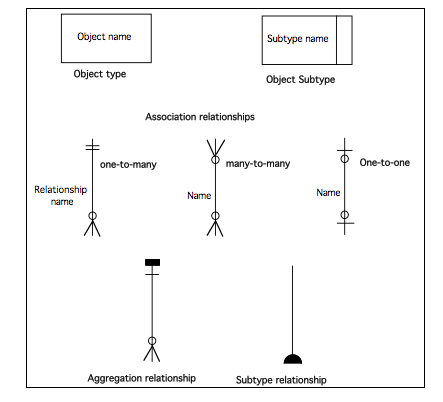
To produce the user object model, the following procedures should be employed:
- Identify objects
Refer to the objects in the DoDD(y). For each object consider the following questions:
- Does the user need to see and interact with the object to perform their tasks?
- Does the object group together related information in a way that helps the user to perform a specific task?
- Does the object exist in the business world, and will it continue to exist with the new system?
- Is the object a useful system object, which the user needs to see and interact with (e.g. printer, fax machine) or should it be invisible to the user (e.g. modem)?
- Is the object just an artifact of the old system, which will be made redundant by the new system? (If so it is probably not required in the user object model, unless it is still a helpful illusion for the end-user.)
If the object is merely a source or recipient of information in the task and the user does not need to see or manipulate the object, then the object may not be required as a user object. An alternative is to interact with the object via some standard communication mechanism such as an electronic mail mailbox.
- Create user object model diagram
Take care to give each object the name that the user wants to call it in the interface. Analyze the relationships between the objects. For each user object, consider which other types of user object it is directly related to. For example, a Person object may ‘own’ a Car object. Define the cardinality of the relationships (one-to-many, manyto-many, etc). For example, one Person may own many Cars, but each Car is owned by one Person. Use a user object model diagram to show all the user objects and the relationships between them. There will often be ‘contains’ relationships, showing container objects (such as lists) related to the objects they contain. Many-to-many relationships are common and oneto-one relationships are quite acceptable. Note the number of occurrences of each user object (e.g. there is only one System object, but there are 1000 Customers and 9000 Orders.)
- Define user object attributes
Define the attributes of each object, i.e. the pieces of information the user knows about the object. For example, a Person object might have a Name, an Address, an Employer, a Date of Birth, a Photograph, a Signature and a List of Leisure Activities. Note that Photograph and (handwritten) Signature are perfectly sensible attributes, even though they are not conventional database fields.
The criteria to use in deciding whether a piece of information should be an attribute of a particular user object are whether it is useful to support a task, and whether it seems sensible to the user. (Avoidance of redundancy, extent of normalization, etc., are not appropriate quality criteria for user object models.)
- Define user object actions
Identify the actions the user will need to perform on (or using) the object, such as Print, Calculate, Authorize, Send to, Allocate to, Add.
User object actions are identified from user tasks, and from discussions with users. Most user objects will have actions to Create or Delete. Establishing (or removing) a rellationship between one user object and another is another common action. Some actions relate to the whole user object, while other actions may only relate to part of the object.
Additional user object actions may be identified and added later, while expressing ask scenarios as sequences of user object actions, and during prototyping. Define each action in terms of the following:
- A brief narrative description
- Any input
- The required effect on object attributes and relationships
- Any output
User object actions describe the ‘behaviour’ of objects in the system. They are the main means of specifying required system functionality. The actions on a user object are considered to be part of the object.
- Create action–object matrix
Create a matrix to show how update actions affect objects.
The action–object matrix provides a useful way of checking the scope and complexity of actions. Most user object actions only affect one user object. However, where an action does affect more than one object, this is significant for GUI design. When the user performs the action on one object, will they expect the effects on other objects to occur?
Construction and review of the matrix often leads to additional actions being identified, to actions being redefined, or to additional effects being noted.
- Check for dynamic behaviour
For each object in turn, consider whether there is significant dynamic behaviour. For the actions of an object, consider the following:
- Can the actions be invalid, depending on the prior state of the object? (Make a note of this for later. This will help during the detailed design of the user interface.
- Are there any constraints on the sequence in which the actions can occur?
(Check that the ordering constraints are represented in the GTM(y)).
OMT Cross-Checking Point:
Refer to the object model, scenarios and use cases generated as part of the OMT process, and carry out the following checks.
Review the DoDD to establish the conceptual entities and operations that form part of the user’s model. Check the OMT object model to ensure that the entities are present as objects, and that the operations are likely to be supported by the methods.
Check the object model against the DoDD(y) to ensure that the objects and their associations agree with the users’ mental representations of the task domain as much as possible.
Check the objects in the DoDD(y) are present in the object model, and in the scenarios and use cases used by OMT. Objects that perform or suffer actions in the DoDD(y) should have dynamic models, as they change state from the user’s point of view. Physical attributes of objects may appear in the DFD (functional model) as data flows, and should appear in the object model as attributes of their objects. Abstract attributes should appear in the object model, and as control flows in the DFD, and may appear in the state diagram as events, attributes or conditions on transitions or within states. (Attribute values derived from user inputs may appear in the event (or message) trace as event parameters, and those actions associated with objects that initiate events may also need to appear in the event trace). Actions associated with objects in the DoDD(y) should be present in the object model as operations.
The actions from the DoDD(y) should be correctly associated with the objects in the object model; in the state diagrams the correct objects should be undergoing transformations or participating in event passing. The methods that initiate events in the DoDD(y) should feature in the scenarios and use cases, and the data transformed by methods in the DFD should agree with the DoDD(y). Similarly, state transitions in the DoDD(y) should be represented in the state diagram.
| DoDD(y) Rating table
Please rate the above procedures according to the extent they fit the descriptions in the left hand column
|
||||||||
| Agree strongly | Agree | Neutral | Disagree | Disagree Strongly | ||||
| Coherent (i.e. understandable) |
* | * | ||||||
| Complete
(i.e. there was nothing missing) |
* | * | ||||||
| Concerned what was desired
(i.e. did the procedures allow you to do what you were supposed to?) |
* | * | ||||||
|
Time taken:
|
Diagrams | Tables | Revision | Other (specify) | ||||
|
Further
|
* Please describe what the problem was |
|||||||
Procedures for phase 2 of MUSE(SE): CTM(y) stage
The high level procedures for the CTM(y) stage of MUSE(SE) may be summarised as shown in the following diagram:
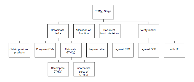
Most of the information required to specify the CTM(y) should be present in the SUN and DoDD(y), particularly where arbitration between alternative design options contained in the GTMs is required.
- Decompose task
Decomposition of the task involves increasing the level of detail so that the designed task satisfies the statement of requirements; this is achieved by selecting components of the GTM(x) and GTM(y) and describing them in more detail to arrive at a conceptual design for the system.
Where a detailed statement of requirements exists, CTM(y) may be very similar to GTM(y). However, the statement of requirements may sometimes be vague, incomplete or even almost non-existent, which results in an impoverished GTM(y). In these circumstances, the CTM(y) should be based more on GTM(x) and the requirements must be updated to reflect this. Even where the statement of requirements provides a detailed functional specification of the target system, it may not contain sufficient information to enable the structure of the task and ordering of subtasks to be specified. In this case, the CTM would reflect the content of GTM(y), but those aspects of the structure of GTM(x) found to be unproblematic during extant systems analysis should be reused; the remainder of the structure should be revised in such a way as to avoid any problems noted.
1a Synthesis: Obtain SoR, DoDD(y), and SUN
Compare GTM(x) and GTM(y)
Extend GTM(y)
Incorporate parts of GTM(x)
The SUN(y) should inform arbitration between the GTM(x) and the GTM(y) by virtue of information concerning evaluation or commentary on the IWS behaviours and the decomposition gathered in the observational studies conducted during the ESA stage, as well as the heuristic evaluation findings. The heuristics that are presented after the procedures for this stage should be used to help selection from the GTMs and elaboration of the CTM.
The objective is to elaborate the GTM(y), describing the subtasks in greater detail to arrive at a more detailed conceptual design for the system.
The correct level of detail in the CTM is where the tasks are described in sufficient detail that all of the steps are included. The CTM should not describe which tasks are done by the user and which are done by the computer or the turn-taking in the interaction; this level of detail will be dealt with later.
1b Record in table:
Design rationale
Design decisions
The CTM(y) supporting table should record the rationale for decisions made concerning the structure of the task. Any porting from GTM(x) or TDs should be noted in the table. If any design decisions made involve changing the structure inherited from GTM(y), the statement of requirements may require modification; this should be noted in the ‘Design Comments’ column and the person responsible for the requirements should be consulted as soon as possible.
The table should take the following form:
| Name | Description | Design Comments |
| Name of the node | Description of the node | Any commentary required, such as the rationale |
2 Perform allocation of function on basis of ESA and SUN(y)
Refer back to the observations and design implications columns of the GTM and TD tables, to identify information gathered in the ESA stage relevant to allocation of function decisions.
Perform the preliminary allocation of function between the user and the device by marking up the CTM, bearing in mind the heuristics on the following page. Refer also to the SUN(y) for relevant information noted during extant systems analysis.
3 Record functionality decisions
Functionality decisions are recorded in the CTM table together with the rationale, to inform subsequent checks against the software engineering specifications to ensure compatibility.
4 Verify model with:
GTM
SoR
SE stream
The CTM is checked against the software engineering specifications (see below), as well as the statement of requirements and the GTMs, to ensure that the requirements are likely to be satisfied by the resulting artefact, that the software engineering specification will support the device under specification, and that the content of the CTM can be either be traced back to the GTMs with rationale for the porting, or that the design decisions made to arrive at a novel structure have been recorded with their rationale. Where possible, additional validation of the CTM with user representatives would serve to increase the level of confidence that could be expressed in the design at this stage.
CTM Heuristics:
Consistency
- Modes should be avoided; operations should have the same effect whenever they are invoked
- Functions should work in the same way everywhere in the application.
- Comparable operations should be activated in the same way; use the same word to describe functions that seem similar to the user
- Promote a good match between system and real world: speak the user’s language, and use terms and concepts drawn from the experience of the anticipated class of user.
- Follow conventions for the environment, so users can reuse knowledge. Use familiar metaphors to allow users to use their experience; don’t be too literal about the metaphor, but extend it to support the task in an intuitive way.
- Support recognition rather than recall of information
Simplicity
- The interface should be simple, easy to learn, and easy to use. Reduce the number and complexity of necessary actions to a minimum.
- Reduce presentation of information to the minimum needed to comminicate adequately. Disclose information to the user progressively to they only see it at the appropriate time.
- Support orientation: if information is too complex or covers more than you can present at one time, the user should be helped to find relevant information by supporting them in orienting themselves.
User control and freedom:
- Aim for minimal surprise: users shouldn’t be surprised by the behaviour of the system.
- Organise sequences of actions with a beginning, a middle, and an end.
- Avoid the user being able to make serious errors by designing them out, and make it easy to correct what non-serious errors are still liable to occur
- Allow users to exit from unwanted dialogues chosen by accident
- Permit easy reversal of actions: as many actions as possible should be reversible
OMT Cross-Checking Point:
Review the CTM to obtain a list of the conceptual entities and operations that appear, as well as any attributes or values. Check the OMT object model to ensure that the entities are present as objects, and that the operations are likely to be supported by the methods. Consider whether the attributes are physical (e.g. temperature in degrees C), or abstract (e.g. ‘ready’). Check the Object model to ensure that the objects possess the relevant physical attributes. Consider whether the abstract attributes are likely to be supported by the model, and whether it would worthwhile adding additional attributes (and possibly operations, additional relationships, or classes) to support them (e.g. consider an object representing a vat in a chemical process; in order to support a ‘readiness’ attribute, it might be necessary for it to know how long it has been at a certain temperature, which would require a timer object).
N.B. Some of the operations may not make sensible methods, particularly if they refer to actions that the user would be expected to perform rather than the device (e.g. answering a ringing telephone in a helpdesk application). Where this is the case, it should be noted so that it is not forgotten during the next stage of the method. A copy of the object model may prove useful for reference during production of the STM.
| CTM Rating table
Please rate the above procedures according to the extent they fit the descriptions in the left hand column
|
||||||||
| Agree strongly | Agree | Neutral | Disagree | Disagree Strongly | ||||
| Coherent (i.e. understandable) |
* | * | ||||||
| Complete
(i.e. there was nothing missing) |
* | * | ||||||
| Concerned what was desired
(i.e. did the procedures allow you to do what you were supposed to?) |
* | * | ||||||
|
Time taken:
|
Diagrams | Tables | Revision | Other (specify) | ||||
|
Further
|
* Please describe what the problem was |
|||||||
Procedures for phase 2: SUTaM stage
The System and User Task Model is a decomposition of the CTM(y) in which the parts of the task to be performed using the target system are separated from the parts of the task that are performed using other devices or systems. The CTM is divided into two models, which are the System Task Model (STM), and the User Task Model (UTM). The STM describes the ‘turn-taking’ in the interaction; what the user does and what the device does in response, but still treated at a device-independent level. The UTM describes the tasks that the user performs ‘off-line’, and is generally not decomposed further, but used as a reference to make sure that the later design remains compatible with the existing systems to be used in conjunction with the target system.
The high level procedures for the SUTaM stage of MUSE(SE) may be summarised as follows:
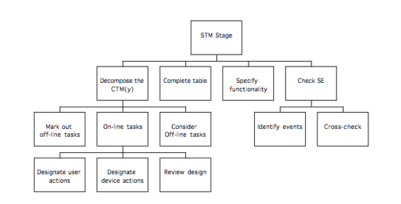
The detailed procedures follow:
- Decompose the CTM(y):
For each node of the on-line task, designate as a H or C node.
Decompose the off-line tasks if required, after constructing the UTM from the marked up areas of the STM.
First, work through the CTM(y), marking out those parts of the task that will not be performed using the target system (these are most frequently either subtasks such as using a telephone or a diary, or parts of other tasks that are interleaved with the current task. A good way of marking the off-line tasks is just to draw a line around them). The off-line tasks should be removed as the STM is produced, although they can be left in where they make the task clearer. The UTM is built by reassembling the off-line tasks to form a separate model.
The next step is to allocate nodes either to the user or the computer to form the basis of the dialog design. Most of the time this is a matter of designating leaves in the CTM(y) as either user or computer actions, but this is sometimes made easier by decomposing parts of the CTM(y) to arrive at a more detailed description.
A useful rule of thumb as you allocate ‘H’ and ‘C’ nodes is to remember that each time the user does something they will generally require some feedback from the device, so each ‘H’ action should normally be followed by a ‘C’ action unless there is a good reason to the contrary (e.g. ‘H’: select document; ‘C’: indicate selected document).
Work through the CTM(y), designating each node as one of the following:
‘H’: user action (e.g. entering information or indicating readiness to proceed)
‘C’: a device action (e.g. executing a command or providing feedback to a user action)
H-C: composite user-computer action, to be used where the actions of the user and device are sufficiently obvious to not need further description
1a Consider whether decompositions of design comply with ‘design principles’ (feedback, etc.)
Once the off-line tasks have been identified and the user and device actions identified with ‘H’ and ‘C’ leaves, the STM should be sufficiently detailed to enable a fair impression of the target system to be gained. Before more detailed design is carried out, the STM should be reviewed to check that there are no issues that need clearing up at this stage. Return to the heuristics specified for use during production of the CTM, and consider whether the design still looks likely to comply with them. SUN should inform design at this stage; details of the type of expected users and any styleguide identified could be used as a guide to the level of support required and the general style of the interaction required.
1b Ensure that STM contains all relevant domain objects and attributes by reference to SUN and DoDD(y). Check SUN for user problems with existing system, and ensure they are not likely to recur.
The SUN is likely to contain some details of the users’ mental processes, and the DoDD(y) will contain details of the semantics of the task as well as the relevant domain objects involved in transformations and the attributes transformed. Examination of the DoDD(y) should allow the users’ mental processes in the SUN (derived from the ESA analysis of concurrent verbal protocols) to be placed in the context of the task and domain, and allow determination of the items of information required in order to support the user during the task; at points in the interaction where the user must make selections or modify an attribute of a domain object, the semantics of the task may require that information additional to the current value of the attribute being modified or the options to be selected from be displayed. As an example, consider a dialog for saving a file to a disk. The user must be provided with a means of specifying a name for the file as well as determining the most suitable directory for it in order to be able to perform the task. However, the task can be performed more easily if the user is provided with additional information such as the other files in the directory, the size of the file that they are about to create, and the available space on the volume. Whilst the CTM may not suggest that such information would be of value, the DoDD(y) would, and the SUN would indicate whether users had suffered from omission of the information in the existing system, or from other features of the design.
1c Complete STM table
The STM table takes the same form as the CTM table; an example is shown below. Any decisions that may require additional functionality (or where the reasons for the decision are less than obvious) should be recorded in the table – particular care should be taken to note the addition (as opposed to decomposition) of nodes. Where extra functionality has been specified, it will be necessary to update the SE specifications that were checked against the Composite Task Model.
| Name | Description | Design Comments |
| Name of the node | Description of the node | Design rationale |
- Document the required interface functionality
The purpose of checking the Composite Task Model against the Software Engineering design products was to ensure that appropriate functionality would be specified to support the target system. However, it is normal for some parts of the CTM not to require a user interface. Examine the STM, categorising areas according to which of the following categories the functionality referred to falls into:
User only: subtasks the user performs without the device. Most of these should have been moved into the User Task Model; those remaining should have been left in the STM for purposes of clarity. Do not require a user interface; should not be in the SE models.
User and computer: tasks the user performs using the device. Will require a user interface.
Computer only: Tasks the device performs without the user. If the task is requested by the user, then an interface is required (e.g. progress formatting a disk). If the task is performed automatically, then a user interface is only required if the user needs to be aware of the task (e.g. periodic requests to save work).
- Handshake with SE.
If production of the STM has resulted in a requirement for additional functionality (or possibly a realisation that there is surplus functionality) then the modifications should be communicated to the SE stream. If the modifications are not straightforward, the STM should be checked against the SE products using the checks in the CTM procedures.
| SUTaM Rating table
Please rate the above procedures according to the extent they fit the descriptions in the left hand column
|
||||||||
| Agree strongly | Agree | Neutral | Disagree | Disagree Strongly | ||||
| Coherent (i.e. understandable) |
* | * | ||||||
| Complete
(i.e. there was nothing missing) |
* | * | ||||||
| Concerned what was desired
(i.e. did the procedures allow you to do what you were supposed to?) |
* | * | ||||||
|
Time taken:
|
Diagrams | Tables | Revision | Other (specify) | ||||
|
Further
|
* Please describe what the problem was |
|||||||
Phase 3
Design Specification
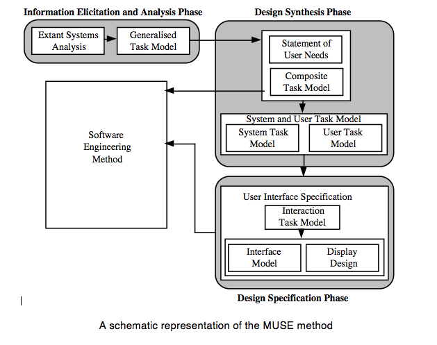
Phase 3 Procedures: ITM(y) stage
The Interaction Task Model is based on the STM, and specifies the actions of the user in sufficient detail to inform implementation. Computer behaviours are not specified in detail at this stage because they are described by later products; the actions of the user should be specified in terms of the interface objects to be used in the final interface.
For the present purposes, pictorial screen layout (PSLs) construction will be treated as part of specification of the Display Design products and is described in the following section. Specification of the ITM(y) can be performed in parallel with specification of later products; concrete representations such as the PSL(y)s can simplify the process of producing the ITM(y) quite considerably, particularly where the task is fairly straightforward and the required windows and dialogs can be easily visualised. Where it is less easy to decide which windows and dialogs will be needed, the later part of this stage includes procedures to support window and dialog allocation.
The high level procedures for the ITM(y) stage are as follows:
These procedures will now be described in more detail:
- Select nodes of the STM(y) for decomposition (H or H-C leaves)
Look through the STM, and note where the H and H-C leaves are. These leaves will be decomposed to produce the ITM. (It may be useful to mark the nodes on a printout in pen).
- For each H-C leaf: if standard behaviour, – study ‘standard’ package
– analyse behaviour
– document behaviour
– rename items in ITM & DoDD(y)
If the H-C leaves describe behaviours that are standard for the environment that the target system is to be implemented in (e.g. a file dialog from Windows ‘98), then the behaviour of an existing package should be examined and documented so that the target system will behave correctly. If the implementers are totally familiar with the environment in question, then it may be sufficient to provide an unambiguous reference to the feature required.
3.1 Obtain DoDD(y)
The DoDD(y) should be referred to whilst the ITM(y) is being produced, as it summarises the attributes and relationships of domain objects that are relevant from the user’s point of view. As the STM is decomposed, refer to the DoDD(y) to determine the type of relationships that the object being manipulated has with other objects, considering whether there is a need for related objects to be visible at the same time, whether it is enough to be able to navigate between the views of the objects, or whether there is no need for either. Consider also the nature of the attributes that are to be manipulated and how this will influence the most suitable type of control.
Refer also to the heuristics for the ITM stage, which are reproduced after the procedures for this stage. You may find it useful to have the styleguide at hand if one is available, particularly if you are not totally familiar with the user interface environment.
3.2 For each H leaf :
- Decide if it is an active (control) or passive (read display) action for the user. (Different coloured highlighter pens can be used to mark the nodes distinctively)
- If it is passive display reading, make a note of it for the Pictorial Screen Layout
- If it is an action involving a control:
– determine object and attribute modified in DoDD(y) or user object model
– Check DoDD(y) semantic net to see if other attribute displays must be visible, and note this for when the PSL is being produced.
– Check if object already has controls specified (If so, ensure consistency)
– Determine nature of attribute change from DoDD(y) models
– Using styleguide, select most appropriate control.
– Enter the appropriate ‘H’ action, based on the styleguide
– Record choice of interface object (or a reference to the styleguide) to enable later ‘C’ action specification and PSL construction
– If an action-object matrix was constructed, identify action, object, and attribute, and check the matrix against the ITM(y) if it is absent.
- Note important features for later
Ensure that any behaviours that aren’t immediately obvious from the ITM are recorded in the table. Check each ‘C’ leaf, and decide if the operation refers to a purely user interface related function or whether it will involve a process that is not part of the user interface. Mark, or make a note of, those functions that will require services from outside the user interface.
- Document in diagram and table
The description in ITM(y) is supposed to continue to a level where it can be understood by the design team, taking into account the characteristics of the user interface, the existing system’s user interface, and the earlier HF descriptions. Therefore, the ITM table is usually rather less detailed than those for other products. However, the designer may have to select between a number of design options of equal merit. Documentation of the basis of these decisions is desirable, as it may assist design review by others in the design team or save ‘reinventing the wheel’ during design iterations. It is suggested that the ITM(y) table should follow the layout shown below:
| Name | Description | Design Comments |
| Name of the node | Description of the node | Design rationale |
- Iterate with: CTM(y) (task features)
STM(y) (allocation of function)
UTM(y) (off-line tasks)
Tell SE stream about iterations
Iteration at this point is optional, and has been included in the procedures because producing the ITM sometimes results in insights into places where the structure of the diagram could be simplified or where modifications are necessary. Major iterations are best avoided, particularly where they have implications for the SE design stream, so a trade-off needs to be made between the cost of revising earlier products and the benefits likely to result.
Some of general rules of thumb for the ITM stage:
- Iterate the stage as necessary with earlier stages, and return to the ITM after later stages if necessary to modify the node names to preserve consistency.
- STM nodes more than 2 from the bottom are unlikely to change; those less than 2 nodes from the bottom are most likely to change.
- Demarcate screen boundaries
Once the ITM has been produced to the level where the detailed input behaviours are specified, it is usually quite straightforward to determine the windows and dialogs necessary to support the task. Refer to the heuristics given at the end of the stage for guidance when carrying out the following procedures.
- Define window for each major object in DoDD(y) user object model
- For each user object:
– Define menu header
– Define user object views; consider using multiple views if:
- there is too much information for a single view
• some information is used frequently and some is used less frequently ( consider putting the less frequently used information in a
supplementary view)
• the user object is used in different contexts or tasks
• providing graphical visualisations of the object may help the user to manipulate it more effectively
• different subtasks involve using the object differently (i.e. inputting information might require a different view to reviewing information already in the system
• some information is restricted to certain types of user
– Decide window basis – if part of larger object use pane or own window, else use own window
– Decide views: either single or multiple, and if multiple, simultaneous or selectable
– Refer to styleguide for appropriate window style
– Select attributes for representation in window
– Define window(s) by listing attributes to be included
– Inspect action object matrix (or DoDD(y)) for actions on the object
- Identify the subtask containing the object in the ITM(y)
- For each subtask:
– Refer to subtask
– If the action initiates a subtask, and the subtask can be initiated at nearly any point in the task sequence (indicated by lax ordering or iteration over a selection in the ITM), or can be performed on more than one type of selected object or subobject (indicated by repetition of subtask in ITM), consider using a menu item or keystroke to invoke the subtask.
– If the subtask consists of several steps, or feedback / confirmation is required before the subtask can be completed, use one or more modal dialogs.
– Allocate subtask related interface objects to dialogue
– Determine whether undo or cancel options are required
– Document design decisions
- For each action:
– Refer to subtask
– Consider appropriateness of control based on attribute changed
– Discard empty menu headers
– Use DoDD(y) and card sorting to determine optimum menu organisation
– Record menu organisation in PSL(y)
The DoDD(y) can help selection of controls based on the ITM(y); inspect the object that is being manipulated to uncover related objects that are be involved from the user’s point of view; the related objects (or their relevant attributes) should be visible when the user is interacting with the first object, in order to avoid them having to interrupt the task in order to check on related objects. Styleguides often contain guidance concerning selection of controls based on the type of variable being manipulated, so check the styleguide if one is available.
Having specified ITM(y), it now remains to derive the remaining part of the user interface specification. First, the ITM(y) should be checked once more against the software engineering products, using the checks on the following page .
OMT Cross-Checking Point:
Check the OMT object model to ensure that the entities are present as objects, and that the operations are likely to be supported by the methods. Refer to the ‘C’ actions that were marked on the STM or noted as requiring services from outside the user interface, and check that the user interface class is associated with the objects with the appropriate methods so that it can request them when needed. Check that the event (or message) trace would support the task in the ITM. Check the DFD (functional model), event trace, scenarios, state diagram and event flow (object message) diagram to ensure that the commands and arguments used by the user (as well as state variables and any important contexts) will be supported. The physical actions of the user and display actions of the system should be present in the scenarios, and specified in the state diagram. Areas where significant decomposition of the CTM has occurred to produce the ITM may indicate that decomposition into sub-states should have occurred in the state diagram.
Abstract attributes mentioned in the ITM should be consistent with control flows in the DFD, and with the state diagram. Attribute values should agree with event parameters (particularly user inputs) in the event trace, state diagrams and scenarios.
Ensure that relationships between processes and data in the ITM agree with those in the DFD, and that state transitions implied by the ITM are described in the state diagram. Check that the objects transformed by operations in the DFD agree with the description in the ITM, and that the transitions and event passing in the state diagram (and event flow diagram) are also compatible.
ITM heuristics
Consistency:
- Interface objects should be named so that they will be concrete and recognisable
- Be consistent in terminology and follow the styleguide
- Comparable operations should be activated in the same way, and should work in the same way everywhere. Use the same command to carry out functions that seem similar to the user
- Use identical terminology in prompts, menus and help sections and consistent commands; follow conventions for the environment, so users can reuse knowledge from elsewhere
- When using metaphors, ensure properties of objects are appropriate
Simplicity:
- Reduce number and complexity of necessary actions to a minimum; the interface should be simple, easy to learn, and easy to use.
- Maximising functionality works against maintaining simplicity, and needs a balance.
- Reduce presentation of information to the minimum needed to comminicate adequately.
- Use natural mappings and semantics in the design.
- Provide information not data
- Disclose information to the user progressively to they only see it at the appropriate time, but don’t require the user to use special techniques (or keys) to reveal information vital to the task
- Minimal surprise: users shouldn’t be surprised by the behaviour of the system
- Reduce short term memory load: keep displays simple, consolidate multiple page displays, reduce window-motion frequency, and allow sufficient training time.
- Salience: present critical information in a sufficiently intrusive way
Menus:
- Use verbs for menu commands that perform actions
- Don’t make up your own menus and give them the same names as standard menus
- Flexibility and ease of use: use accelerators and allow users to tailor the system if appropriate.
Feedback
- Offer informative feedback: for every operator action there should be some system feedback (visual and/or audio) – this can be minor for frequent and minor actions, and more substantial for infrequent and major actions
- Ensure feedback is timely.
- Show progress of lengthy operations.
- Ensure feedback is appropriate to the task (or operation).
Error prevention:
- Prevent errors from occurring in the first place
- Help users recognise, diagnose and recover from errors: plain error messages which are informative
Put the User in Control
- As far as possible, the user should initiate actions, not the computer
- The user should always be able to see what they can do and what state the machine is in.
- Accommodate users with different levels of skill; provide shortcuts for frequent users
- Avoid modes, and where they are unavoidable make them obvious, visible, the result of user choice, and easy to cancel.
User guidance:
- Consider providing on-line help, and decide what documentation will be required.
| ITM Rating table
Please rate the above procedures according to the extent they fit the descriptions in the left hand column
|
||||||||
| Agree strongly | Agree | Neutral | Disagree | Disagree Strongly | ||||
| Coherent (i.e. understandable) |
* | * | ||||||
| Complete
(i.e. there was nothing missing) |
* | * | ||||||
| Concerned what was desired
(i.e. did the procedures allow you to do what you were supposed to?) |
* | * | ||||||
|
Time taken:
|
Diagrams | Tables | Revision | Other (specify) | ||||
|
Further
|
* Please describe what the problem was |
|||||||
Phase 3 of MUSE(SE): Display Design stage
The Display Design stage involves specifying the user interface in sufficient detail such that implementation can begin. A number of products are prepared, each describing a different aspect of the interface:
- The Pictorial Screen Layouts (PSL(y)s) show the layout of screen objects within each window and dialog. They can be either be produced using a tool such as Visual Basic, or by using pen and paper, depending on what is most convenient.
- The Interface Models (IM(y)s) show the behaviour of individual screen elements using the structured diagram notation common to the other products of MUSE. Each screen object (or group of screen objects) has its own Interface Model. If a screen object exhibits standard behaviour for the environment (e.g. buttons that highlight when the mouse is clicked on them), then there is no need to create an IM for that object; only objects with non-obvious behaviour should be documented.
- The Dictionary of Screen Objects (DSO) lists all the screen objects specified, whether they have an IM or not. A brief description of the behaviour of each object is provided, and cross-references to IMs made as appropriate.
- The Dialog and Inter-Task Screen Actuation diagram (DITaSAD) summarises what triggers each screen and dialog (including error messages) to appear and disappear. It is mainly used to specify the appearance of error messages, but also shows the combinations of screens that are allowed. The DITaSAD is specified using SDN.
- The Dialog and Error Message table is a list of all the error messages that can appear. The format of the table is provided in the procedures.
Heuristics for use during the stage are provided following the procedures.
The high level procedures for the Display Design stage may be summarised as follows:
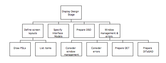
The procedures will now be described in more detail:
- Define screen layouts
1.1. For each screen boundary, prepare a PSL(y):
In general, it is a good idea to start off by designing windows to be as simple as possible; don’t try to make each window do too much, or it will be confusing for the user. If necessary, the window boundaries in the ITM should be revised.
Produce a Pictorial Screen Layout for each screen allocated in the ITM(y), as follows. (PSLs should also be produced for each menu, to show the ordering of items).
For each screen allocated in the ITM(y):
- refer to styleguide for the standard window behaviours
(in addition to the standard window controls, don’t forget to include any applicable shortcuts for more expert users)
- note how each PSL is invoked and dismissed
- identify the screen objects that have been specified by examining the ITM; make a note of each object for the Dictionary of Screen objects
- refer to each subtask in the ITM
- group subtask related objects in window according to subtask order (work left to right and top to bottom, like reading a page of text)
- within the subtask groupings, arrange objects according to DoDD(y) relationships or task order, as appropriate
- if there is more than one subtask in a dialog, use lines to separate the objects into related groups, or consider a selection mechanism.
- put the button that dismisses the window to the bottom right of the dialog
Where screen layouts are to be designed in colour, a degree of caution should be used. Colour is useful for distinguishing or classifying items, as well as gaining attention or indicating context or status of objects. Colours should be chosen so that there will be sufficient contrast between foreground and background objects, and particularly striking combinations such as red on blue are avoided. In general, a fairly muted palette should be used and bright colours reserved for specific circumstances where the user needs to be alerted to something important.
- Specify IM(y)s
Decide if each object in the window is to behave according to the standard manner for the environment – if so, no IM(y) will required for that object.
For each non-standard object, prepare an IM(y) as follows, bearing in mind that similar objects should exhibit similar behaviours:
2.1 for each menu & object
– determine when visible to user during task
– determine if the object or menu item is always a valid selection
– when the object is invalid but visible, it should be disabled, and a visible indication (such as dimming) used to inform the user
– ensure that objects are enabled (i.e. not dimmed) when they are a valid selection, and that they are visible to the user
-record the enabling/disabling behaviours using SDN
– reference in DSO and link to styleguide
for each menu item:
– specify the behaviour triggered by selecting the menu item as SDN
- Prepare Dictionary of Screen Objects
For each screen object used, complete an entry in the DSO as follows (n.b. refer to the heuristics at the end of the stage, as well as the styleguide to help determine the behaviours of the objects):
| Screen object | Description | Design Attributes |
| Identify the screen object | Description of the screen object | Describe the attributes/behaviour of the object |
- Store items together
Group the PSLs together with the Dictionary of Screen Objects and the relevant Interface Models.
- Deal with window management and errors
- Study the PSLs (refer to the ITM(y) for the points in the interaction where they are used)
- identify potential errors, and list them out
- refer to the IM and ITM, and see if the error can be designed out
- iterate until – error potential removed (revise products)
– error not removed, in which case:
Extend DET
– compose an error message
– add it to the DET
– prepare a PSL for the error message dialog
– note the cross-reference to the point in the ITM(y) where the error occurs
5.1 Window management and errors:
For each menu, and each PSL:
- Document what causes it to be triggered and dismissed
- Document what happens when it is dismissed action (for object windows, decide if a warning dialog is required, for instance if there is a danger of losing work)
- For non-modal dialogs: Decide if another screen should be triggered as a default, and document it.
Decide how errors are to be treated:
- obtain the ITM, the IMs and the PSLs
- step through the ITM
for each subtask: determine enabled controls from PSL and IM
Determine if error results directly from control operation:
If error results, either revise design to remove error, disable control, or specify error behaviour
For each H action: determine if error possible (e.g. invalid data entry format)
If error possible, devise error message
For each C action: determine if non-completion error result possible
If error possible, devise error message
List all of the error messages in the Dialog and Error Message Table (DET), which should take the following form:
| Message number | Message |
| Message number (assign a number to the message, and cross-reference to the DITaSAD or PSL(y)) | Content of the message as it will appear on the screen |
6 Produce the DITaSAD
(tip: the DITaSAD can be based on the ITM structure by removing the bottom nodes apart from those that cause screens to appear or disappear, or where an error message might be triggered. It is easiest to produce the DITaSAD in two stages first ignoring the errors, and then adding them in by referring to the DET)
- obtain the ITM, IM(y) and the notes on PSL activation
- note transition triggers for activation and consumption
- summarise in diagram
The above procedures complete the derivation of the user interface specification; in the remaining stage of MUSE(SE), this specification will be evaluated to ensure its suitability for the intended users and to reveal any areas where improvements need to be made.
Display Design Stage Heuristics
Consistency
- Modes should be avoided, operations should have the same effect whenever they are invoked
- Functions should work in the same way everywhere in the application.
- Use the same command to carry out functions that seem similar to the user
- Use identical terminology in prompts, menus and help sections and consistent commands
- Follow conventions for the environment, so users can reuse knowledge
- Ensure properties of objects are appropriate
- Do use verbs for menu commands that perform actions
- The user should be able to determine what tasks can be performed and the state of the machine all at times.
- Don’t change the way the screen looks unexpectedly, especially by scrolling automatically more than necessary
User in control
- Design dialogues to yield closure: organise sequences of actions with a beginning, middle, and end. Support contexts – based on data or tasks
- User should initiate actions, not the computer.
- Users should be able to personalise the interface
- Accommodate users with different levels of skill; provide short-cuts for frequent users
- Avoid modes, and where they are unavoidable make them obvious, visible, the result of user choice, and easy to cancel.
Errors
- Prevent errors from occurring in the first place by designing them out
- Help users recognise, diagnose and recover from errors.
- Do make alert messages self-explanatory
Simplicity
- The interface should be simple, easy to learn, and easy to use.
- Reduce the number and complexity of necessary actions to a minimum
- Reduce presentation of information to the minimum needed to comminicate adequately. Disclose information to the user progressively to they only see it at the appropriate time, but don’t require the user to use special techniques (or keys) to reveal information.
- Use natural mappings and semantics in the design.
- Support orientation: if information is too complex or covers more than you can present at one time, the user should be helped to find relevant information by supporting them in orienting themselves.
Use of Colour
- Use colour coding in a thoughtful and consistent way.
- Use colour change to show a change in system status. If a display changes colour, this should mean that a significant event has occurred. Colour highlighting is particularly important in complex displays with many entities. If one part of the interface shows error messages in red (say), then all parts should do likewise. Be aware of the assumptions which the users may have about the meaning of colours.
- Use colour coding to support the task which users are trying to perform, for example when identifying similarities or anomalies in data.
Directness
- Use direct manipulation, and make consequences of actions visible
- Use familiar metaphors to allow users to use their experience; don’t be too literal about the metaphor, but extend it to support the task in an intuitive way. • Support recognition rather than recollection
Feedback:
- The user should be informed of the consequences of their actions, and for every operator action there should be some system feedback (visual and/or audio) – this can be minor for frequent and minor actions, and more substantial for infrequent and major actions, but must be timely. Ensure feedback is appropriate to the task (or operation).
- Show progress of lengthy operations.
Redundancy:
- Wherever possible, provide summary information in several ways
- Support orientation: if information is too complex or covers more than you can present at one time, the user should be helped to find relevant information by supporting them in orienting themselves.
Flexibility:
- The user should be able to choose modality of task performance, and should have as much control as possible over the appearance of objects on the screen
- Do make alert messages self-explanatory
- Don’t use the keyboard where the mouse would be easier (or vice-versa)
| Display Design Rating table
Please rate the above procedures according to the extent they fit the descriptions in the left hand column
|
||||||||
| Agree strongly | Agree | Neutral | Disagree | Disagree Strongly | ||||
| Coherent (i.e. understandable) |
* | * | ||||||
| Complete
(i.e. there was nothing missing) |
* | * | ||||||
| Concerned what was desired
(i.e. did the procedures allow you to do what you were supposed to?) |
* | * | ||||||
|
Time taken:
|
Diagrams | Tables | Revision | Other (specify) | ||||
|
Further
|
* Please describe what the problem was |
|||||||
Phase 3 of MUSE(SE): Design Evaluation stage
The design evaluation stage involves assessing the user interface design to ensure that it will provide satisfactory support for the intended users carrying out the tasks specified in the requirements. The evaluation consists of two stages; analytic evaluation, in which the specifications are reviewed, and an empirical evaluation in which a prototype is constructed and tried out on users. The techniques used in the empirical evaluation have already been described in detail in the procedures for extant systems analysis, and should therefore be familiar. The findings of the evaluation are used to determine whether any aspects of the design require revision, and following this the documentation of the design is finalised ready for final implementation.
The procedures for the Design Evaluation stage can be summarised as follows:
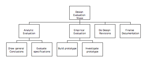
These procedures will now be outlined in more detail:
- Analytic evaluation:
Draw general conclusions:
Practical
Meets usability requirements
(Check SUN, and complete final column)
Syntax: simple, objective, consistent?
Semantics: computer imposed on UI?
Good relationship with task
Obtain the SUN, and review the specifications generated in the Display Design stage, ensuring that all the usability requirements have been met as far as possible. Complete the final column of the SUN, saying how each of the requirements has been met by the design. Appraise the specifications, considering whether the interface will behave consistently and appear simple and objective to the user, and whether the design seems to have a good relationship with the task it is supposed to support. Having followed the design process, the user interface should be based on the user’s view of the task, and should not be driven by the computer-specific aspects; see whether this is the case, and whether the terminology used in the interface is that of the user’s domain or the computer’s.
Evaluate specifications
all states reachable
feedback
input sequences all catered for Default states
Functional requirements
– identify device behaviours
– check if UI function
Review the specifications, ensuring that every point in the interface can be reached, and that there are no ‘dead ends’, such as dialogs with no way back from them. Check that each valid user action is followed by some type of feedback from the device, whether visual or audible; at any point in the interaction, the user should be able to determine the state of the system from the feedback on the screen. Make sure that all the likely sequences of user input are catered for by looking at the original Task Descriptions and checking that those users would be able to use the new system.
When the system is started, establish what the default state will be, and ensure that it will make sense to the user. Similarly, make sure that the default states of dialogues will make sense. Finally, make sure that the system will meet the functional requirements in the Statement of Requirements by identifying all the device behaviours; collectively, those behaviours that are not wholly connected with the operation of the user interface should comprise the functionality listed in the Statement of Requirements.
- Empirical evaluation
The empirical evaluation involves building a user interface prototype and testing it on users. The type of prototype will depend on the objectives for the evaluation, and doesn’t necessarily have to be very complicated – a paper prototype consisting of hand-drawn screens is often sufficient for simple evaluations; tools such as Visual Basic or Director can be used to create prototypes to suit most requirements ranging from simple prototypes consisting of windows and dialogs with no functionality suitable for testing navigation through the system, to sophisticated prototypes with functionality very close to that of the final implementation.
Prototype GUI: – define objectives
– choose tool
– build prototype
The objectives for the prototype are dependent on what needs to be known about the user interface design. Initially, a prototype may be used to ensure that users find the icons and screen layouts meaningful, and would know what to do if faced with the design. Evaluation at this level does not require the prototype to have any functionality, and hand-drawn paper prototypes or printouts of screen designs may be entirely adequate. With a well-designed paper prototype, much can be learned about the system; by producing a number of paper ‘screen-shots’ showing the intended appearance of the system at each stage of a pre-specified task; simple evaluations can be performed by asking the user to indicate where on the paper screen they would click or what key presses they would make, and presenting them with the appropriate screen in response. When planning the evaluation, consideration should be given to what should happen if the user clicks in the ‘wrong’ place; in some cases it may be appropriate merely to inform them that part of the prototype isn’t implemented, but in many cases presenting them with the screen that would appear in the full system is worthwhile, as it allows investigation of whether they realise their error, and whether they will be able to recover from it.
The objectives of the evaluation should be to determine whether the usability requirements set for the system at the end of extant systems analysis (activity 4), and recorded in the SUN, have been satisfied. The main requirements for which levels should have been set are: Productivity, Learnability, User satisfaction, Memorability and Errors. The priority of the requirements should have been determined earlier, and testing should aim to provide evidence that the most important requirements have been satisfied; this has implications for the type of prototype that is required. A prototype intended to assess productivity might need to simulate the functionality of the target system, and behave realistically over time, whereas assessment of the number of user errors might be performed satisfactorily with a paper prototype. Consideration should be given to how realistic the prototype needs to be in terms of appearance, functionality, and temporal behaviour, and how well the available tools would support this. The scope of the prototype needs to be decided before it is constructed; consider if the prototype needs to represent all the screens or just some of them, and whether it needs to simulate the functionality accurately or merely contain mock data. The fidelity of the prototype might also be important; does it need to bear a close resemblance to the target system in terms of visual appearance and response times? A further factor that might influence the choice of tool is whether the prototype will need to interact with other systems such as databases or word processors, or whether it will be sufficient to simulate this.
– investigate prototype with design team and users:
user training
scenario briefing
data collection (PLUME)
data analysis
report results
Investigation of the prototype with the design team is essentially the same as the activity performed during extant systems analysis, when the investigator familiarised themselves with the system (activity 2.1). Members of the design team should experiment with the system to form a general impression about the usability of the interface. Experimentation with the prototype should also provide an input to planning the evaluation, and should inform decisions about who much training the users involved in testing should have prior to the evaluation, and how much information should be contained in the task that the users will be required to perform during the evaluation. The data to be collected should be determined prior to the evaluation, as well as the way it is to be analysed and reported.
Design evaluation:
– select approach
expert heuristic evaluation
user testing / observation
user survey
– identify participants
– decide session protocol
– pilot evaluation
Having determined the data to be collected it should be possible to decide the form of the evaluation. If users are unavailable or a fairly straightforward initial assessment of usability is required, an heuristic evaluation may be appropriate. If users are available, observational studies should be conducted of them using the prototype, similar to those conducted during extant systems analysis. If desired, a questionnaire could be administered to the users after they complete the task to elicit their opinions about the user interface by asking them to rate how easy they found it to use, note aspects they liked or disliked, and compare aspects of the new and old systems.
The plan for the evaluation should contain the number of participants and where they are to be drawn from, and the way in which the sessions are to be conducted should be decided before the event. A pilot study should be conducted, even if only on a single user, to ensure that the evaluation can be conducted as planned.
Collect data:
– real-time note taking
– video recording
– thinking aloud
– heuristic evaluation
The data collection techniques listed above were described as part of the procedures for extant systems analysis. The evaluation should consist of observation of users following a predetermined task (possibly the task used during extant systems analysis) whilst using the ‘thinking aloud’ technique discussed earlier. The investigator should observe, noting events of interest, errors made by the users, and time taken to perform the task. Video recordings of the users may prove useful during the analysis of findings. If a heuristic evaluation is to be performed, one or two of the design team should evaluate the interface against the heuristics (the heuristics used in the display design stage would be a suitable set for this purpose).
Analyse data: user testing:
time to complete
number and nature of errors
user problems
user comments
user survey statistics
Analyse the data collected in the evaluation to produce a summary of the findings. The above categories are intended as a starter set, and other categories can be added as appropriate.
impact analysis
analyse problems wrt usability criteria (SUN/PLUME)
rank order problems
generate design requirements
estimate resource requirements
review
Once the data has been summarised, the findings should be reviewed in the light of the usability criteria in the Statement of User Needs, and the usability requirements determined at the end of the extant systems analysis stage. An assessment should be made of the likely effort required to rectify each of the usability problems noted. The heuristics provided at the end of this stage allow estimation of the products that are likely to require revision based on the types of problem observed.
- Agree redesign
Assess problem (prioritise according to severity)
Agree action – solve next cycle
– solve now
– no action
Once the effort required to rectify the usability problems noted during evaluation has been estimated, the severity of the problems should be assessed and the problems should be prioritised. By comparing the severity of the problems with the effort required to rectify them, decisions can be made about whether to solve a problem now, wait until the next cycle, or take no action.
- Finalise documentation
Once the design has been finalised and the revisions made, the user interface specification should be checked to ensure that it is complete and correct prior to implementation of the finished system. The Display Design products can now be used to define an OMT dynamic model according to the following scheme:
- The Dialog and Inter-Task Screen Actuation diagram (DITaSAD) can be used to derive the main states and transitions in the dynamic model for the user interface class (and any subclasses), to determine the default states of the device, and to determine the extent of any concurrency. There should be a state for each of the windows and dialogs specified, as well as for the menus; it should be possible to derive the transitions directly from the model.
- The Dictionary of Screen Objects lists all the interface objects specified; in conjunction with the PSLs and IMs, it can be used to derive the substates in the diagram, using the ITM for reference.
- The Pictorial Screen Layouts and the Dialog and Error Message Table should be kept with the SE products, and used as a specification of the user interface components to be implemented.
| Evaluation Rating table
Please rate the above procedures according to the extent they fit the descriptions in the left hand column
|
||||||||
| Agree strongly | Agree | Neutral | Disagree | Disagree Strongly | ||||
| Coherent (i.e. understandable) |
* | * | ||||||
| Complete
(i.e. there was nothing missing) |
* | * | ||||||
| Concerned what was desired
(i.e. did the procedures allow you to do what you were supposed to?) |
* | * | ||||||
|
Time taken:
|
Diagrams | Tables | Revision | Other (specify) | ||||
|
Further
|
* Please describe what the problem was |
|||||||
Heuristics for determining the likely extent of design iterations based on evaluation of the prototype design
Part 1: Problems with the behaviour of the user or device noted during observation and by styleguide assessment.
- a) If the system does not support the task appropriately (i.e. forces the user to perform the task in an unnatural order, or does not support all aspects of the task), investigate the CTM(y)
- b) If users experienced at the task do not understand how to perform it using the prototype system, investigate the CTM(y)
- b) If the dialogue structure is problematic, or the system does not provide appropriate feedback, investigate the CTM(y) and the SUTaM
- c) If the content of dialogues confuses the user, or if the user inputs appear to be problematic, revise the ITM(y)
- d) If the layout of windows or dialogues is problematic, revise PSL(y)
Part 2: Problems interfering with the user’s ability to think about the task or to use their existing task knowledge, noted during verbal protocols.
- a) If the user’s thought processes appear to be disrupted by performing the task with the system, check the CTM(y) and SUTaM(y) against the SUN.
- b) If the users make incorrect assumptions about the target system, check the SUN and DoDD(y).
Part 3: Problems concerning the task objects and their attributes, noted during observation of the users or by questionnaire .
- a) If the representation of task objects or their attributes is problematic, or does not appear to match the goals of the task, check the products from CTM(y) onwards against the DoDD(y)
- b) If users do not achieve an acceptable level of quality (PRODUCTIVITY)when performing the work, check the products from CTM(y) onwards against the SUN(y)
Part 4: Problems related to the costs incurred by the user or device when performing the task, noted during observational studies.
- a) If the users find it difficult to learn the new system, check the products from CTM(y) onwards against the SUN(y). (LEARNABILITY, MEMORABILITY)
- b) If the users spend too long doing the task, make an unacceptable number of errors, check the products from CTM(y) onwards against the SUN(y) (ERRORS, USER SATISFACTION)
Part 5: Problems with the physical aspects of the worksystem, noted during assessment using guidelines or heuristics:
- a) If there are problems related to the physical aspects of the system, check the SUN(y). Problems relating to the appearance or layout of the device may require revisions to DSO and PSL(y)
Part 6: Problems related to mismatches between aspects of the design uncovered by assessment with the styleguide or guidelines (n.b these problems can be difficult to diagnose, and may result from errors in any one of a number or products. If the diagnoses below do not appear to describe the problem, suspect errors or omissions in the SUN)
- a) If the behaviours specified for the user or device appear inconsistent with the types of interface object chosen, the domain objects or the task goals, check the products from CTM(y) onwards against the SUN(y)
- b) If the interface objects appear inconsistent with the goals of the task or the users knowledge or mental processes, check the products from CTM(y) onwards against the SUN(y)
- c) If the user or device behaviours appear inconsistent with the users knowledge or mental processes, check the products from CTM(y) onwards against the SUN(y)
MUSE(SE)
Example
MUSE(SE) Phase 1: Extant Systems Analysis Stage
The following example concerns a notional redesign of the bookmark editing facilities of NetScape Navigator 2.0. The example was selected firstly because it concerned an application that would be familiar to most readers, secondly because bookmark management had been noted to cause problems for a number of users (and thus there would be a problem to solve), and finally because the design products to be generated would be concise and easily understood.
- Examine Documents: Obtain the statement of requirements
Establish the requirements
A notional set of requirements (shown below) was prepared; the ‘designer’ who was to apply the method had not been involved in setting the requirements.
Statement of requirements
The current system for bookmark management of NetScape 2.0 is unwieldy for users with large bookmark collections.
The target system should support the bookmark management facilities of the bookmark window of NetScape 2.0, so that the user can re-organise their bookmarks into a form such that they are happy with the ‘Bookmarks’ menu, and can use it to navigate effectively. The target system should be designed to be compatible with the Apple Macintosh styleguide.
The functionality is as follows:
Display bookmarks
Select a bookmark (or bookmarks)
Change order of bookmarks
Collect into groups (using folders and separators)
Add a bookmark
Edit a bookmark change name label
change URL
add comments
show age and date last visited
Delete a bookmark
Create an alias
(Merging bookmarks won’t be considered in the current study.)
- Examine the systems: Identify Users
Identify Systems
Identify Tasks
Identify circumstances of use
Users
number = millions
Type of users: Highly variable; internet users
Experience level: Variable – novice to expert
Systems used: Assume Apple Macintosh MacOS 7.x experience.
Education level: variable from young children to postdoctoral level
Age: All (likely to be predominantly 17-35)
Classes: Novices
Experienced users (experience problems due to difficulty managing large bookmark files; categorisation problems, navigation during browsing, obsolete links, long list unless folders used.
(etc.)
Tasks
Reorganise bookmarks
Navigate through to select desired bookmark
Storing for reference
Export bookmarks (or subset) for use by others
Use bookmark as a placeholder (temporary) between sessions – can add with one operation, but takes several to delete
Deleting bookmarks
(more about tasks in the following section; information elicited by observing a user)
Circumstances of use
managing bookmarks – housekeeping (infrequent)
If bottom of bookmark menu is longer than the screen, need to rearrange it.
tasks include:
Moving items nearer to the top of the menu
Deleting obsolete (or no longer functional) bookmarks if they are very old and not used for a long time [in the existing system a ‘?’ appears after some length of time]
Putting into folders, moving from one folder to another, duplicating
Just bookmarked (i.e. management of 1 or 2 bookmarks) want to put straight into folder or delete as desired (once or twice a week, frequently)
The more frequently the second is done, the less frequently the first needs to be done.
Discretionary use – can stick with big long list
Motivation:
Provide quick and easy access to large number of information sources.
Make sense of the internet
Empowerment – enhance speed of access to information and understanding of the information sources collected. This is manifested as a sense of control of the categorisation methods and understanding of their resource capabilities.
2.1 Familiarise investigator with the system by:
Observational studies
Task execution
NOTES ON OBSERVING ONE USER OF NS 2.0
Delete bookmark is under ‘Edit’ menu – makes errors in selecting menu, although shortcuts known.
Sorting: Moves bookmarks by dragging from bottom of list to desired position, either in the list or in a folder.
Inside the folder, the bookmarks are not sorted alphabetically, although NS offers the facility to do so. Dropped items go to the top of the list, unless explicitly placed elsewhere inside the folder.
Can write comments about the bookmark so they can be seen only when ‘Edit Bookmark’ window is opened.
Creates folder, slots in under current position, drag and drop bookmarks into folder.
Deleting folder deletes folder and contents.
Not vital for menus to be visible on one screen, but if the menu is too long, it takes time for the menu to be drawn and scroll and the user may slide mouse off the menu and have to repeat the selection attempt.
(etc.)
Following observation of one user, the tasks and subtasks were identified. (The following is a transcript of the hand-written notes made during observation of the user).
Task: Add Bookmark
Task Goal: Add a bookmark to facilitate later retrieval of the document.
Frequency: Often
Duration: Short
Error frequency: Apparently few errors
Decomposition:
Add bookmark consists of: Get the desired document in the active window
then either:
– Press �–D
– select ‘Add Bookmark’ from the ‘Bookmark’ menu
Domain objects:
Task: Sort Bookmarks
Subtasks: 1. Display bookmarks
- Add folder
- Add separator
- Move bookmark in list
- Add bookmark to folder
- Remove bookmark from folder
- Delete bookmark
- Duplicate/alias bookmark
- Edit bookmark info
These subtasks are now decomposed to give a complete description of each, and also the task ‘sort bookmarks’
Sort Bookmarks
Performer: User
Task Goals: Arrange bookmarks in window so that bk menu supports easy access to bookmarks: creating useful subgroups, ensuring bk list is not too long, ensuring menu items support identification of the appropriate URL.
Frequency: Approximately once a week, although this varies greatly between users.
Duration: This varies: if the task is performed frequently then duration is shorter. Large scale reorganisation of bookmarks to different categories is a different subgoal.
Error frequency: ?
Subtasks: 1 to 9 as above
Criticality: None, although if bookmarks list is too long, browser may sometimes crash when bookmarks menu is opened.
Subtask: Selecting bookmark
Performed by: User
Goal: To access the page which the bookmark refers to
Frequency: Varies
Duration: Very quick and simple
Error frequency: Occasionally the pointer slips off the menu, especially if the menu is very long. The item next to the desired bookmark is occasionally selected, the wrong bookmark is chosen due to the title not corresponding to the users knowledge of the page, ambiguous titles, etc.
Subtasks: Click on bookmarks to access menu. Hold down mouse and scroll down menu to item. Release the mouse button to select the item.
Criticality: Not vital, the user may simply select another bookmark to recover from an incorrect choice.
(etc.)
User costs:
Structural – training. Some similarities to finder, enabling use of prior experience, but this was partial.
Needed prompting on some tasks (delete)
Didn’t know what the question marks on Bookmarks meant.
Physical: Holding down mouse whilst navigating large menu structures is difficult, as can slip off and have to repeat.
Mental: Not so high for adding task, using task (though finding bookmark when name is not useful relies on memory of all bookmarks added to infer likely candidates). Bookmark management: Some errors caused by use of ‘Finder’ like look for window, although it has different functionality.
Device costs: Not overly repetitive or costly.
Candidate Domain Objects:
Internet Page
URL
Title (Useful | Not useful)
Bookmark Name (Unsorted | Sorted)
Bookmark window (Contains bookmarks)
Folder (Open | Closed)
Separator
Observational studies:
User: [The user was identified by initials]
Used hold down mouse button menu [automatic pop-up] to create bookmarks
Edit bookmarks
Used cut and paste to transfer between folders
Had trouble locating delete – dragged to wastebasket instead (this worked). However, differs from finder functionality as the wastebasket didn’t get fat.
Had trouble identifying bookmarks from the name only, instead, used location in menu (i.e. 2 from bottom to infer the right bookmark).
2.2 Interview user representatives to obtain problems and task objects using: Card sorting
Structured interviews
Following the initial observation, 3 users were interviewed about their bookmark management. 2 users used NetScape 2.0, and one used Internet Explorer
A transcript of the notes from interviewing one user of NetScape is shown below.
Notes from Interview with User 2:
I use it so I can go back to interesting or useful pages later.
Use window to sort into related groups or folders
Groups are put into folders, which have a name (may put items into folder prior to naming it, and then move the folder to the location where I want it and give it a name) and bookmarks inside
I put the best bookmarks at the top of the menu. The best bookmarks are the ones I use most often.
I use dividers to split the list up a bit so it looks right.
When I organise bookmarks, I alphabetise selected bookmarks. Only available when the folder is selected or set of adjacent bookmarks is selected . Arranges these in alphabetic order, in the same place as the original block in the list.
Problems:
Naming decisions: If I can’t decide on a name, it occurs to me that this grouping might not be appropriate and I move things around again.
Deleting things using menus: It’s in the Edit menu, and I always look under ‘Item’ first.
Renaming: I have to go to edit bookmark; this is a frequent task, or rather it would be if it was easier to do.
The question mark appears in the Bookmark window, but there’s nothing in the menu. This would be as useful in the menu, to show links that I’ve never visited.
There is no way of sorting or collating bookmarks as you add them, and there’s also no way you can change the name or add a description at the time of adding them either.
The finder metaphor doesn’t work properly.
It would be useful if it stored the title of the link rather than the URL, which it does when you bookmark a link.
Below are three ‘Mind Maps’ taken from interviews with browser users. Notice that although each map is different, there are similarities between them, and that the mind maps vary in their completeness or ‘correctness’.
‘Mind map’ from interview with user using NetScape on Mac
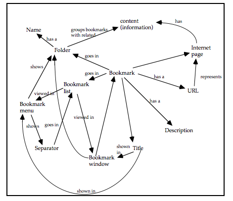
‘Mind map’ from interview with second user using NetScape on Mac
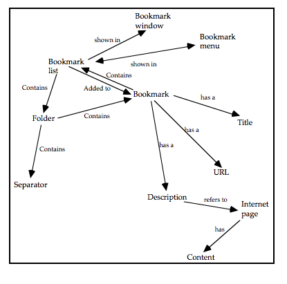
‘Mind map’ from interview with a third user using Microsoft Internet Explorer on PC
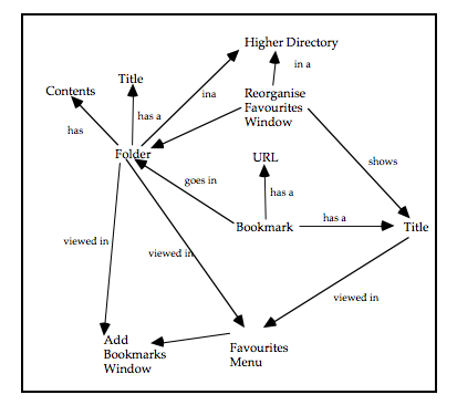
2.3 Record findings of 2.1 as preliminary TD(ext) products, and separate those of 2.2 into behaviours and domain information
The following diagrams were derived from the study of a user on Microsoft Internet Explorer. (The diagram was originally one large diagram, and has only been split up for the purposes of the example). Other diagrams were produced for each user of NetScape, and for the related systems studied. Diagrams are created to document the actions of individual users at this stage, and the users combined into a single diagram later on.
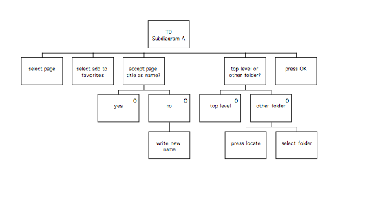
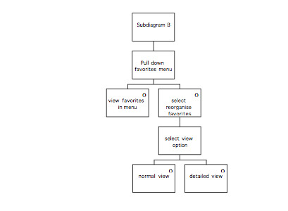
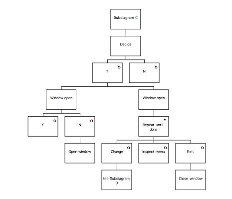
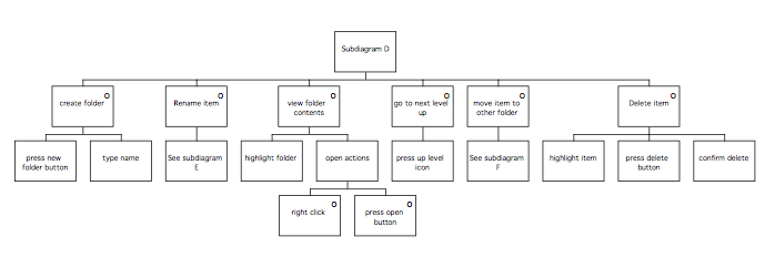
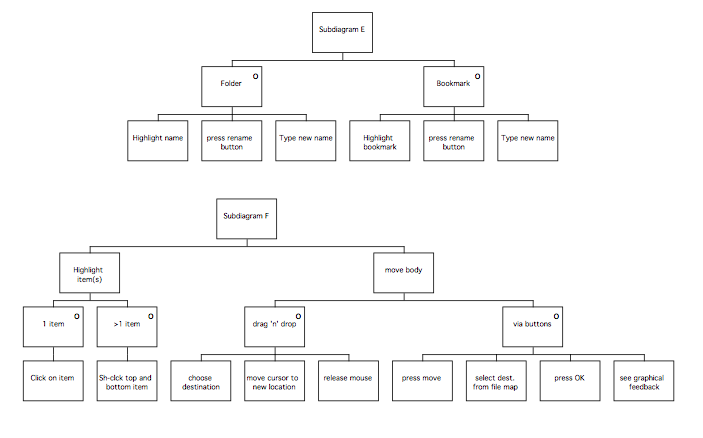
Example entry from supporting table:
Title:_MSIE Task Description for user 3________________ Page:_1__________
Date:_28/11/97__________ Author:_SC_______
| Name | Description | Observation | Design Implication | Speculation |
| Accept title page as name | User has to choose a name | Giving it an existing name will delete the old one without warning | This should be avoided in the target system | Allow multiple names which are the same |
| (etc.) |
2.4 Construct ‘typical’ tasks to be used during testing.
Note: When the users sat down at the machine, it was already running the browser, which was displaying a page of information about the day’s news. The browser had been set up with a large bookmarks file. The task was designed so that the users would use as many of the functions that had been identified as being of interest, whilst the task retained reasonably realistic. (The task shown below lacks any context or introduction; this is because the users received verbal instructions as well as the written task).
Please use the browser to perform the following task:
- Make a bookmark for the current page
- View the current homepage
- Use the bookmark to return to the first page
Using the ‘Bookmarks’ window:
- Add a folder so it appears near the top of the menu, and call it ‘UCL Pages’. (Put it after the second ‘Kite Shop’ bookmark).
- Insert a separator above the folder
- Move the bookmark into the folder, and rename it ‘MSc Homepage’
- Change the URL of the bookmark to
“http://www.ergohci.ucl.ac.uk/msc-info/”
- Delete the bookmark.
2.5 Study the systems using:
Informal / Observational studies / Usability tests
Concurrent verbal protocol
Task execution
PLUME, Guidelines and heuristics
The following notes were made based on a user observed using Finder. As they were made in real-time whilst the user was observed, they are somewhat confused, but allowed the task to be reconstructed after the observation to produce a Task Description diagram:
Finder Analysis
User: XX
Task: Tidying up games on Hard Drive.
Create Folder
Opens File menu and selects ‘New Folder’
Names it by typing immediately (the name is highlighted by default, which means that it will change to whatever is typed before the mouse is clicked or return or enter is pressed).
Opens folder and modes over on screen
Makes the original window active
Added at top of list, as in ‘last modified’ view – at end if viewed alphabetically
Shift-clicks on ‘Games’ folder visible without scrolling. Drags and drops into folder in that window.
Scrolls…
finds another, clicks on it and drags into games folder window, the games folder remains inactive but now contains the new item,
View by icon – jumbled screen of icons, not in list
(See procedure 4 for an example of observations grouped into the PLUME categories)
Extract from the Ravden and Johnson Checklist, completed for NetScape Navigator 2.0 (the other systems were not evaluated using the checklist), with evaluator’s comments in italics.
SECTION 3: COMPATIBILITY
The way the system looks and works should be compatible with user conventions and expectations.
| 1 | Are colours assigned according to conventional associations where these are important? (e.g. red = alarm, stop) | N/A | ||||
| 2 | Where abbreviations, acronyms, codes and other alphanumeric information are displayed:
(a) are they easy to recognize and understand? |
N/A | ||||
| (b) do they follow conventions where these exist? | N/A | |||||
| 3 | Where icons, symbols, graphical representations and other pictorial information are displayed:
(a) are they easy to recognise and understand? |
√ |
Not bkmk and unused bkmk (‘?’ icon) |
|||
| (b) do they follow conventions where these exist? | √ | |||||
| 4 | Where jargon and terminology is used within the system, is it familiar to the user? | √ | ||||
| 5 | Are established conventions followed for the format in which particular types of information are displayed? (e.g. layout of dates and telephone numbers) | √ | Bkmks arranged by user, unlike most which are alphabetic | |||
| 6 | Is information presented and analysed in the units with which the users normally work? (e.g. batches, kilos, dollars) | N/A | ||||
| 7 | Is the format of displayed information compatible with the form in which it is entered into the system? | √ | Sometimes the bookmark title is not the filename, users sometimes have difficulty finding these bkmks | |||
| (etc.) | ||||||
- Are there any comments (good or bad) you wish to add regarding the above issues?
They extrapolated from ‘Finder’ style commands which are not all similar
Repeat procedures 2.1, 2.3, and 2.5 for any related systems identified.
In addition to observing the 3 users as they used browsers, a couple of related systems were selected for study.
ResEdit, a resource editing program used on Apple Macintosh computers, was selected for its menu editing features (the remainder of the package was not studied).
Finder, an application that runs all the time on Apple Macintosh computers performing the role of the Microsoft Windows File Manager and Program Manager by supporting the desktop and representation of file structures on mounted drives, was selected on the basis that it is a very familiar application for the intended user group
- Decompose tasks to: produce TD(ext)
process TD(ext)
Diagram derived from related system analysis: Finder TD(ext)
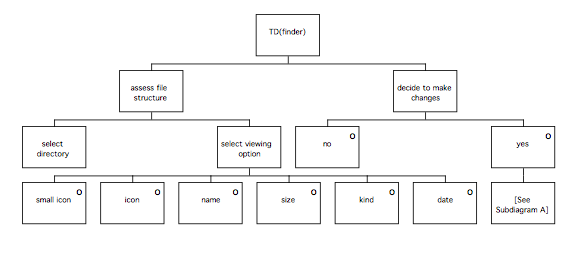
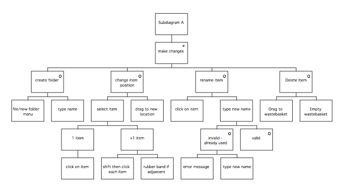
- Identify usability requirements
Notes for SUN
– the task is lax ordered
Identify Usability Requirements
Productivity
Must not be less productive than current implementation. Measure this by number of operations required for test scenarios.
Learnability
Must be better than current system. The menu items are difficult to use unless experienced, as are several other functions (e.g. clicking on bk in window opens page rather than allowing rename as in Finder). Use bk test scenarios – user should be able to perform these actions and be unambiguous about how (or at least one way of doing each operation).
User Satisfaction
Should be able to easily regroup items such that they support the task of information retrieval. Current system is lacking only in learnability and the easy access to a description. Change these so description etc. can be accessed, and used as grouping aid.
Memorability
User should be able to identify bks from title easily. Must be consistent operations across objects to be transformed.
Errors
No errors on user testing scenarios for naive subjects (re new users) though should have computer experience to allow reasonable degree of pretraining. No non-recoverable errors: should be able to undo.
MUSE(SE) Phase 1: GTM stage
Generifying tasks to produce GTM(ext)s
GTM(ext) for Finder
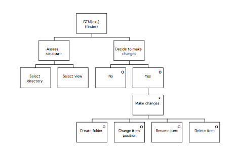
GTM(ext) for ResEdit
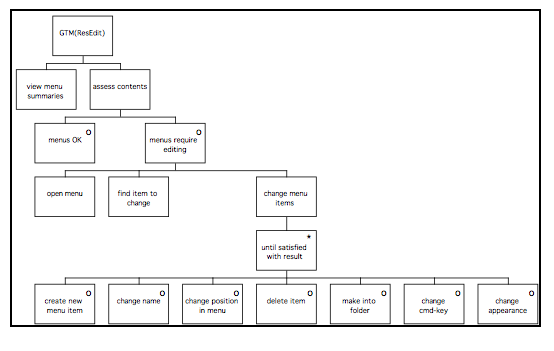
GTM(ext) for Microsoft Internet Explorer
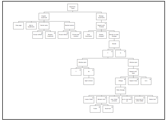
GTM(ext) for NetScape Navigator
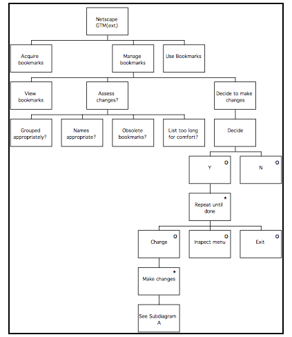
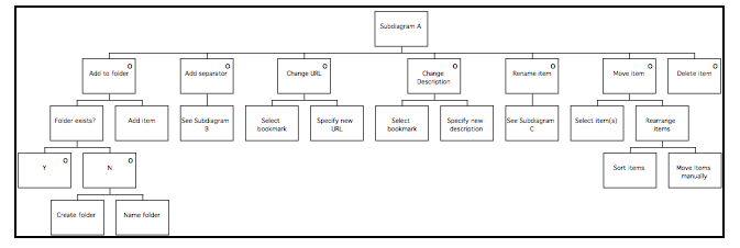
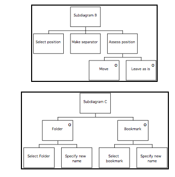
- Generify (scope system at task level)
This involves the following steps, which are described in more detail afterwards.
Prepare GTM(y)
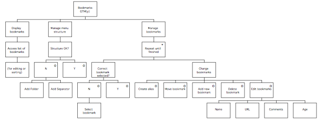
Prepare GTM(x)
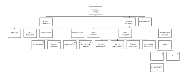
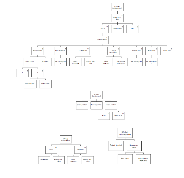
The models were checked by asking the users of each system if they described their tasks, and if they could think of anything to add to the diagrams.
MUSE(SE) Phase 2: SUN stage
- Document user problems
The Statement of User Needs is reproduced below. Some of the sections have been shortened for the current example, and most of the ‘Features’ tables have been omitted apart from those useful for the purposes of illustration. The final column was completed during the evaluation stage.
Title:____SUN: NetScape Bookmark window___ Page:_1__________
Date:____15/11/97_____________ Author:_SC_________
User and Device Actions
| Problem | Caused by | Consequences | Addressed by |
| No feedback if ‘delete key pressed (must use cmd-delete in extant system) | Functionality differs from user model of functionality (possibly from other applications) | User frustration | Different Keys
Delete is delete Key now |
| Change folder name & change bookmark name done differently | Use of ‘Edit bkmk’ rather than highlight and type new one | Could be difficult to change names – edit bookmark is an obscure menu item name | More finder-like i.e. change name in list window. |
| Feature | Caused by | Consequences | Addressed by |
| User may not realise that they can sort bkmks as desired, i.e. non-alphabetically | Lack of auto alphabetisation, although this is a desirable feature. | Ordering is part. Modal, dialog indicates they can choose location |
User and device actions
| Problem | Caused by | Consequences | Addressed by |
| Delete folder deletes contents without warning | No warning message | Not addressed-decided consistent with Finder functionality | |
| Unrecoverable errors | Can’t undo unsuccessful sorting command | Now you can – and if no selection prior to sort shows error message 4 . Apple-Z to undo | |
| Menu slow to appear | If too long, device delay causes sluggish response | Hardware issue. Controlling menu length is a goal of task performance, which has been addressed | |
| Duplicated Bkmk titles | System not prompting for alternative to default | OK to have multiple, then choose name & can see any duplications in folder window (Screen 2) | |
| ‘Add bookmark’ can be done with bookmark window open (adds for front-most browser window, which is not visible at the time) | Not disabling the menu item when the bookmark window opens | Apple-D disabled when bookmark window is active. | |
| (etc.) | (etc.) | (etc.) | (etc.) |
Task (Domain) Objects
| Problem | Caused by | Consequences | Addressed by |
| Description not accessible unless in edit Bookmark – offers poor support for identification of page when browsing
|
Only one can be viewed at a time, and not moved; not useful for comparisons | Bookmarks are ordered as saved, which is better (this wasn’t directly addressed, because it doesn’t interfere with task performance that seriously). | |
| ‘?’ Causes confusion | ? means unvisited, but user may think differently | Might think it means ‘no longer valid’ and delete it | Listing in bookmark window now has ‘Date last visited’ – this reads ‘Not visited’ instead of using the icon. |
User and device costs
| Problem | Caused by | Consequences | Addressed by |
| Menu items difficult to identify | Poor menu categories/ inconsistency, Poor titles for menu items | Menus reorganised |
| Feature | Caused by | Consequences | Addressed by |
| Target: More learnable than current system | Yes: fewer errors and less confusion | ||
| Target: Memorability. Bkmk names sometimes incomplete | Auto naming | Prompt user for better name when making bookmark in Sc2 | |
| Target: Computer users who have no experience of browsers should be able to use the bookmarks without training | If have finder experience, then functionality is similar enough. |
Physical aspects; device construction, appearance and layout.
| Problem | Caused by | Consequences | Addressed by |
| Try to do things which have different procedures. | Visual similarity to Finder | Emphasis on ‘Bookmark’ instead of ‘File’. Functionality is now more Finder-like. |
Miscellaneous
| Problem | Caused by | Consequences | Addressed by |
| Delete Bookmark hard to find
|
It’s in ‘Edit’ whereas all other Bookmark operations are under ‘Item’ | Changed to delete key. | |
| Sort bookmarks not easy to find | Bad menu choice | Changed menu design |
MUSE(SE) Phase 2: DoDD(y) stage
Analyse task domain.
DoDD(y):
| Node | Description | Number | Relation |
| Title | The title of the bookmark which identifies the page | 1 | shown in |
| Bookmark | An instance of a bookmark | 2 | has a |
| Bookmark window | The window that the bookmarks are edited in | 3 | shows |
| Bookmark menu | The menu that the bookmarks are chosen from whilst browsing | 4 | shows |
| Title | The folder title | 5 | shown in |
| Bookmark | An instance of a bookmark | 6 | has |
| Folder | A folder in the bookmark window | 7 | contains |
| Bookmark list | Ordered collection of bookmarks | 8 | contains |
| Folder | A folder in the bookmark window | 9 | contains |
| Folder | A folder in the bookmark window | 10 | has |
| URL | The internet location referred to by a bookmark | 11 | refers to |
| Page | A www page or internet resource | 12 | has |
| Rename bookmark | Behaviour | 13 | changes |
| View menu | Behaviour | 14 | shows |
| Open window | Behaviour | 15 | shows |
| Change description | Behaviour | 16 | changes |
| Delete bookmark | Behaviour | 17 | deletes |
| Move Bookmark | Behaviour | 18 | changes |
| Add separator | Behaviour | 19 | creates |
| Delete Separator | Behaviour | 20 | deletes |
| Add bookmark | Behaviour | 21 | creates |
| Rename folder | Behaviour | 22 | changes |
| Change URL | Behaviour | 23 | changes |
| Open Bookmark | Behaviour | 24 | opens appropriate |
| Delete folder | Behaviour | 25 | deletes |
| Add folder | Behaviour | 26 | creates |
Extract from Action – Object Matrix
| Bookmark | Bk list | Bk menu | Bk window | (etc.) | ||
| add bk | C | U | U | U | ||
| add folder | U | U | ||||
| add sep.tor | U | U | ||||
| K | delete bk | D | U | U | ||
| K | delete folder | U | U | |||
| K | delete sep.tor | U | U | |||
| sort bks | U | U | ||||
| make alias | C | U | U | |||
| F | Rename bk | U | U | |||
| F | rename folder | U | U | |||
| S | change descr. | |||||
| open bk page | R | R | ||||
| view menu | R | C | ||||
| open window | R | C | ||||
| F | move bk | U | U | |||
| S | change URL |
Key: K= key only F: Finder Functionality S: Subtask involked by edit bk details
MUSE(SE) Phase 2: CTM(y) stage
The CTM(y) is reproduced in full on the following page.
- Decompose task
Notice that the level of decomposition of the CTM(y) is slightly lower than either of the GTMs; in the present example, the ‘Edit Bookmarks’ task has been described in slightly more detail.
1a Synthesis: Obtain SoR, DoDD(y), and SUN
Compare GTM(x) and GTM(y)
Extend GTM(y)
Incorporate parts of GTM(x)
The CTM(y) is composed from GTM(y) and GTM(x). In this case, the CTM has taken most of its structure from the GTM(x), because the requirements were not specific enough to enable a detailed GTM(y) to be constructed. Some low-level detail of the GTM(y) has been incorporated, to ensure that the target system will meet the requirements. Folder management and the use of separators have been carried over from the GTM(x), as they were not present in the GTM(y), but were a useful feature of the existing system. This would need to be negotiated with the ‘owner’ of the requirements. The extant systems analysis revealed that renaming bookmarks was problematic for users, and the CTM(y) has added an alternative method of renaming items which is compatible with the Finder application studied during the analysis of existing systems and present in GTM(x).
Composite Task Model
(photocopy CTM printed @about 30% onto this page)
1b Record in table:
Design rationale
Design decisions
CTM Table:
| Name | Description | Design Comments |
| Acquire bookmarks body | Ported from GTM(x) | Required by SUN(y), avoids new bookmarks appearing at end of long list, or having an inappropriate name |
| Manage bookmarks | Ported from GTM(x) | Required as a result of adding acquire bookmarks body. (Disp. bookmarks and manage menu structure have moved down). |
| Assess changes | Ported from GTM(x) | Users must be able to assess the aspects they will change |
| Decide to make changes | Ported from GTM(x) | Structure taken from GTM(x) |
| Add to folder | Ported from GTM(x) | Required as consequence of SoR, but not in GTM(y) |
| Create alias | From GTM(y) | Uses structure of adding new bookmark from GTM(x) |
| Move item | Adapted from GTM(x) | Detail from GTM(x) |
| Add separator | Adapted from GTM(x), but in GTM(y) anyway | Moving separator is new |
| Edit bookmark | The user changes the attributes of the bookmark, or creates a new one. | New bookmark from GTM(x), edit structure in GTM(y). |
| Rename item | From GTM(x); an alternative way of renaming bookmarks consistent with Finder (as prompted by heuristics); also consistent with folder renaming | From GTM(x) |
| Delete Item | Decompose from GTM(y) | Needs to be consistent with metaphor (heuristics) |
| New bookmark | Can add new bookmark not necessary for page currently active in the browser | Two ways: Menu and accelerator keys. Menu gives Untitled bookmark (then as ‘edit bkmk’), accel. key gives bkmk for most recently active window, which can then be edited. Accel key disabled if no browser open. |
Differences between GTM(y) and CTM(y)
- CTM features acquire bkmk procedures, ported from MSIE
- GTM assesses structure (& adds separators/folders) prior to sorting bookmarks. These structure related tasks are in with bookmark editing in CTM(y).
- Add new bookmark is separated from edit bookmark in GTM, but as procedure is same the CTM approach of using same procedures for both appears viable
Phase 2: SUTaM stage
- Decompose the CTM(y):
For each node of the on-line task, designate as a H or C node.
Decompose the off-line tasks if required, after constructing the UTM from the marked up areas of the STM.
At this point, the design is specified in more detail, and as a consequence the diagram will become significantly larger. Compare the following extract from the CTM:
1a Consider whether decompositions of design comply with ‘design principles’ (feedback, etc.)
This is largely a matter of stepping thorough the diagram and checking, for example, that every time the user does something, the device does something to provide feedback.
1b Ensure that STM contains all relevant domain objects and attributes by reference to SUN and DoDD(y). Check SUN for user problems with existing system, and ensure they are not likely to recur.
Once again, a matter of stepping through the diagram to track down the items in the DoDD(y), ensuring that none have been forgotten. In our example, all the items from the DoDD(y) were located in the SUN.
1c Complete STM table
Notice how the heuristics have been used to provide rationale for design decisions.
| Name | Description | Design Comments |
| Decide name/location | User gets shown the default name and location | If all this is on once screen, it yields closure. Also, much faster than current system, where location/name would have to be effected later in the bookmark window.
• Prevents errors |
| Check bookmark window open | Have to look and see, and open it if it’s not | Must open the bookmark window to manipulate bookmarks – can’t do it from menu
• Directness |
| Create alias | Makes a pointer to the original, which may then be placed | Using Finder metaphor for this so it’s •Consistent (although not with ‘add bookmark). Reuses knowledge, from knowledge of the Finder. |
| Add to folder | Behaves just like Finder | • Consistent • Reuse of knowledge • Non-surprising |
| Move Items Sort Items |
Same as Finder | as above |
| Separator | None in Finder, but they are in menus | Behaves as bookmark or folder in Finder, following metaphor (though of course you can’t ‘get info’ or ‘Edit’ them) |
| New bookmark | In with Edit Bookmark, as the URL specified with name – this is consistent, as cannot use add blank screen due to no URL | • Prevent errors • Reduce number of actions • Yields closure |
| Rename item | Folders and bookmarks are same here – refer to later procedures for spec of this | |
| Delete item | Direct manipulation operates as Finder |
Phase 3 of MUSE(SE): ITM(y) stage
- Select nodes of the STM(y) for decomposition (H or H-C leaves)
The STM(y) can be marked up using a highlighter pen to identify the leaves for decomposition, as shown in the following diagram. One colour of highlighter was used to mark ‘Active/control’ actions, and a different pen was used to mark ‘Passive/read display’ actions.
- For each H-C leaf: if standard behaviour, – study ‘standard’ package
– analyse behaviour
– document behaviour
– rename items in ITM & DoDD(y)
The following extract from the ITM illustrates how H-C leaves are decomposed to ensure that the standard behaviour is specified.
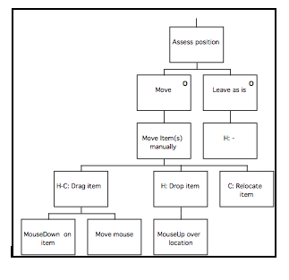
3.1 Obtain DoDD(y)
3.2 For each H leaf : (Decomposition)
The following extract from the ITM should be compared with the STM extract to illustrate the process of decomposing the STM into the ITM.
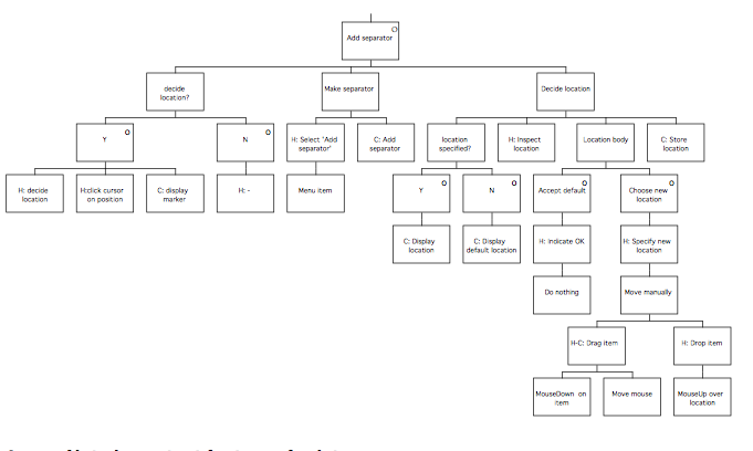
- Note important features for later
Hand-written notes were kept of each significant decision made whilst the ITM was produced. These were filed with the design products using plastic wallets to keep them together. A table was produced which described the subtasks identified as the ITM was decomposed (this was based on the ITM table, but the ‘Description’ heading was amended to read ‘Subtask’).
- Document in diagram and table
The ITM diagram became quite extensive, as was the table. As with the other tables produced during the design process, the ITM table was hand-written on a photocopied proforma. The ITM table was produced in three sections: those comments about the H-C leaves, comments about the ‘Active’ H leaves, and comments about the ‘Passive’ H leaves. The following table presents extracts from each section to indicate the type of comments made. Notice the cross-references to pages of Inside Macintosh, the programmer’s reference containing a version of the Apple Macintosh styleguide.
ITM Table:
| Name | Description | Design Comments |
| H-C leaf decomposition | ||
| Drag item to folder | H moves cursor to item, presses mouse button & moves cursor to new location, then releases. If illegal move, the item’s ‘ghost’ springs back to the original location. | Standard functionality |
| Drag item (twice, for items and separators) | As above | Standard functionality |
| Select bookmark | H double-clicks on selected bookmark or clicks once to highlight then uses menu to open | Standard functionality |
| Activate menu | H moves cursor to menu title on bar and presses mouse button. C displays menu | Standard functionality |
| Close bookmark window & Close bookmarks | H ensures window active, either click box on top left of window or press Apple-W or selects close from menu | Standard functionality |
| H leaves: Active leaves | ||
| Add bookmark | Creates new bookmark | Apple guide: Inside Mac [rel] menus or button [I-51]
C: Create bkmk attrs: name, URL, descr. + store info |
| Naming body | Allows user to accept default name or change to new name | Inside Macintosh [I-67]. modal dialog box, as choice must be made before bk can be stored (shows other bks to ensure names). |
| Location body | As above | As above |
| Open bkmks | Opens bk window | Inside Mac [I-51] menu or button |
| Open window | Same as open bkmks | |
| (etc.) | ||
| H leaves: Passive leaves | ||
| Inspect page | (Whilst browsing) | The page to be bookmarked |
| Inspect name location | Default name and location for new bookmark | Like std dlg? |
| Inspect bookmarks | Menu or window | (Whichever is open, but in window need attributes visible). |
| Inspect location | Look at default loc which is displayed | In a mode here;have to click OK |
| (etc.) |
- Iterate with: CTM(y) (task features)
STM(y) (allocation of function)
UTM(y) (off-line tasks)
Tell SE stream about iterations
In the present example, the iteration consisted of a certain amount of renaming of items in earlier products to maintain consistency and traceability.
- Demarcate screen boundaries
The following extract from the ITM shows how screen boundaries are marked on the ITM(y).

In the example here, rough sketches of screens were drawn whilst the ITM was being produced as an aid to decision making. The following extracts from the notes show the reasoning behind one decision concerning screen allocation:

The design rationale was noted so that the decision could be justified later on:
This has 1 window for bk window and each bk. However, only one bk details can be opened at once. So to compare 2 bk descriptions + URLs etc., would need 2+ windows available. This could get confusing.
So, stick with single instances, as above

Phase 3 of MUSE(SE): Display Design stage
- Define screen layouts
1.1. For each screen boundary, prepare a PSL(y):
Pictorial screen layouts were sketched by hand (as for the examples in the ITM stage). Once the design appeared satisfactory, more realistic screen layout diagrams were produced either by cutting and pasting parts of screenshots of standard applications using Adobe PhotoShop, or by using a user interface prototyping tool (in this case, HyperCard) to produce the dialogs and then capturing them as screenshots.
The following PSL was produced using HyperCard:

- Specify IM(y)s
No Interface Models were produced, as there were no bespoke items; all of the novel items specified had been based on ‘Finder’, which is effectively a part of MacOS, and no items such as check buttons toggling the dimming of other controls, or groups of radio buttons which would merit production of an IM(y) had been specified. Behaviours of menus were described in the ITM supported by text, and were entirely standard.
- Prepare Dictionary of Screen Objects
Extract from the dictionary of screen objects
| Screen object | Description | Design Attributes |
| Screen 2
Dialog box |
As for ‘Save file’ in standard applications | Has scrolling window to navigate folder structures, a box for containing the default name (highlighted). OK and cancel buttons. Has folder title at top as standard |
| Screen 3
Plain scrolling window
Menus: File Edit Bookmark Item Add Bookmark Add Folder Add Separator Make Alias Delete Item Open bk details… Sort Bookmarks…
|
As Finder window
[Resource name = DocumentProc Window]
As before Loses ‘Delete Bookmark’ As before |
Resizing handles, scrollbars, etc., as standard Finder window |
- Store items together
All of the products comprising the user interface specification were put in the ring-bound file in plastic wallets behind a divider marked ‘Display Design’.
- Deal with window management and errors
(A certain amount of iteration with earlier products resulted in some potential errors being designed out)
5.1 Window management and errors:
Dialog and Error Message Table:
‘EM’ refers to error messages; ‘W’ refers to the window or dialog where the message is liable to appear.
| Message number | Message |
| EM1 [W3] | To delete an item, select item(s) then press delete key or select ‘Delete Item’ in Item menu |
| EM2 [W2,3 & 4] | Bookmarks cannot have a blank name |
| EM3 [W2, 3 & 4] | Bookmark names must be shorter than [x] characters |
| EM4 (dialog) [W3] | Sort items will sort all items in list if no items are selected. This action is irreversible if you then change the item order |
6 Produce the DITaSAD
The following extract from the DITaSAD shows how screen transitions and error message presentations are dealt with:
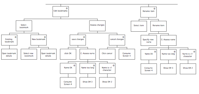
Phase 3 of MUSE(SE): Design Evaluation stage
- Analytic evaluation:
Draw general conclusions: Practical
Meets usability requirements
(Check SUN, and complete final column)
Syntax: simple, objective, consistent?
Semantics: computer imposed on UI? Ggood relationship with task
Evaluate specifications
all states reachable
feedback
input sequences all catered for Default states
Functional requirements
– identify device behaviours
– check if UI function
The design was reviewed to ensure that it met the above criteria; refer back to the SUN for the notes in the final column, which were completed at this point.
- Empirical evaluation
Prototype GUI: – define objectives
– choose tool
– build prototype
The user interface was prototyped by animating the PSLs by pasting them into HyperCard and scripting them with hidden buttons. Due to the limited speed of the available computers, this prototype ran too slowly to make its use in user testing viable, but it proved valuable for allowing the designer to evaluate the design. A second prototype was made; this one was a paper-based which took the form of a pair of booklets containing ‘screen shots’ of the target system in all the states required for the evaluation (this involved having a separate screen shots for folders open and closed, and so on). One of the booklets was plain apart from having the pages clearly numbered. The other booklet was annotated with the page numbers of the screen shots that should be presented in response to user actions, or other device behaviours such as beeping in response to errors (in which case the investigator would say ‘beep’!). The following diagram is an extract from the annotated booklet.

The user was instructed to indicate where mouseclicks would be made by pointing at the page using a pen to indicate the mouse pointer and saying something like ‘I’ll click on that menu there”. The evaluator would refer to their (annotated) copy to find out which page should be presented next and place the corresponding (unannotated) page in front of the user (obscuring or removing the other ‘screens’ already there, as appropriate). The user would then indicate their next response, such as “I’ll select ‘Sort Items’ ” and so on.
The user required a small amount of training in the technique at the start of testing, but overall the paper prototype was found to work well and the short delays whilst the experimenter found the next page were considered acceptable.
– investigate prototype with design team and users:
user training
scenario briefing
data collection (PLUME)
data analysis
report results
The designer experimented with the HyperCard prototype, and used the paper prototype with the confederate as the system to ensure that all the screens that would required had been specified; this also allowed the confederate to practice the technique, but only a small amount of practice was required before the confederate felt confident enough to attempt trials with a real user. The final paper prototype required 23 interlinked pages to depict the behaviour of the system in the various states required by the task to be used for testing. See below for the notes taken on the PLUME categories.
Design evaluation: – select approach
expert heuristic evaluation
user testing / observation
user survey
– identify participants
– decide session protocol
– pilot evaluation
The task used for initial testing during the ESA stage was reused at this point; although this would not be recommended in most cases, it was considered that the functionality of the bookmarks window was sufficiently limited that a task designed to test the items of interest would of necessity be very similar to the original task. A pilot examination was conducted using one of the design team, who behaved as a naive user for the purposes of the trial.
The user selected for the trial had not been involved in the initial testing, and was chosen because although they had some experience of using NetScape, their experience of using the bookmark features was very limited because they had not used the browser for long enough to accumulate a list that required maintenance. See the following extract from hand-written notes made at the time:
Notes on Evaluation (XX)
Subject has experience with using NetScape 2.0 on Macintosh, however, limited use of bookmarks. Uses add bookmark and the bookmark menu, but rarely uses the bookmark window or sorts bookmarks.
Collect data: – real-time note taking
– video recording
– thinking aloud
– heuristic evaluation
The evaluation was conducted in the usability laboratory; the room was located in a quiet location in the building where the task could be conducted without distractions from nearby activities, so that the user’s comments could be heard and recorded clearly for later analysis. More importantly, the room was equipped with high-quality video and audio recording equipment and an overhead camera; this allowed the designer to review the tapes following the session, and meant that they did not need to have such a detailed view of the table top. A colleague of the designer acted as the ‘system’ by managing the annotated booklet and interacting with the user, whilst the designer acted as observer and made notes as the task progressed. The video tapes of the session were reviewed afterwards; some example images showing the view from the camera are shown below.


Analyse data: user testing: time to complete
number and nature of errors
user problems
user comments
user survey statistics
The video was reviewed, and the following notes were made:
No probs adding bookmark.
Goes to home with toolbar button
Uses bkmk menu to go to original page again.
Had difficulty finding bkmk window – tried bkmk menu originally
Then sees window menu and opens bkmk window
Evidently unfamiliar with adding folders
Tries file menu
Tries bkmk menu
Tries Item menu – moves to insert folder
types UCL pages (no hesitation)
Returns to item menu
Insert separator – it appears
Clicks and drags to location specified
Rubber bands [original page] and drags to ‘UCL pages’ folder
Change URL:
tries ‘edit’ menu, then goes to item menu – edit bookmark
– bkmk details opens
Retypes details
pressed OK
Delete:
Goes to item
selects delete item
(It disappears)
Thought item menu was ambiguous tried edit sometimes instead
Other ways of doing things
Move – might try menu
Thought that double clicking folder might open it
Not surprised if dble clicking bkmk would open it, but thought it might open page (though possibly because NetScape already does this)
Thinks of opening bkmk as opening the Page, rather than bkmk details, but not surprised by this.
Thought Edit Bookmark seemed like an OK name, however.
Impact analysis analyse problems wrt usability criteria (SUN/PLUME)
rank order problems
generate design requirements
estimate resource requirements
review
The problems uncovered by the evaluation were analysed and noted:
Outstanding problems following evaluation
- ‘?’ issue – still confusing
- No accelerators for add bkmk in bkmk window
- Delete folder – problem not addressed, as not very important. Possibly address next time
- Didn’t have last visited problem in prototype. Should have been in bkmk window (added during evaluation)
- Agree redesign
Assess problem (prioritise according to severity)
Agree action – solve next cycle
– solve now
– no action
The problems were assessed and rank ordered, and the decisions concerning each were noted (in the event, the decisions were not executed; the method application was performed as an exercise):
Rank ordered problems
1st 2 Solve now (add accelerator)
2nd 4 Solve now – new prototype
3rd 1 Solve now – new prototype
4th 3 Solve next time
The iteration heuristics were used to determine the extent of the iterations that would be needed to solve each problem:
Iterations required (using heuristics)
1st 2 Heuristic 3b – check CTM onwards against SUN
2nd 4 Heuristic 3a – check CTM against SUN
3rd 1 Heuristic 3a – check CTM against SUN
4th 3 Heuristic 2b – check SUN and DoDD(y)
Finally, the PLUME categories were revisited to check that the design had met the objectives set at the end of extant systems analysis.
PLUME categories revisited
Productivity
Add bookmark involves location screen, which is extra procedure. However, this obviates the need to change the name and location later. Also, bookmark default location is top of menus, so less movement of the cursor is required to use the most recent bookmarks.
Learnability
Although initial search for correct menu, item names were easily understood once viewed
User Satisfaction
Easier grouping, as it is done when page is in browser. Previous SUN notes required access to description to aid sorting. However, bookmarks are sorted as they are made now, thus this should be easier.
Memorability
Consistent – yes, can identify bookmarks from title more easily because they are named when the page is active.
Errors
No non-recoverable errors, as can undo delete warning before sorting.
The Ravden & Johnson Evaluation Checklist:
Ravden, S., Johnson, G., (1989) Evaluating Usability of Human-Computer Interfaces: a practical method. Ellis Horwood.
INSTRUCTIONS FOR COMPLETING THE CHECKLIST
Sections 1 to 9: Criterion-based questions
(1) Each of these sections is based on a different criterion, or ‘goal’ which a well-designed user interface should aim to meet, The criterion is described at the beginning of the section, and consists of:
– a heading (e.g. ‘Visual Clarity’), followed by
– a statement (e.g. ‘information displayed on the screen should be clear, well- organized, unambiguous and easy to read’).
(2) A number of checklist questions follow, and these aim to assess whether the user interface meets the criterion.
For example, in section 1 (‘Visual clarity’), the questions check whether information which is displayed on the screen is clear, well-organized, unambiguous and easy to read.
(3) To the right of the checklist question, you will see four columns, labelled ‘Always’, ‘Most of the time’, ‘Some of the time’, and ‘Never’.
For each checklist question, please tick the column which best describes your answer to the question.
(4) Then write any comments which you feel you could make when answering a checklist question in the column labelled: ‘Comments’.
For example, when answering question 12 in section 1: ‘Is information on the screen easy to see and read?’, you may tick the column ‘some of the time’, and you may mention particular screens where information was very difficult to see and read, in the ‘Comments’ column.
(5) If you feel that a checklist question is not relevant to the interface which you are evaluating (e.g. questions relating to colour if the system does not use colour, questions referring to printouts if the there is no printer attached), then please write ‘Not Applicable’ or ‘N/A’ in the ‘Comments’ column beside that question, and move on to the next question.
(6) After the checklist questions in each section, you are asked for: ‘…any comments (good or bad)…’ which you would like to add concerning the issues in that section.
For example, you may wish to describe a particular problem, or make a particular point which you did not have room to make beside the checklist question, or you may feel the checklist questions have not covered a particular aspect of the interface which you feel should be mentioned.
(7) At the end of each section, you will see a rating scale, ranging from ‘Very satisfactory’ to ‘Very unsatisfactory’. Please tick the box which best describes the way you feel about the user interface in terms of the issues in that section.
Section 10: system usability problems
(1) The questions in this section ask you about specific problems which you experienced when carrying out the evaluation task(s).
(2) To the right of each question you will see three columns labelled: ‘No problems’, ‘Minor problems’ and ‘Major problems’.
For each question, please tick the column which is most appropriate.
(3) As in Sections 1 to 9, please write any particular comments, descriptions of problems, and so on, in the column labelled ‘Comments’, beside each question.
(4) If there are any questions you feel are not relevant to the interface which you are evaluating, then please write: ‘Not applicable’ or ‘N/A’ in the ‘Comments’ column for that question.
Section 11: general questions on system usability
This section asks you to give your views on the interface which you have been evaluating. Please feel free to write as much as you like in answer to each question.
SECTION 1: VISUAL CLARITY
Information displayed on the screen should be clear, well-organized, unambiguous and easy to read.
| 1 | Is each screen clearly identified with an informative title or description? | |||||
| 2 | Is important information highlighted on the screen? (e.g. cursor position, instructions, errors) | |||||
| 3 | When the user enters information on the screen, is it clear:
(a) where the information should be entered? |
|||||
| (b) in what format it should be entered? | ||||||
| 4 | Where the user overtypes information on the screen, does the system clear the previous information, so it does not get confused with the updated input? | |||||
| 5 | Does the information appear to be organised logically on the screen? | |||||
| 6 | Are different types of information clearly separated from each other on the screen? (e.g. instructions, control options, data displays) | |||||
| 7 | Where a large amount of information is displayed on one screen, is it clearly separated into sections on the screen? | |||||
| 8 | Are columns of information clearly aligned on the screen? (e.g. columns of alphanumerics left-justified, columns of integers right-justified) | |||||
| 9 | Are bright or light colours displayed on a dark background, and vice-versa? | |||||
| 10 | Does the use of colour help to make the displays clear? | |||||
| 11 | Where colour is used, will all aspects of the display be easy to see if used on a monochrome or low-resolution screen, or if the user is colour-blind? | |||||
| 12 | Is the information on the screen easy to see and read? | |||||
| 13 | Do screens appear uncluttered? | |||||
| 14 | Are schematic and pictorial displays (e.g. figures and diagrams) clearly drawn and annotated? | |||||
| 15 | Is it easy to find the required information on a screen? | |||||
- Are there any comments (good or bad) you wish to add regarding the above issues?
- Overall, how would you rate the system in terms of visual clarity?
| Very satisfactory | Moderately satisfactory | Neutral | Moderately unsatisfactory | Very unsatisfactory |
SECTION 2: CONSISTENCY
The way the system looks and works should be consistent at all times
| 1 | Are different colours used consistently throughout the system? (e.g. errors always highlighted in the same colour) | |||||
| 2 | Are abbreviations, acronyms, codes and other alphanumeric information used consistently throughout the system? | |||||
| 3 | Are icons, symbols, graphical representations and other pictorial information used consistently throughout the system? | |||||
| 4 | Is the same type of information (e.g. instructions, menus, messages, titles) displayed:
(a) in the same location on the screen? |
|||||
| (b) in the same layout? | ||||||
| 5 | Does the cursor appear in the same initial position on displays of a similar type? | |||||
| 6 | Is the same item of information displayed in the same format, whenever it appears? | |||||
| 7 | Is the format in which the user should enter particular types of information on the screen consistent throughout the system? | |||||
| 8 | Is the method of entering information consistent throughout the system? | |||||
| 9 | Is the action required to move the cursor around the screen consistent throughout the system? | |||||
| 10 | Is the method of selecting options (e.g. from a menu) consistent throughout the system? | |||||
| 11 | Where a keyboard is used, are the same keys used for the same functions throughout the system? | |||||
| 12 | Are there similar standard procedures for carrying out similar, related operations? (i.e. updating and deleting information, starting and finishing transactions) | |||||
| 13 | Is the way the system responds to a particular user action consistent at all times? | |||||
- Are there any comments (good or bad) you wish to add regarding the above issues?
- Overall, how would you rate the system in terms of consistency?
(Please tick appropriate box below.)
| Very satisfactory | Moderately satisfactory | Neutral | Moderately unsatisfactory | Very unsatisfactory |
SECTION 3: COMPATIBILITY
The way the system looks and works should be compatible with user conventions and expectations.
| 1 | Are colours assigned according to conventional associations where these are important? (e.g. red = alarm, stop) | |||||
| 2 | Where abbreviations, acronyms, codes and other alphanumeric information are displayed:
(a) are they easy to recognize and understand? |
|||||
| (b) do they follow conventions where these exist? | ||||||
| 3 | Where icons, symbols, graphical representations and other pictorial information are displayed:
(a) are they easy to recognise and understand? |
|||||
| (b) do they follow conventions where these exist? | ||||||
| 4 | Where jargon and terminology is used within the system, is it familiar to the user? | |||||
| 5 | Are established conventions followed for the format in which particular types of information are displayed? (e.g. layout of dates and telephone numbers) | |||||
| 6 | Is information presented and analysed in the units with which the users normally work? (e.g. batches, kilos, dollars) | |||||
| 7 | Is the format of displayed information compatible with the form in which it is entered into the system? | |||||
| 8 | Is the format and sequence in which information is printed compatible with the way it is displayed on the screen? | |||||
| 9 | Where the user makes an input movement in a particular direction (e.g. using a direction key, mouse, or joystick), is the corresponding movement on the screen in the same direction? | |||||
| 10 | Are control systems compatible with those used in other systems with which the user may need to interact? | |||||
| 11 | Is information presented in a way which fits the user’s view of the task? | |||||
| 12 | Are graphical displays compatible with the user’s view of what they are representing? | |||||
| 13 | Does the organisation and structure of the system fit the user’s view of the task? | |||||
| 14 | Does the sequence of activities required to complete a task follow what the user would expect? | |||||
| 15 | Does the system work the way the user thinks it should work? | |||||
- Are there any comments (good or bad) you wish to add regarding the above issues?
- Overall, how would you rate the system in terms of compatibility?
(Please tick appropriate box below.)
| Very satisfactory | Moderately satisfactory | Neutral | Moderately unsatisfactory | Very unsatisfactory |
SECTION 4: INFORMATIVE FEEDBACK
Users should be given clear, informative feedback on where they are in the system, what actions they have taken, whether these actions have been successful and what actions should be taken next.
| 1 | Are instructions and messages displayed by the system concise and positive? | |||||
| 2 | Are messages displayed by the system relevant? | |||||
| 3 | Do instructions and prompts clearly indicate what to do? | |||||
| 4 | Is it clear what actions the user can take at any stage? | |||||
| 5 | Is it clear what the user needs to do in order to take a particular action? (e.g. which options to select, which keys to press) | |||||
| 6 | When the user enters information on the screen, is it made clear what this information should be? | |||||
| 7 | Is it made clear what shortcuts, if any, are possible? (e.g. abbreviations, hidden commands, type ahead) | |||||
| 8 | Is it made clear what changes occur on the screen as a result of a user action? | |||||
| 9 | Is there always an appropriate system response to a user input or action? | |||||
| 10 | Are status messages (e.g. indicating what the system is doing, or has just done):
(a) informative? |
|||||
| (b) accurate? | ||||||
| 11 | Does the system clearly inform the user when it completes a requested action (successfully or unsuccessfully)? | |||||
| 12 | Does the system promptly inform the user of any delay, making it clear that the user’s input or request is being processed? | |||||
| 13 | Do error messages explain clearly:
(a) where the errors are? |
|||||
| (b) what the errors are? | ||||||
| (c) why they have occurred? | ||||||
| 14 | Is it clear to the user what should be done to correct an error? | |||||
| 15 | Where there are several modes of operation, does the system clearly indicate which mode the user is currently in? (e.g. update, enquiry, simulation) | |||||
- Are there any comments (good or bad) you wish to add regarding the above issues?
- Overall, how would you rate the system in terms of informative feedback?
(Please tick appropriate box below.)
| Very satisfactory | Moderately satisfactory | Neutral | Moderately unsatisfactory | Very unsatisfactory |
SECTION 5: EXPLICITNESS
The way the system works and is structured should be clear to the user.
| 1 | Is it clear what stage the system has reached in a task? | |||||
| 2 | Is it clear what the user needs to do in order to complete a task? | |||||
| 3 | Where the user is presented with a list of options (e.g. in a menu), is it clear what each option means? | |||||
| 4 | Is it clear what part of the system the user is in? | |||||
| 5 | Is it clear what the different parts of the system do? | |||||
| 6 | Is it clear how, where and why changes in one part of the system affect other parts of the system? | |||||
| 7 | Is it clear why the system is organised and structured the way it is? | |||||
| 8 | Is it clear why a sequence of screens are structured the way they are? | |||||
| 9 | Is the structure of the system obvious to the user? | |||||
| 10 | Is the system well-organised from the user’s point of view? | |||||
| 11 | Where an interface metaphor is used (e.g. the desk-top metaphor in office applications), is this made explicit? | |||||
| 12 | Where a metaphor is employed, and is only applicable to certain parts of the system, is this made explicit? | |||||
| 13 | In general, is it clear what the system is doing? | |||||
- Are there any comments (good or bad) you wish to add regarding the above issues?
- Overall, how would you rate the system in terms of explicitness?
(Please tick appropriate box below.)
| Very satisfactory | Moderately satisfactory | Neutral | Moderately unsatisfactory | Very unsatisfactory |
SECTION 6: APPROPRIATE FUNCTIONALITY
The system should meet the needs and requirements of users when carrying out tasks.
| 1 | Is the input device available to the user (e.g. pointing device, keyboard, joystick) appropriate for the tasks to be carried out? | |||||
| 2 | Is the way in which information is presented appropriate for the tasks? | |||||
| 3 | Does each screen contain all the information which the user feels is relevant to the task? | |||||
| 4 | Are users provided with all the options which they feel are necessary at any particular stage in a task? | |||||
| 5 | Can users access all the information which they feel they need for their current task? | |||||
| 6 | Does the system allow users to do what they feel is necessary in order to carry out a task? | |||||
| 7 | Is system feedback appropriate for the task? | |||||
| 8 | Do the contents of help and tutorial facilities make use of realistic task data and problems? | |||||
| 9 | Is task specific jargon and terminology defined at an early stage in the task? | |||||
| 10 | Where interface metaphors are used, are they relevant to the tasks carried out using the system? | |||||
| 11 | Where task sequences are particularly long, are they broken into appropriate sub sequences? (e.g. separating a lengthy editing procedure into its constituent parts) | |||||
- Are there any comments (good or bad) you wish to add regarding the above issues?
- Overall, how would you rate the system in terms of appropriate functionality?
(Please tick appropriate box below.)
| Very satisfactory | Moderately satisfactory | Neutral | Moderately unsatisfactory | Very unsatisfactory |
SECTION 7: FLEXIBILITY AND CONTROL
The interface should be sufficiently flexible in structure, in the way information is presented and in terms of what the user can do, to suit the needs and requirements of all users, and to allow them to feel in control of the system.
| 1 | Is there an easy way for the user to ‘undo’ an action, and step back to a previous stage or screen? (e.g. if the user makes a wrong choice, or does something unintended) | |||||
| 2 | Where the user can ‘undo’, is it possible to ‘redo’ (i.e. to reverse this action)? | |||||
| 3 | Are shortcuts available when required? (e.g. to bypass a sequence of activities or screens) | |||||
| 4 | Do users have control over the order in which they request information, or carry out a series of activities? | |||||
| 5 | Can the user look through a series of screens in either direction? | |||||
| 6 | Can the user access a particular screen in a sequence of screens directly? (e.g. where a list or table covers several screens) | |||||
| 7 | In menu-based systems, is it easy to return to the main menu from any part of the system? | |||||
| 8 | Can the user move to different parts of the system as required? | |||||
| 9 | Is the user able to finish entering information (e.g. when typing in a list or table of information) before the system responds? (e.g. by updating the screen) | |||||
| 10 | Does the system prefill required information on the screen, where possible? (e.g. to save the user having to enter the same information several times) | |||||
| 11 | Can the user choose whether to enter information manually or to let the computer generate information automatically? (e.g. when there are defaults) | |||||
| 12 | Can the user override computer-generated (e.g. default) information, if appropriate? | |||||
| 13 | Can the user choose the rate at which information is presented? | |||||
| 14 | Can the user choose how to name and organize information which may need to be recalled at a later stage? (e.g. files, directories) | |||||
| 15 | Can users tailor certain aspects of the system for their own preferences or needs? (e.g. colours, parameters) | |||||
- Are there any comments (good or bad) you wish to add regarding the above issues?
- Overall, how would you rate the system in terms of flexibility and control?
(Please tick appropriate box below.)
| Very satisfactory | Moderately satisfactory | Neutral | Moderately unsatisfactory | Very unsatisfactory |
SECTION 8: ERROR PREVENTION AND CORRECTION
The system should be designed to minimize the possibility of user error, with inbuilt facilities for detecting and handling those which do occur; users should be able to check their inputs and to correct errors, or potential error situations before the input is processed.
| 1 | Does the system validate user inputs before processing, wherever possible? | |||||
| 2 | Does the system clearly and promptly inform the user when it detects an error? | |||||
| 3 | Doe the system inform the user when the amount of information entered exceeds the available space? (e.g. trying to key five digits into a four-digit field) | |||||
| 4 | Are users able to check what they have entered before it is processed? | |||||
| 5 | Is there some form of cancel (or ‘undo’) key for the user to reverse an error situation? | |||||
| 6 | Is it easy for the user to correct errors? | |||||
| 7 | Does the system ensure that the user corrects all detected errors before the input is processed? | |||||
| 8 | Can the user try out possible actions (e.g. using a simulation facility) without the system processing the input and causing problems? | |||||
| 9 | Is the system protected against common trivial errors? | |||||
| 10 | Does the system ensure that the user double-checks any requested actions which may be catastrophic is requested unintentionally? (e.g. large-scale deletion) | |||||
| 11 | Is the system protected against possible knock-on effects of changes in one part of the system? | |||||
| 12 | Does the system prevent users from taking actions which they are not authorized to take? (e.g. by requiring passwords) | |||||
| 13 | In general, is the system free from errors and malfunctions? | |||||
| 14 | When system errors occur, can the user access all necessary diagnostic information to resolve the problem? (e.g. where and what the fault is, what is required to resolve it) | |||||
- Are there any comments (good or bad) you wish to add regarding the above issues?
- Overall, how would you rate the system in terms of error prevention and correction?
(Please tick appropriate box below.)
| Very satisfactory | Moderately satisfactory | Neutral | Moderately unsatisfactory | Very unsatisfactory |
SECTION 9: USER GUIDANCE AND SUPPORT
Informative, easy-to-use and relevant guidance and support should be provided, both on the computer (via an on-line help facility) and in hard-copy document form, to help the user understand and use the system.
| 1 | If there is some form of help facility (or guidance) on the computer to help the user when using the system then:
(a) Can the user request this easily from any point in the system? |
|||||
| (b) Is it clear how to get in and out of the help facility? | ||||||
| (c) Is the help information presented clearly, without interfering with the user’s current activity? | ||||||
| (d) When the user requests help, does the system clearly explain the possible actions which can be taken, in the context of what the user is currently doing? | ||||||
| (e) When using the help facility, can the user find relevant information directly, without having to look through unnecessary information? | ||||||
| (f) Does the help facility allow the user to browse through information about other parts of the system? | ||||||
| 2 | If there is some sort of hard-copy guide to the system (e.g. user guide or manual) then:
(a) Does this provide an in-depth, comprehensive description, covering all aspects of the system? |
|||||
| (b) Is it easy to find the required section in the hard-copy documentation? | ||||||
| 3 | Is the organization of all forms of user guidance and support related to the tasks which the user can carry out? | |||||
| 4 | Do user guidance and support facilities adequately explain both user and system errors, and how these should be corrected? | |||||
| 5 | Are all forms of user guidance and support maintained up-to-date? | |||||
- Are there any comments (good or bad) you wish to add regarding the above issues?
- Overall, how would you rate the system in terms of user guidance and support?
(Please tick appropriate box below.)
| Very satisfactory | Moderately satisfactory | Neutral | Moderately unsatisfactory | Very unsatisfactory |
SECTION 10: SYSTEM USABILITY PROBLEMS
When using the system, did you experience problems with any of the following:
| 1 | Working out how to use the system | |||||
| 2 | Lack of guidance on how to use the system | |||||
| 3 | Poor system documentation | |||||
| 4 | Understanding how to carry out the tasks | |||||
| 5 | Knowing what to do next | |||||
| 6 | Understanding how the information on the screen relates to what you are doing | |||||
| 7 | Finding the information you want | |||||
| 8 | Information which is difficult to read properly | |||||
| 9 | Too many colours on the screen | |||||
| 10 | Colours which are difficult to look at for any length of time | |||||
| 11 | An inflexible, rigid, system structure | |||||
| 12 | An inflexible HELP (guidance) facility | |||||
| 13 | Losing track of where you are in the system or what you are doing or have done | |||||
| 14 | Having to remember too much information whilst carrying out a task | |||||
| 15 | System response times that are too quick for you to understand what is going on | |||||
| 16 | Information that does not stay on the screen long enough for you to read it | |||||
| 17 | System response times that are too slow | |||||
| 18 | Unexpected actions by the system | |||||
| 19 | An input device that is difficult or awkward to use | |||||
| 20 | Knowing where or how to input information | |||||
| 21 | Having to spend too much time inputting information | |||||
| 22 | Having to be very careful in order to avoid errors | |||||
| 23 | Working out how to correct errors | |||||
| 24 | Having to spend too much time correcting errors | |||||
| 25 | Having to carry out the same type of activity in different ways | |||||
SECTION 11: GENERAL QUESTIONS ON SYSTEM USABILITY
Please give your views on the usability of the system by answering the questions below in the spaces provided. There are no right or wrong answers.
- What are the best aspects of the system for the user?
- What are the worst aspects of the system for the user?
- Are there any parts of the system which you found confusing or difficult to fully understand?
- Were there any aspects of the system which you found particularly irritating although they did not cause major problems?
- What were the most common mistakes you made when using the system?
- What changes would you make to the system to make it better from the user’s point of view?
- Is there anything else about the system you would like to add?
Blank Tables
The following pages contain blank tables for the main MUSE products. To avoid alternating between diagram editor and word processor during design, these can be photocopied and used for making hand-written notes whilst the corresponding diagrams are being produced.
Once the diagrams are completed, it is recommended that the tables are typed up so that a complete record of the design process can be maintained on disk.
Task Description Table
Title:________________________________________ Page:____________
Date:_________________ Author:__________
| Name | Description | Observation | Design Implication | Speculation |
|
|
Generalised Task Model Supporting Table
Title:________________________________________ Page:____________
Date:_________________ Author:__________
| Name | Description | Observation | Design Implication |
Speculation |
|
|
Statement of User Needs: User and Device Actions
Title:________________________________________ Page:____________
Date:_________________ Author:__________
User and Device Actions
| Problem | Caused by | Consequences | Addressed by |
|
|
| Feature | Caused by | Consequences | Addressed by |
|
|
Statement of User Needs: User mental processes and mental model
Title:________________________________________ Page:____________
Date:_________________ Author:__________
User mental processes and mental model
| Problem | Caused by | Consequences | Addressed by |
|
|
| Feature | Caused by | Consequences | Addressed by |
|
|
Statement of User Needs: Task (Domain) Objects
Title:________________________________________ Page:____________
Date:_________________ Author:__________
Task (Domain) Objects
| Problem | Caused by | Consequences | Addressed by |
|
|
| Feature | Caused by | Consequences | Addressed by |
|
|
Statement of User Needs: User and device costs
Title:________________________________________ Page:____________
Date:_________________ Author:__________
User and device costs
| Problem | Caused by | Consequences | Addressed by |
|
|
| Feature | Caused by | Consequences | Addressed by |
|
|
Statement of User Needs: Physical aspects; device construction, appearance and layout.
Title:________________________________________ Page:____________
Date:_________________ Author:__________
Physical aspects; device construction, appearance and layout.
| Problem | Caused by | Consequences | Addressed by |
|
|
| Feature | Caused by | Consequences | Addressed by |
|
|
Statement of User Needs: Miscellaneous
Title:________________________________________ Page:____________
Date:_________________ Author:__________
Miscellaneous
| Problem | Caused by | Consequences | Addressed by |
|
|
| Feature | Caused by | Consequences | Addressed by |
|
|
DoDD(y) Supporting Table
Title:________________________________________ Page:____________
Date:_________________ Author:__________
Notes:
- The relations in the table are intended to be read in the direction of the arrow in the DoDD(y) diagram
| Node | Description | Number | Relation |
|
|
Composite Task Model Supporting Table
Title:________________________________________ Page:____________
Date:_________________ Author:__________
| Name | Description | Design Comments |
|
|
System / User Task Model Supporting Table
Title:________________________________________ Page:____________
Date:_________________ Author:__________
| Name | Description | Design Comments |
|
|
Interaction Task Model Supporting Table
Title:________________________________________ Page:____________
Date:_________________ Author:__________
| Name | Description | Design Comments |
|
|
Dialog and Error Message Table
Title:________________________________________ Page:____________
Date:_________________ Author:__________
| Message number | Message |
|
|
Dictionary of Screen Objects Table
Title:________________________________________ Page:____________
Date:_________________ Author:__________
| Screen object | Description | Design Attributes |
|
|
[1]Also if particular OMT products haven’t been prepared at the time of the cross-check
[2]The user object model is taken from Redmond-Pyle, D., and Moore, A., (1995) ‘Graphical User Interface Design and Evalution (GUIDE): A practical Process’, Prentice Hall, London, and the user object model procedures reproduced here are based on those by Redmond-Pyle